What to expect?
Let’s examine a practical application of basic Data Visualization concepts and Data Storytelling. We will look at one existing publicly available chart on the internet, preferably each week. You can take these lessons to your world of Data Storytelling. Apply them at the office or home when persuading your spouse about spending habits :-).
Data Storytelling Example
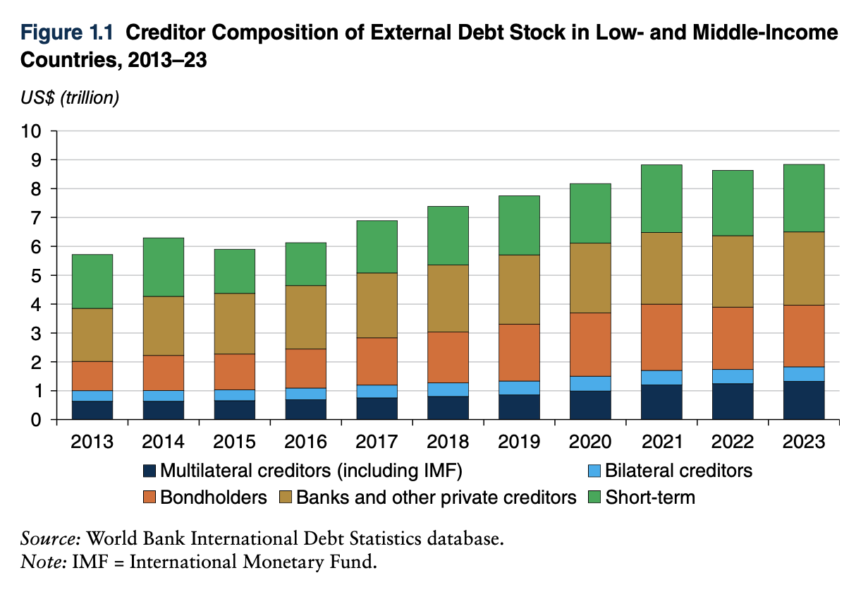
Our example will be a chart from a World Bank report on Low and Middle-Income countries’ External Debt Composition. Don’t get scared by the topic. It’s irrelevant. The Data Storytelling tips are.
The setting
The report is very long. The first part explains the trend in External Debt for these countries. It wants to say that there is an increase in debt provided by Multilateral creditors and Bondholders. Remember that the word “increase” can, in this instance, mean an increase in Mix as % of Total External Debt. It can also mean an increase in $ value. But the chart name gives us a small clue. It says “Creditor Composition,” which indicates a Mix%. The chart has the data, but the story does not stand out. So, I would make the following adjustments to elevate the message and increase the visual elements. Practice these Data Visualization skills to become fluent and progress faster in your career.
Further enhancements to the chart to improve the Data storytelling should be:
- Reduce the white space – I generally like white space to project cleanness but this chart has a LOT of white
- Change the Chart Type – This is a clear Component Comparison. A 100% stacked chart is necessary to show the change in the mix over time. The original chart has only one category you can clearly see changing. That category is Multilateral creditors. It is the only category that sits on a straight line (base line). All the other categories are at the mercy of this category.
- Simplify the X axis – if it’s clear from the heading of the chart that it spans 10 years, you don’t need to show all ten data labels on X axis to show all years. I decided to skip one. But in this case you can dare just to put 2013, 2018 and 2023 if you wish (by 5 years)
- Re-do the legend – In this case, I would prefer to put the legend next to the chart, to the areas they belong to, so that the cognitive load going back and forth is reduced to a minimum
- Change colors for the categories – the message needs to be visually visible that there is a growth in the Multilateral Creditors and Bondholders to the detriment of the Short Term creditors (all 3 have distinctive colors)
- Add a Telling Title – so that when you read the title. You got the message straight away and can easily follow it in the charts if you are more interested in the details
- Add Coloring to the Headlines too – so that you can clearly associate the verbal narrative to the visual
An alternative result after application of a few concepts of Data Visualization:

Summary
Review the simple concepts for clear Data Storytelling. Keep practicing. You can do wonders—not only for the Visualizations but also for your Data Storytelling and professional career.
If there is a chart you wish me to review, just let me know. I can give some thoughts on revision. Please contact me via the contact form.
You can use the Chart of the Week tag to see other examples.

Leave a comment