What to expect?
Let’s examine a practical application of basic Data Visualization concepts and Data Storytelling. We will look at one existing publicly available chart on the internet, preferably each week. You can take these lessons to your world of Data Storytelling. Apply them at the office or home when persuading your spouse about spending habits :-).
Data Storytelling Example
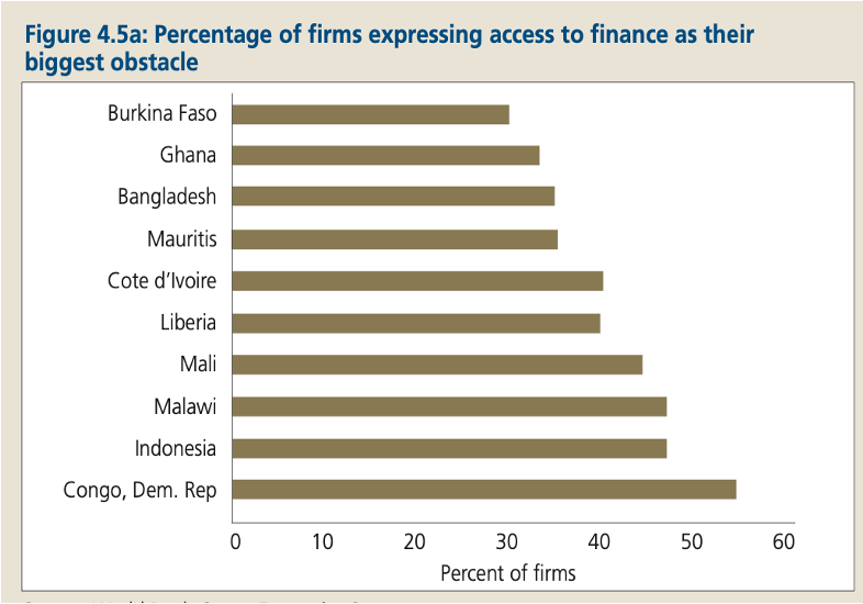
Our example will be a chart from a World Bank report on Low and Middle-Income countries’ External Debt Composition. Don’t get scared by the topic. It’s irrelevant. The Data Storytelling tips are.
The setting
The report is very long. This section explains which countries consider access to financing the most challenging. I think the chart selected is not wrong because it compares items – in this case, Countries. The chart has the data, but the story does not stand out. Thus, I would suggest the following adjustments to enhance the message and incorporate more visual elements. Practice these Data Visualization skills to become fluent and progress faster in your career.
Further enhancements to the chart to improve the Data storytelling should be:
- Reduce the white space – I generally like white space to project cleanness but this chart has a LOT of white
- Remove the X axis – I think adding Data labels in this case is a better option than having X axis
- Add the Continent legend – to clearly indicate which country is from what Continent
- Change colors for the categories – same as above, I wanted to clearly highlight that most of the countries are coming from Africa
- Add a Telling Title – so that when you read the title. You got the message straight away and can easily follow it in the charts if you are more interested in the details
- Add Coloring to the Headlines too – so that you can clearly associate the verbal narrative to the visual
An alternative result after application of a few concepts of Data Visualization:

Summary
Review the simple concepts for clear Data Storytelling. Keep practicing. You can do wonders—not only for the Visualizations but also for your Data Storytelling and professional career.
If there is a chart you wish me to review, just let me know. I can give some thoughts on revision. Please contact me via the contact form.
You can use the Chart of the Week tag to see other examples.

Leave a comment