What to expect?
Let’s examine a practical application of basic Data Visualization concepts and Data Storytelling. We will look at one existing publicly available chart on the internet, preferably each week. You can take these lessons to your world of Data Storytelling. Apply them at the office or home when persuading your spouse about spending habits :-).
Data Storytelling Example
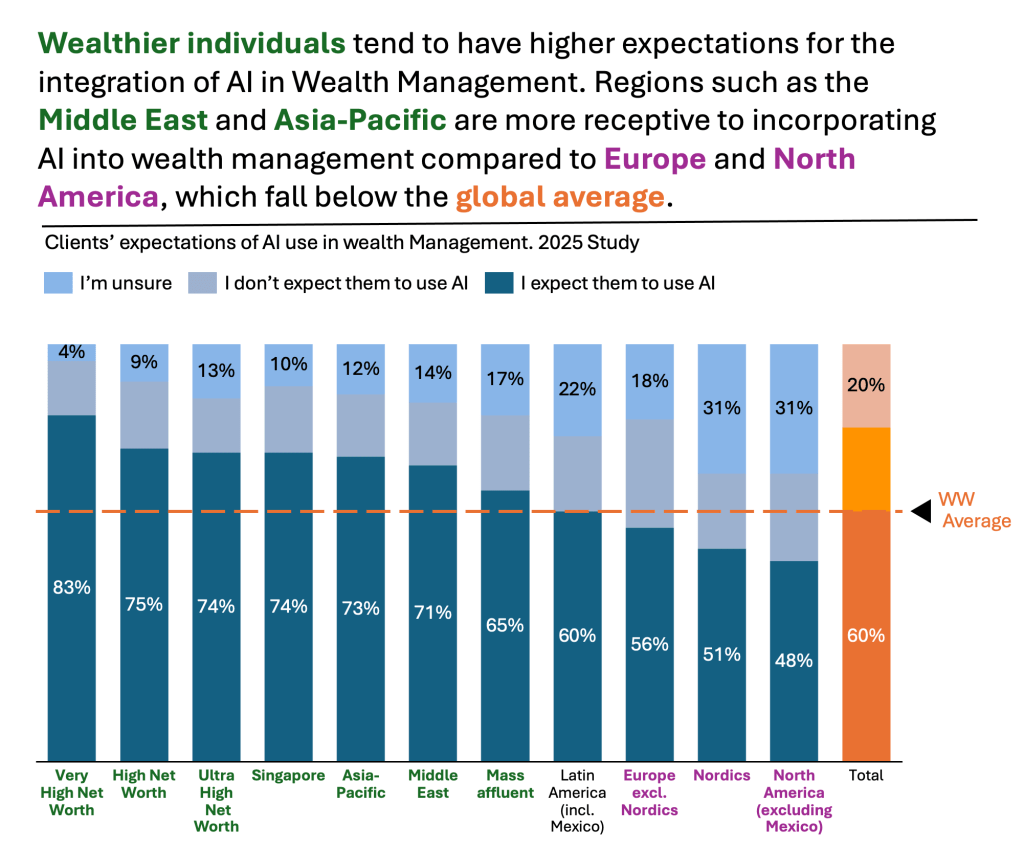
Our example will be a chart from a Singapore Business times article. This article talks about a survey conducted by EY in their 2025 Global Wealth Research Report. They were asking recipients if they expect their wealth managers to use AI in Wealth Management. The topic is not the most interesting. It’s irrelevant. The Data Storytelling tips are.

The setting
The article is sweet and short. It describes the categories and the background of the survey. It tells the story, but not in this chart. The chart displays the data. It is properly selected because it is Component Compare. Yet, the story does not stand out right away. Thus, I would suggest the following adjustments to enhance the message and incorporate more visual elements. Practice these Data Visualization skills to become fluent and progress faster in your career.
Further enhancements to the chart to improve the Data storytelling should be:
- Reorder the components – I would put the most essential series at the base of the chart. This series is “I expect them to use AI.” This is important because it is one of the two categories that can be easily compared across. The other category is the one at the top. This comparison is only possible with a 100% stacked chart.
- Rank – If the main message is to recognize which groups are most inclined towards the use of AI in Wealth Management, then I would rank them. I would find these groups first. I would rank them from highest to lowest. I would place the World Wide average last for benchmarking purposes.
- Change colors for the categories – you argue that it does not matter. Still, I wanted to clearly highlight the “I expect them to use AI.” Then, call out the WW average (in orange).
- Add a Telling Title – When you read the title, you should get the message straight away. This lets you easily follow it in the article if you are more interested in the details.
- Add Coloring to the Headlines (and X-axis) too – so that you can clearly associate the verbal narrative to the visual
An alternative result after application of a few concepts of Data Visualization:
Summary
Review the simple concepts for clear Data Storytelling. Keep practicing. You can do wonders—not only for the Visualizations but also for your Data Storytelling and professional career.
If there is a chart you wish me to review, just let me know. I can give some thoughts on revision. Please contact me via the contact form.
You can use the Chart of the Week tag to see other examples.

Leave a comment