
What to expect?
Let’s examine a practical application of basic Data Visualization concepts and Data Storytelling. We will look at one existing publicly available chart on the internet, preferably each week. You can take these lessons to your world of Data Storytelling. Apply them at the office or home when persuading your spouse about spending habits :-).
Data Storytelling Example
Our example will be a chart from a World Bank blog featuring various topics, accompanied by corresponding charts. Here, we are not very interested in the topic itself. We focus more on the visual and the story it wants to tell. Note that there is a difference between presenting a whole article and presenting it. A full article sometimes explains what you can see on the chart. It differs from when you have just you and your slide in front of an audience. The way you show your points will differ. The important thing is: Data Storytelling is everywhere.
The setting
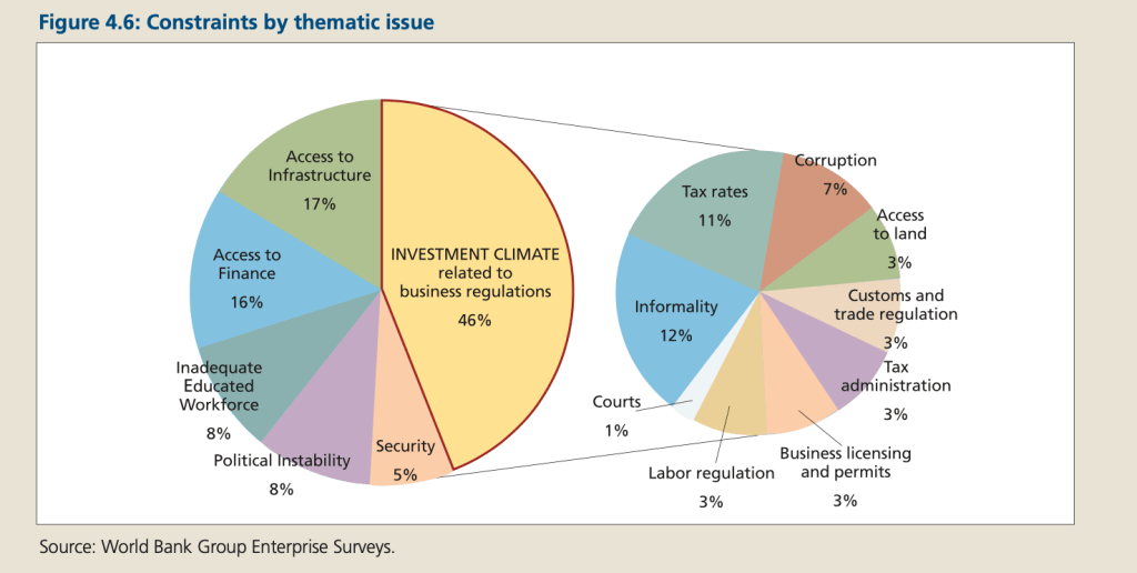
The article discusses various constraints that developing countries face in creating jobs. As there are many obstacles the countries are facing, it’s quite challenging to convey them all without getting too cluttered. The chart displays the data. However, I would not choose the Pie Chart because I usually avoid them whenever possible. However, it is a Component Compare. Thus, I would suggest the following adjustments to enhance the message and incorporate more visual elements. Practice these Data Visualization skills to become fluent and progress faster in your career.
Further enhancements to the chart to improve the Data storytelling should be:
- Change the chart – I would choose Stacked Bar Chart. Its width can be adjusted to accommodate the text. It also reflects the % mix of that specific constraint. The text is not overflowing, unlike with Pie Charts.
- Highlight the important. Use distinctive colors for items you want to highlight. Not everything is important at the same level. Do not show mix % for items you will not discuss.
- Use connectors – When you have charts that are “connected” through a message, make sure to use connectors. This helps the audience follow your line of thoughts.
- Add a Telling Title – When you read the title, you should get the message straight away. This lets you easily follow it in the article if you are more interested in the details.
- Add Coloring to the Headlines too – so that you can clearly associate the verbal narrative to the visual
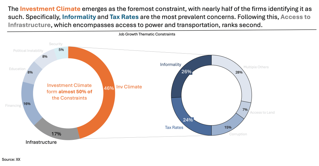
An alternative result after application of a few concepts of Data Visualization:

But if you are by any chance too attracted to Pie Charts, use a Doughnut chart then:
Doughnut charts are a welcome option to Pie charts. You can write the most important message inside them. This makes them more visually attractive. Apply the same enhancements as above.
Summary
Review the simple concepts for clear Data Storytelling. Keep practicing. You can do wonders—not only for the Visualizations but also for your Data Storytelling and professional career. There are multiple views of the same story; you need to select the one that best suits you.
If there is a chart you wish me to review, just let me know. I can give some thoughts on revision. Please contact me via the contact form.
You can use the Chart of the Week tag to see other examples.
You can download the free Chart Decision Tree and Visual Compare Guide.

Leave a comment