Back to Storytelling with Charts
We have already discussed some basic principles of Data Storytelling. We understand the right Compares. We also select the correct chart based on keywords for your messaging. I have also introduced you to the SCR framework.
Now is the time to put into action everything we have learned (basic concepts).
Let’s examine the following example from a fictional company.
The Procurement Department needs help sorting out its supplier base

Situation
The Procurement Department of a mid-sized manufacturing company has recently expanded its supplier base. This expansion aims to improve cost competitiveness. It also ensures supply chain resilience. However, senior leadership is concerned about rising costs and inconsistent supplier performance. The department needs to present a concise analysis to leadership. This analysis must be data-driven. It should highlight key supplier issues. Additionally, it should recommend actionable next steps.
Complication
Despite onboarding new suppliers, the department lacks a straightforward, visual method for comparing supplier performance across critical metrics. Decision-making is slow. It isn’t easy to find which suppliers are driving cost increases. Delivery delays or quality issues complicate the process. Without a clear comparison, it is challenging to rank efforts for supplier improvement or consolidation.
Data Set

What Chart to use?
Whenever we have words like “compare” or “rank” in the message, it usually indicates an Item Comparison. Hence, I would suggest the following view to compare the Supplier base across the KPIs. I selected 3 of them.
And here it comes:
Resolution
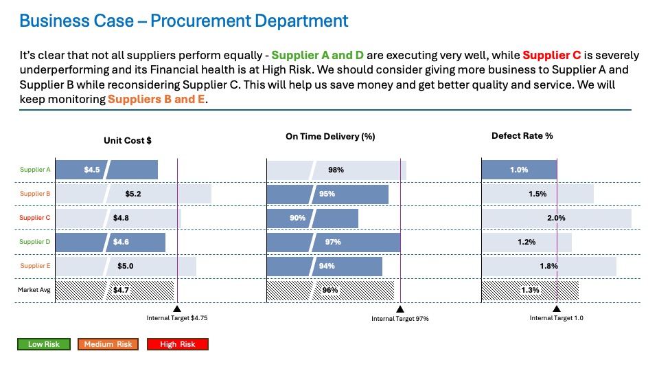
Not all suppliers operate equally. Supplier A and D are executing very well. In contrast, Supplier C is severely underperforming. Its financial health is at high risk. We should consider giving more business to Supplier A and Supplier B while reconsidering Supplier C. This will help us save money and get better quality and service. We will keep monitoring Suppliers B and E.
Summary
I hope this example provides you with some more straightforward guidelines on Item Comparison from day-to-day life. I did not explain all the small tricks on purpose. That explanation will probably come later on. For now, the important thing was to give you a simple walkthrough from task to outcome.
For a free downloadable resource, click the Chart Decision Tree and Compare Visual Guide.

Leave a comment