
What to expect?
Let’s examine a practical application of basic Data Visualization concepts and Data Storytelling. We will look at one existing publicly available chart on the internet, preferably each week. You can take these lessons to your world of Data Storytelling. Apply them at the office or home when persuading your spouse about spending habits :-).
Data Storytelling Example
Our example will be a chart from a World Bank blog featuring various topics, accompanied by corresponding charts.
“I really don’t have anything against the World Bank, but they give me a lot of “good” examples :-)”
Here, we are not very interested in the topic itself. We focus more on the visual and the story it wants to tell. Note that there is a difference between presenting a whole article and presenting it. A full article sometimes explains what you can see on the chart. It differs from when you have just you and your slide in front of an audience. The way you show your points will differ. The important thing is: Data Storytelling is everywhere.
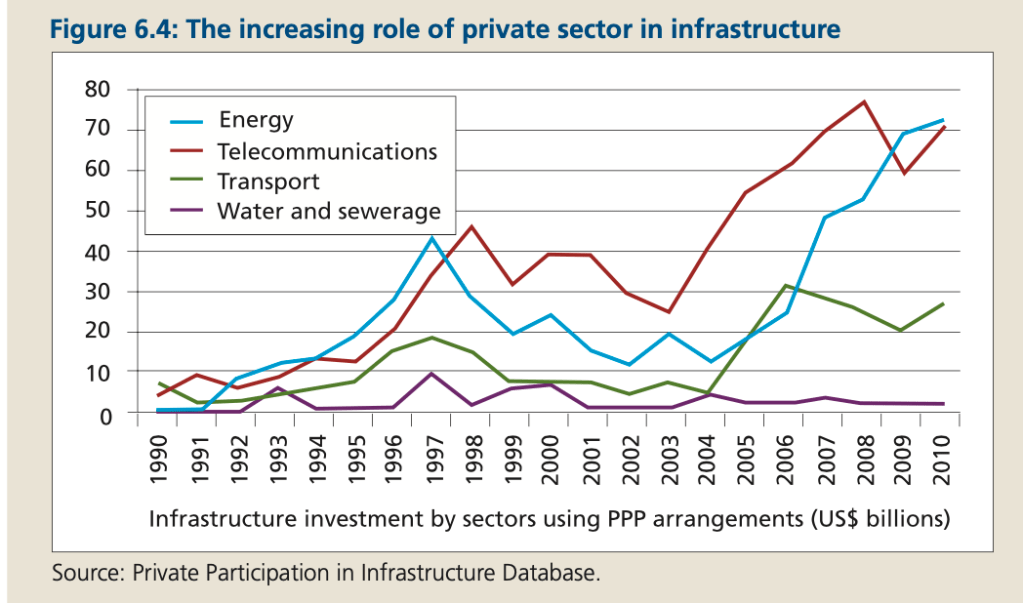
The setting
This section discusses the role the Private sector plays in Infrastructure projects. The message was clear to me when I read the article. Still, deciphering it from just the chart would take some time. The chart displays the data. But the chart itself is too cluttered and does not align with Tufte’s data-to-ink ratio. Thus, I would suggest the following adjustments to enhance the message and incorporate more visual elements. Practice these Data Visualization skills to become fluent and progress faster in your career.
Further enhancements to the chart to improve the Data storytelling should be:
- Clean the chart – I would remove the grids and keep just one or two to indicate the numbers. We don’t need to know the exact numbers, as that is not the point of the article. The fact is direction and rough %.
- Highlight the important. Use distinctive colors for items you want to highlight. Not everything is important at the same level. No need to highlight Water & Sewerage, but still keep there for reference. If W&S is the key issue to highlight, I would reverse the coloring. W&S should be highlighted, and other elements should be kept gray.
- Simplify both axis – You don’t need to clutter your axis with unnecessary items. It is clear there is a continuum. In this case, same is valid for the years as for the Participation %.
- Add a Telling Title – When you read the title, you should get the message straight away. This lets you easily follow it in the article if you are more interested in the details.
- Add Coloring to the Headlines too – so that you can clearly associate the verbal narrative to the visual
An alternative result after application of a few concepts of Data Visualization:
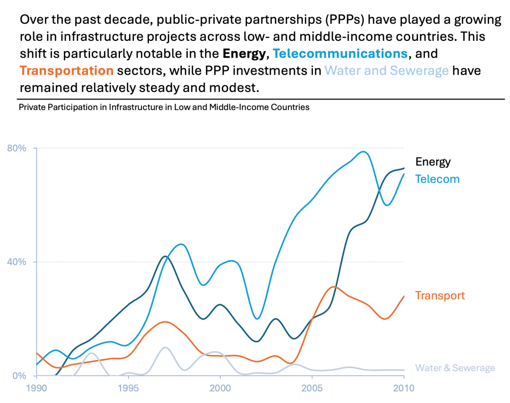
There can be many other alternatives, but I picked one, which simplifies and detangles spaghetti charts:
You need to keep the charts exactly the same for this to work. This way, you can clearly see the differences in the Participation %.
Many people would cut the Y-axis to 40% or 20% for the charts at the bottom. However, doing so would only confuse people. It would lead them to incorrect conclusions. You need to keep the charts the same to prove your point.

Summary
Review the simple concepts for clear Data Storytelling. Keep practicing. You can do wonders—not only for the Visualizations but also for your Data Storytelling and professional career. There are multiple views of the same story; you need to select the one that best suits you.
If there is a chart you wish me to review, just let me know. I can give some thoughts on revision. Please contact me via the contact form.
You can use the Chart of the Week tag to see other examples.
You can download the free Chart Decision Tree and Visual Compare Guide.

Leave a comment