
What to expect?
Let’s examine a practical application of basic Data Visualization concepts and Data Storytelling. We will look at one existing publicly available chart on the internet, preferably each week. You can take these lessons to your world of Data Storytelling. Apply them at the office or home when persuading your spouse about spending habits :-).
Data Storytelling Example
Our example will be a chart from a World Bank blog featuring various topics, accompanied by corresponding charts.
“I really don’t have anything against the World Bank, but they give me a lot of “good” examples :-)”
Here, we are not very interested in the topic itself. We focus more on the visual and the story it wants to tell. Note that there is a difference between presenting a whole article and presenting it. A full article sometimes explains what you can see on the chart. It differs from when you have just you and your slide in front of an audience. The way you show your points will differ. The important thing is: Data Storytelling is everywhere.

The setting
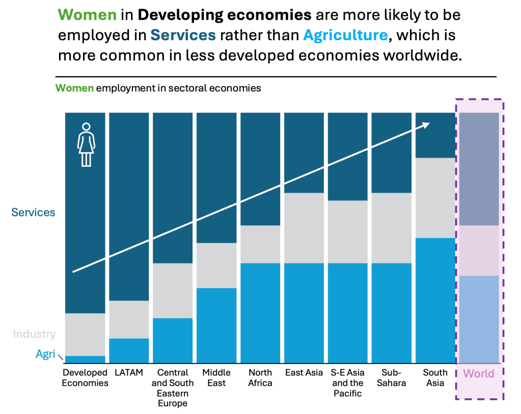
This section discusses where Females and Males are mostly employed. The message was clear to me when I read the article. Still, deciphering it from just the chart would take some time. The chart displays the data. But the chart itself is too cluttered and does not align with Tufte’s data-to-ink ratio. Thus, I would suggest the following adjustments to enhance the message and incorporate more visual elements. Practice these Data Visualization skills to become fluent and progress faster in your career.
Further enhancements to the chart to improve the Data storytelling should be:
- Split the chart – I would split the chart into two sections. One is dedicated to Women and one to Men. I don’t think putting both of them into one chart does justice to the Data Storytelling.
- Highlight the important. Use distinctive colors to highlight the items you want to emphasize. Not everything is equally important. There is no need to highlight all three sectors if they are not needed. What you don’t want to highlight, keep it grey(ish).
- Simplify both axes – You don’t need to clutter your axes with unnecessary items. Splitting the chart into two helps to remove one layer of the X axis. Remove the percent sign (%) from the Y axis. It is not essential when you want to tell a “directional” story.
- Add a Telling Title – When you read the title, you should get the message straight away. This lets you easily follow it in the article if you are more interested in the details.
- Add Coloring to the Headlines too – so that you can clearly associate the verbal narrative to the visual
- Add Icon(s) – If there is a space to add Icons, because it helps visually to understand what it is about, is a big PLUS
An alternative result after application of a few concepts of Data Visualization:
Here is how it can look like when you do the same for MEN too:
Having both charts next to each other helps tell two stories: one for women and one for men. But hey, it helps with a third one, which is the comparison between the two! But you need to keep the charts the same to prove your point.

Summary
Review the simple concepts for clear Data Storytelling. Keep practicing. You can do wonders—not only for the Visualizations but also for your Data Storytelling and professional career. There are multiple views of the same story; you need to select the one that best suits you.
If there is a chart you wish me to review, just let me know. I can give some thoughts on revision. Please contact me via the contact form.
You can use the Chart of the Week tag to see other examples.
You can download the free Chart Decision Tree and Visual Compare Guide.

Leave a comment