
Back to Storytelling with Charts
We have already discussed some basic principles of Data Storytelling. We understand the right Compares. We also select the correct chart based on keywords for your messaging. I have also introduced you to the SCR framework.
Now is the time to put into action everything we have learned (basic concepts).
Let’s examine the following example from a fictional company.
The HR Department needs help with Employee Turnover issues

Situation
The Human Resources department of a multinational corporation is responsible for overseeing workforce health and retention across various regions. Recently, there have been growing concerns about increasing employee turnover rates, especially within specific departments and job levels. In response, leadership has called for a comprehensive, data-driven analysis. They aim to spot patterns that will inform the development of targeted strategies for improving retention.
Complication
Current HR reports show turnover data in lengthy tables or separate charts for each region or department. This makes it difficult for leadership to quickly compare turnover rates by job level across regions. Identifying how different factors affect the overall rate is also challenging. Furthermore, recognizing trends over time is a difficult task. As a result, decision-making slows down, and it’s unclear where to concentrate retention efforts.
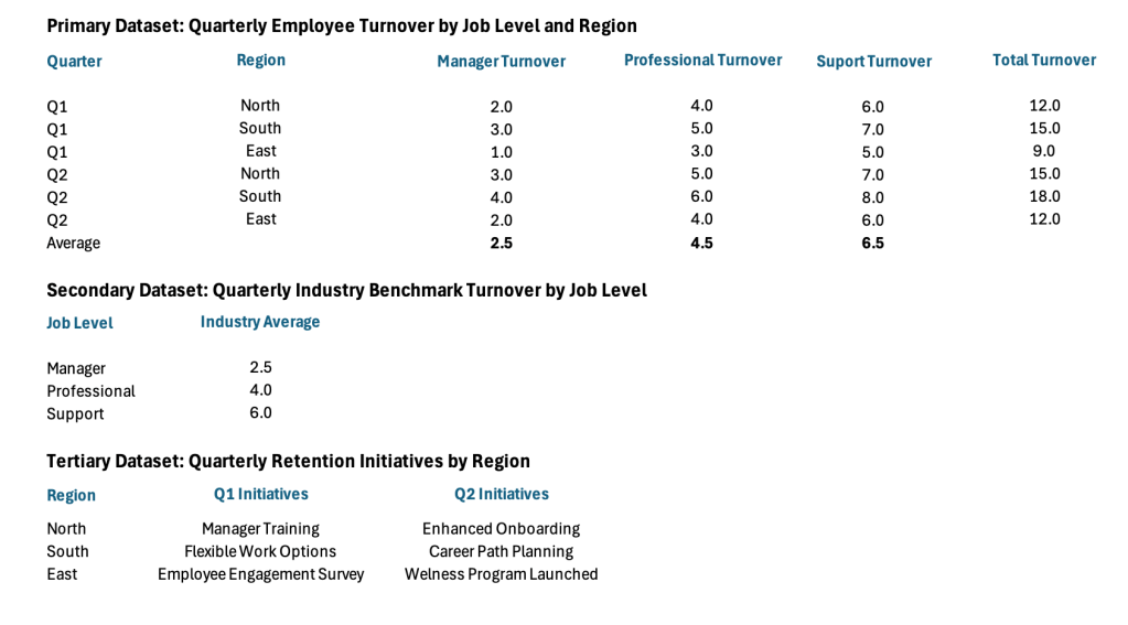
Data Set
What Chart to use?
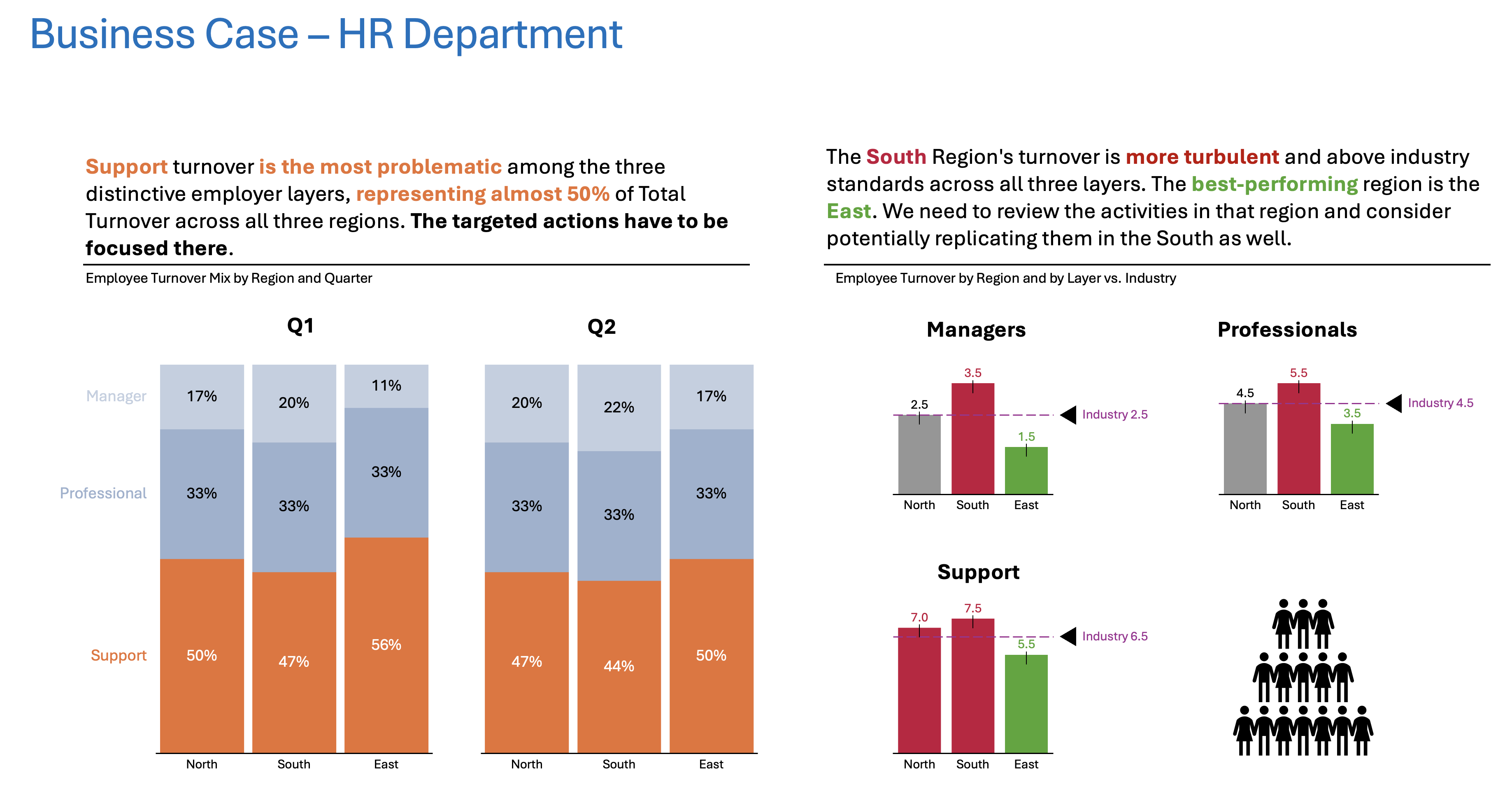
Whenever we have words like “compare” or “composition” in the message, it usually indicates a Component Comparison. I suggest the next approach. This approach compares HR Turnover by Job Level and Region across Quarters. It also compares them to the Industry Average.
What questions do we want to have an answer for?
- What layer has the most turnover?
- What layer and region is above Industry standard?
- Do we see any pattern emerging?
And so with that in mind, we can come up with something like this:
Resolution
The Component Compare Stacked Column Chart shows that Support staff turnover is consistently the most significant contributor to overall turnover. This trend is clear across all regions. The Column Chart (Item Compare) shows that the South region has the highest total turnover. Manager and professional turnover rates are close to or below industry averages. Retention initiatives are in place, but their full impact has yet to be realized.
Call to Action for the Leadership:
- Focus on targeted retention strategies for support staff across all regions, with a particular emphasis on the South.
- Review and expand proven retention initiatives (like flexible work options and wellness programs) to all job levels and regions.
- Track turnover trends quarterly using this chart to assess the effectiveness of interventions and adjust strategies as needed.
Summary
I hope this example provides you with some more straightforward guidelines on Component Comparison from day-to-day life. I did not explain all the small tricks on purpose. That explanation will probably come later on. For now, the important thing was to give you a simple walkthrough from task to outcome.
For a free downloadable resource, click the Chart Decision Tree and Compare Visual Guide.

Leave a comment