
The Ethics of Data Storytelling: Why It Matters and How to Get It Right
I believe it is expected that when it comes to data storytelling, we all want to present ourselves well. We want our reports to impress, our presentations to persuade, and our insights to stand out. But in the rush to make an impact, it’s easy to fall into ethical traps. Today, let’s discuss why ethics matter in data storytelling. We will explore ways to avoid the most common mistakes. We will also discuss how to build trust with your audience. This applies whether you’re presenting to your team, your boss, or your board.
So what’s so important about Ethics?

At its core, data storytelling is about using data to inform, persuade, and drive action. But with great power comes great responsibility. If you cherry-pick numbers, manipulate visuals, or ignore inconvenient truths, you might get short-term applause—but you’ll lose long-term trust. Ethical data storytelling means being honest, transparent, and fair, even when the results aren’t what you hoped for.
Imagine this
You’re presenting quarterly results to your leadership team. The numbers aren’t great — revenue is down, and customer complaints are up. You could focus solely on the few positive metrics and overlook the bad news. But what happens next time, when the truth comes out? Trust is hard to earn and easy to lose.
Common Traps in Data Storytelling
- Cherry picking data: Only showing the data that supports your argument and ignoring the rest. For example, highlighting a spike in sales after a campaign but ignoring a long-term decline.
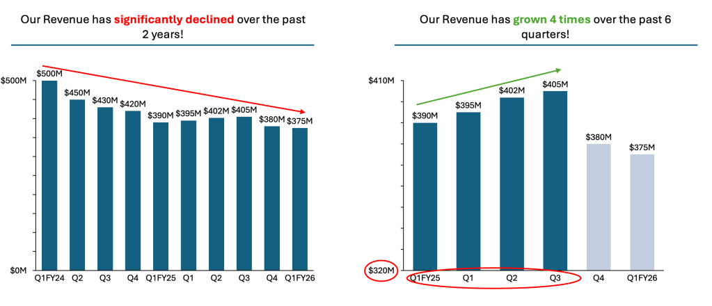
- Misleading visuals: Using charts with skewed axes or selective timeframes to exaggerate trends. A classic example is a bar chart that doesn’t start at zero, making small changes look dramatic.
- Ignoring Context: Presenting data without explaining how it was collected. It also does not explain its limitations. For example, sharing survey results without mentioning the small sample size can be misleading. Another issue is the potential bias in the responses.
Practical Examples: What Works and What Doesn’t
Bad Example:
A marketing team presents last month’s campaign results. They use a bar chart with a narrow y-axis. They choose selective periods to show some decent growth. This makes it appear to be a huge win. The team doesn’t mention that customer satisfaction dropped during the same period. The result? Leadership is misled, and future decisions are based on incomplete information. The left chart provides the full context, while the right chart displays only selected data with truncated axes.
Good Example:
A sales manager shares annual performance data. She includes all key metrics—even the ones that aren’t flattering. She explains the context: “Our Q3 dip was due to supply chain issues, and we’re working on solutions.” She uses clear, honest visuals and invites questions. The result? The team trusts her, and everyone is aligned on next steps.
The Ethics of Data Storytelling: Practical Tips and Tricks for Finance Professionals
In the world of finance, data is everywhere—but its actual value comes from how you tell its story. With great power comes great responsibility, and nowhere is this truer than in financial data storytelling. To earn trust, make informed decisions, and avoid costly mistakes, I believe mastering ethical storytelling is crucial.
Here are some practical tips and tricks I’ve picked up along the way. They are specifically for finance teams like ours. These tips are accompanied by inspiring quotes to guide us.

👉🏻 Be Transparent About Your Methods. Be Open About Your Data Sources
Tip: Always explain how data was collected, what assumptions you made, and any limitations. If you adjusted for outliers or seasonality, say so. If your sample size is small, mention it.
Trick: Create a “Data sourcing” slide or appendix in your presentations. This builds credibility and invites questions, reinforcing a culture of openness.
“The most powerful person in the room is the one with the least to hide.”
👉🏻 Show the Full Picture—Good and Bad
Tip: Don’t cherry-pick data. Present all relevant metrics, even if some tell a less flattering story. If revenue is up but customer acquisition costs have spiked, highlight both.
Trick: Use a “CONTEXT” approach in your dashboards. This approach shows KPIs for growth, profitability, risk, and customer satisfaction side by side.
“Honesty is the first chapter in the book of wisdom.”
👉🏻 Use Visuals Honestly
Tip: Avoid charts that mislead, such as those with truncated axes or selective timeframes. Always start your bar charts at zero and use consistent scales.
Trick: Double-check your visuals with a colleague before sharing. If someone without a finance background can misunderstand the chart, simplify it.
“It’s easy to lie with statistics. It’s hard to tell the truth without statistics.”
👉🏻 Challenge Your Own Biases
Tip: Ask yourself: Am I presenting this data fairly? Am I overlooking any important information? Involve others in your analysis to get different perspectives.
Trick: Establish a “data ethics review” step in your workflow. A peer should review your analysis and storytelling before you share it.
“The eye sees only what the mind is prepared to comprehend.”
Summary
Ethical data storytelling isn’t just about following rules—it’s about building trust, credibility, and long-term success. When your audience knows you’re honest and transparent, they’re more to believe your insights and act on your recommendations. In the corporate world, where decisions can have significant consequences, ethical storytelling is a competitive advantage.
So next time you’re preparing a data story, ask yourself: Am I being honest? Am I being fair? Am I building trust? If the answer is yes, you’re on the right track
For a free downloadable resource, click the Chart Decision Tree and Compare Visual Guide.

Leave a comment