
Back to Storytelling with Charts
We have already discussed some basic principles of Data Storytelling. We understand the right Compares. We also select the correct chart based on keywords for your messaging. I have also introduced you to the SCR framework.
Now is the time to put into action everything we have learned (basic concepts).
Let’s examine the following example from a fictional company.
The Credit and Collections Department needs help with DSO and Collections Performance

Situation
The Credit and Collections department at a large B2B services company manages accounts receivable. It also works to reduce overdue payments. Leadership is concerned about increasing Days Sales Outstanding (DSO). Inconsistent collection rates are also a worry. These issues are impacting cash flow and financial planning. The department needs to present a clear, data-driven analysis to identify trends, diagnose issues, and recommend actionable steps.
Complication
Traditional monthly reports show static figures for DSO, overdue amounts, and collection rates. However, they do not show how these metrics change over time. They also fail to show how these metrics are related to one another. Leadership often struggles to find trends, compare performance across customer segments, or connect changes in processes to outcomes. This lack of visibility makes it challenging to distribute resources, set targets, or justify investments in process improvements.
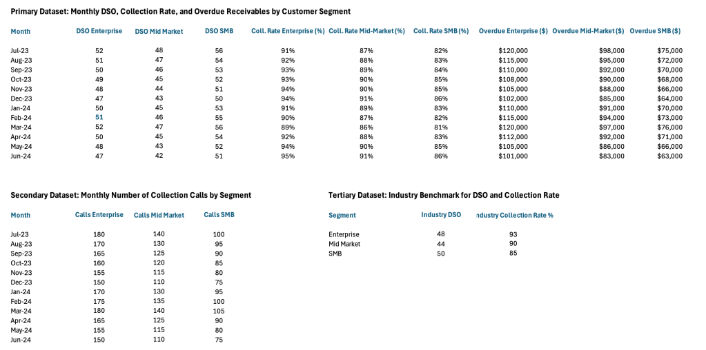
Data Set
What Chart to use?
Whenever we have words like “compare over time” or “trend” in the message, it usually indicates a Time Series Comparison. I suggest the following approach. We need to show the Collection Rates, DSO and other KPIs over time, so that we can spot trends. It also compares them to the Industry Average.
What questions do we want to have an answer for?
- Are our KPIs better or worse than the Industry?
- Is our Collection Rate and DSO improving overtime?
- Do the amount of Collection Calls impact the Outstanding Balances?
And so with that in mind, we can come up with something like this – one view for each Project:


Resolution
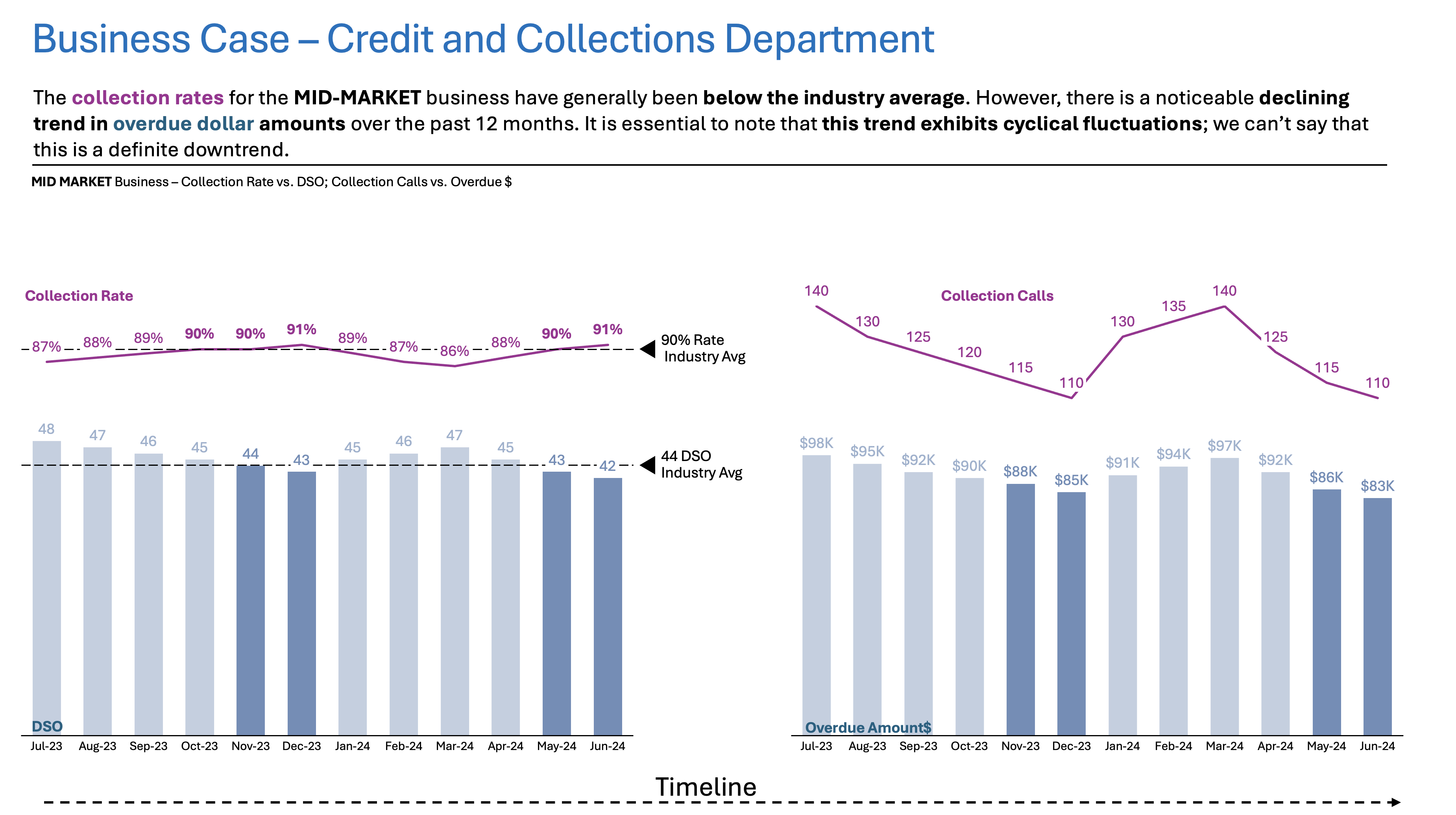
The Time Series Compare chart reveals improvements in DSO and overdue amounts for the Enterprise and Mid-Market segments. However, the SMB (Small and Medium Business) segment continues to lag behind industry benchmarks. Periods of increased collection activity correlate with temporary improvements, but sustained progress is limited for SMBs.
Call to Action for the Leadership:
- Focus on targeted Collection initiatives for SMB Segment
- Consider reallocating resources and setting monthly review checkpoints.
Summary
I hope this example provides you with some more straightforward guidelines on Time Series Comparison from day-to-day life. For now, the important thing is to give you a simple walkthrough from task to outcome.
For a free downloadable resource, click the Chart Decision Tree and Compare Visual Guide.

Leave a comment