
7 Essential Elements for an Impactful Data Storytelling Slide
Storytelling with data is more than just placing numbers on a slide. It’s about weaving those numbers into a compelling narrative. This narrative persuades, informs, and inspires your audience. Crafting a perfect storytelling slide isn’t just about aesthetics—it’s about strategic communication, deliberate design, and clarity of message. Here are six critical points you should always include on your data storytelling slides, and why they matter.
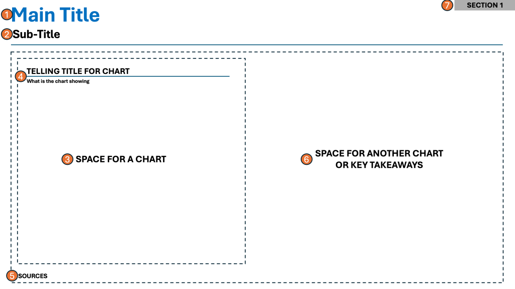
1. Main Headline That Tells the Story
The main headline is arguably the most important element on your slide. It’s not just a title; it’s your narrative’s thesis in a single, bold sentence. This headline needs to immediately communicate the key insight or takeaway, setting the stage for your audience. When your headline tells the story, it instantly frames your data. It focuses attention. It ensures everyone knows what to look for next.
👉🏻 Why it’s important:
A clear, storytelling headline prevents misinterpretation and confusion. It anchors your slide’s focus—people will recall headlines long after they’ve forgotten the numbers.
2. Sub-headline That Expands on the Story
A sub-headline sits just below the main headline and acts as a supporting actor. It provides necessary context or elaborates on the headline’s claim, such as by clarifying the metric, time frame, or impact. This helps the audience quickly grasp the scope and significance of your point.
👉🏻 Why it’s important:
A strong sub-headline answers potential questions before they arise. It deepens your story, making your narrative both accessible and credible.
3. Space for a Chart
Visuals are the heart of data storytelling. Allocate adequate space for a chart. This way, you transform raw numbers into visual stories. These can be a bar graph, line chart, or infographic. Effective charts help break down complex information and uncover patterns that words alone can’t convey.
👉🏻 Why it’s important:
Charts aid comprehension, especially for visual learners. They make trends and relationships immediately visible and memorable.
4. Telling Headline for the Chart
Every chart should have its own telling headline. It should not be a generic label. The headline must explain what the viewer should notice. This headline cues your audience to observe the chart’s story, not just its data.
👉🏻 Why it’s important:
A telling headline turns a static chart into a narrative instrument. It ensures viewers draw the intended conclusions and prevents ambiguity.
5. Sources for Your Data
Always include sources directly on the slide. Crediting your data not only builds trust but also enables follow-up analysis and transparency, critical for any informed decision-making.
👉🏻 Why it’s important:
Clear sourcing establishes your authority and mitigates skepticism. It lets the audience know that your insights are grounded in reliable facts, rather than assumptions or opinions.
6. Key Takeaways
End every storytelling slide with key takeaways. Include a short list or bullet points summarizing the most important conclusions or recommended actions. This encapsulates the value of your story and makes next steps obvious.
👉🏻 Why it’s important:
Key takeaways reinforce retention. They drive action. They also create a concise summary for those who view your materials later.
7. Optional – Section Header
This is valid for larger decks/presentations where there are multiple nested topics. Each theme is different. When you are going through a lot of slides, ground your audience. Let them know what “theme” they are currently viewing.
👉🏻 Why it’s important:
It clears up confusion about what topic is being discussed. It also sets the entire audience’s attention on the current theme.
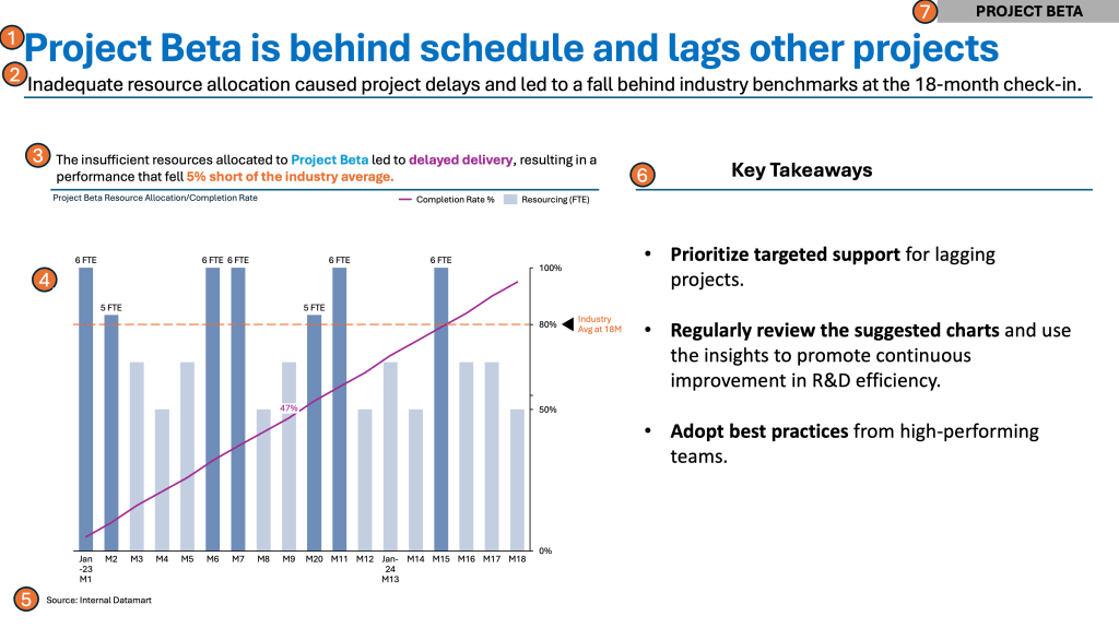
Practical Examples from the Corporate World
Something around Projects and Completion Rates…
Summary
A successful data storytelling slide includes several key elements. It has a main headline that tells the story. There is a sub-headline to add context. The slide requires prominent space for a chart to visualize the data effectively. A telling chart headline guides the viewer. Clear data sources are necessary for credibility. Key takeaways should be easily digestible to drive action.
Nail each of these elements to provide a coherent, memorable narrative that wins attention and confidence. This structured approach not only improves understanding and recall but also drives your audience to take meaningful actions. By meticulously crafting each point, you transform ordinary data slides. These slides become powerful storytelling tools. They resonate long after your presentation ends.
For a free downloadable resource, click the Chart Decision Tree and Compare Visual Guide.

Leave a comment