
What to expect?
Let’s examine a practical application of basic Data Visualization concepts and Data Storytelling. We will look at one existing publicly available chart on the internet, preferably each week. You can take these lessons to your world of Data Storytelling. Apply them at the office or home when persuading your spouse about spending habits :-).
Data Storytelling Example
Our example will be a chart from Canary Media blog. It features a topic on Energy generation for the EU. The chart is accompanied by corresponding charts.
Here, we are not very interested in the topic itself. We focus more on the visual and the story it wants to tell. Note that there is a difference between reading a whole article to understand context. Presenting the idea in front of an audience is a different skill. A full article sometimes explains what you can see on the chart. It is another challenge when you have just you and your slide in front of an audience. The way you show your points will differ. The important thing is: Data Storytelling is everywhere.

The setting
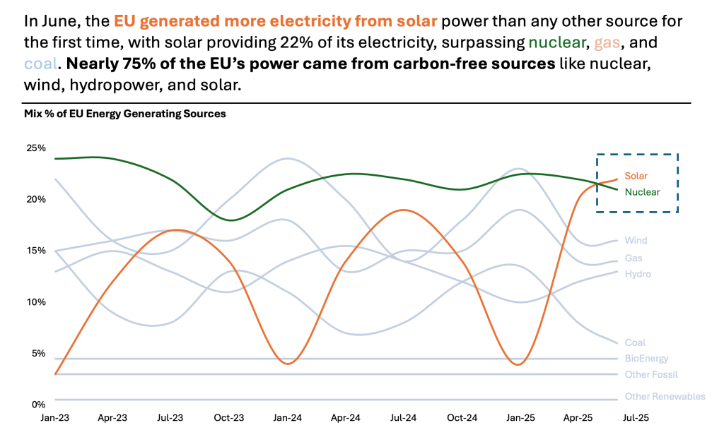
This article talks about the different sources of Energy for EU in the past few years. The main point the author wanted to say was that Solar overtook everything else as the No. 1 source for EU energy. This happened for the first time in June 2025. The author uses a Line Chart. The chart displays the data. But the chart itself is too bare and does not align with Tufte’s data-to-ink ratio. Thus, I would suggest the following adjustments to enhance the message and incorporate more visual elements. Practice these Data Visualization skills to become fluent and progress faster in your career.
Further enhancements to the chart to improve the Data storytelling should be:
- Isolate the “story” – Solar energy has become the number one source in the EU. This is the main point of the article. This achievement marks its first time ever reaching this position. It is not visible in the original chart. Here, I have isolated the Solar and Nuclear to clearly show the Solar’s trajectory to the top. All of the rest of sources I have kept grey as they are there just for reference.
- Declutter the X axis – You don’t have to write the entire “2023” year. If it is clear that it is a “year” label, abbreviate it.
- Add a Telling Title – When you read the title, you should immediately grasp the message. This allows you to easily follow along in the article if you are more interested in the details.
- Add Coloring to the Headlines, too, so that you can associate the verbal narrative with the visual.
An alternative result after application of a few concepts of Data Visualization:
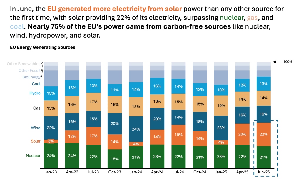
Another option is 100% Stacked Column Chart.
It shows the composition of 100%. We are referring to Component Compare here. Here, I have decided to add a little more color to other sources to show their trend too:
Summary
Review the simple concepts for clear Data Storytelling. Keep practicing. You can do wonders—not only for the Visualizations but also for your Data Storytelling and professional career. There are multiple views of the same story; you need to select the one that best suits you.
If there is a chart you wish me to review, just let me know. I can give some thoughts on revision. Please contact me via the contact form.
You can use the Chart of the Week tag to see other examples.
You can download the free Chart Decision Tree and Visual Compare Guide.

Leave a comment