What to expect?
Let’s examine a practical application of basic Data Visualization concepts and Data Storytelling. We will look at one existing publicly available chart on the internet, preferably each week. You can take these lessons to your world of Data Storytelling. Apply them at the office or home when persuading your spouse about spending habits :-).
Data Storytelling Example
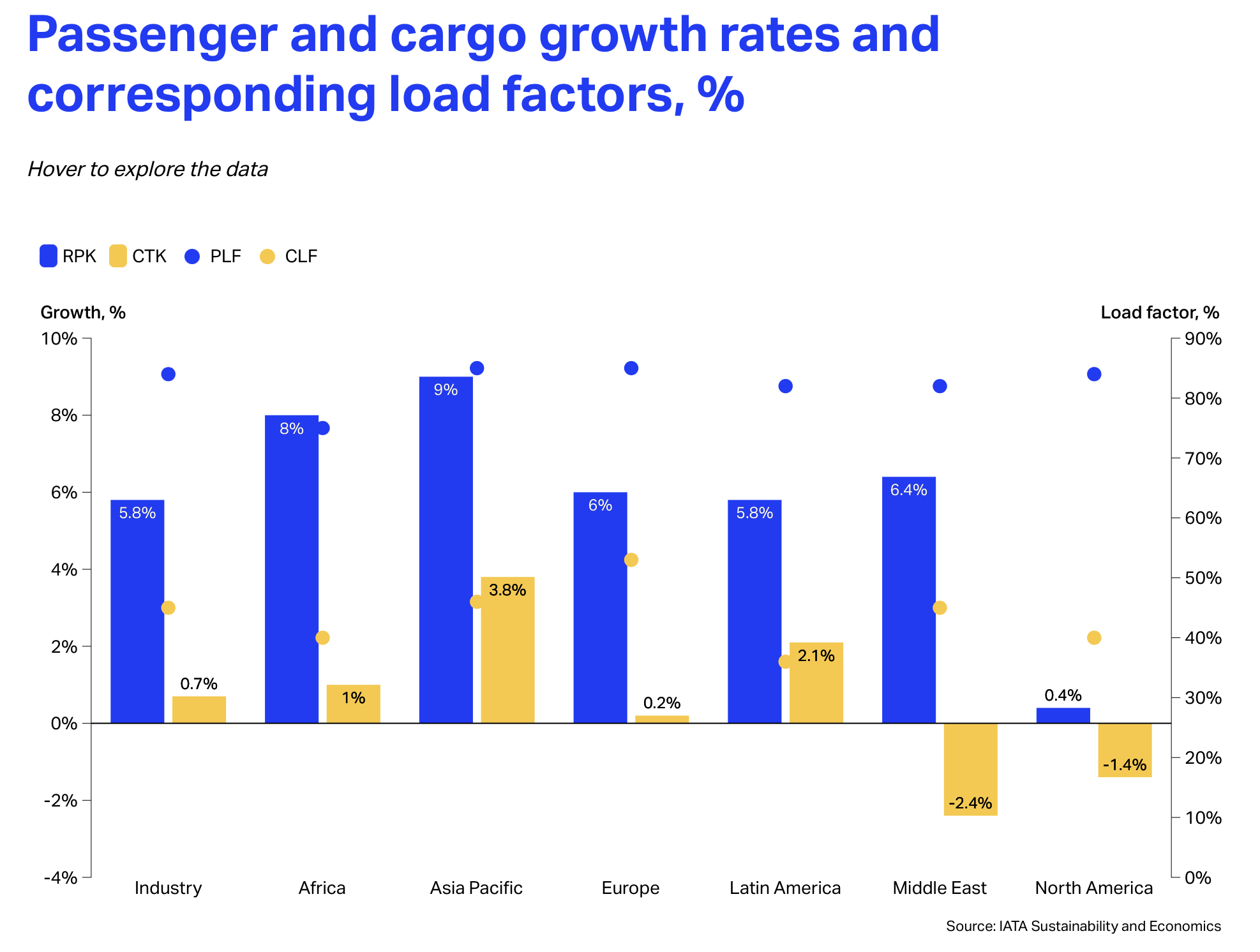
Our example will be a chart from IATA blog. It features a topic on Air Travel Projections for 2025, covering both passenger and cargo traffic. A corresponding chart is provided below to accompany the article.
Here, we are not very interested in the topic itself. We focus more on the visual and the story it wants to tell. Note that there is a difference between reading a whole article to understand context. Presenting the idea in front of an audience is a different skill. A full article sometimes explains what you can see on the chart. It is another challenge when you have just you and your slide in front of an audience. The way you show your points will differ. The important thing is: Data Storytelling is everywhere.
The setting
This article is talking about the potential trends by Region. It has few flaws, omitting Africa from explanations while the region is being No. 2. The author’s main point is to compare Regions and their expected annual growth and load factors. This is for the year 2025. The author uses a blend of a 100% Grouped Column Chart and a Line Chart (transformed to dots), where the lines have been removed and only the tick marks remain. The chart displays the data. But the chart itself has too many elements and does not align with Tufte’s data-to-ink ratio. Thus, I would suggest the following adjustments to enhance the message and incorporate more visual elements. Practice these Data Visualization skills to become fluent and progress faster in your career.
Further enhancements to the chart to improve the Data storytelling should be:
- Use Bar Chart – This type of chart is suitable for “Ranking”. It displays data sets from High to Low or in reverse order. And it creates more space for long text labels when you have one.
- Isolate the “story” with vivid Colors. Keep the regions in Blue. The Industry can go Purple as it is used as a benchmark in this context. Use Green and Red indicating that something is above and below. You can use the colors across the chart and the Headline to visualize the story as well.
- Declutter the Y axis – You don’t need the Y axis if you put numbers at the top of the bars.
- Add Labels where needed – I suggest moving the Legend over the first bar. This placement helps people easily understand what the numbers refer to. For better visualization, use the same colors as the bars.
- Add a Telling Title – When you read the title, you should immediately grasp the message. This allows you to easily follow along in the article if you are more interested in the details.
- Add Coloring to the Headlines, too, so that you can associate the verbal narrative with the visual.
An alternative result after application of a few concepts of Data Visualization:

Summary
Review the simple concepts for clear Data Storytelling. Keep practicing. You can do wonders—not only for the Visualizations but also for your Data Storytelling and professional career. There are multiple views of the same story; you need to select the one that best suits you.
If there is a chart you wish me to review, just let me know. I can give some thoughts on revision. Please contact me via the contact form.
You can use the Chart of the Week tag to see other examples.
You can download the free Chart Decision Tree and Visual Compare Guide.

Leave a comment