What to expect?
Let’s examine a practical application of basic Data Visualization concepts and Data Storytelling. We will look at one existing publicly available chart on the internet, preferably each week. You can take these lessons to your world of Data Storytelling. Apply them at the office or home when persuading your spouse about spending habits :-).
Data Storytelling Example
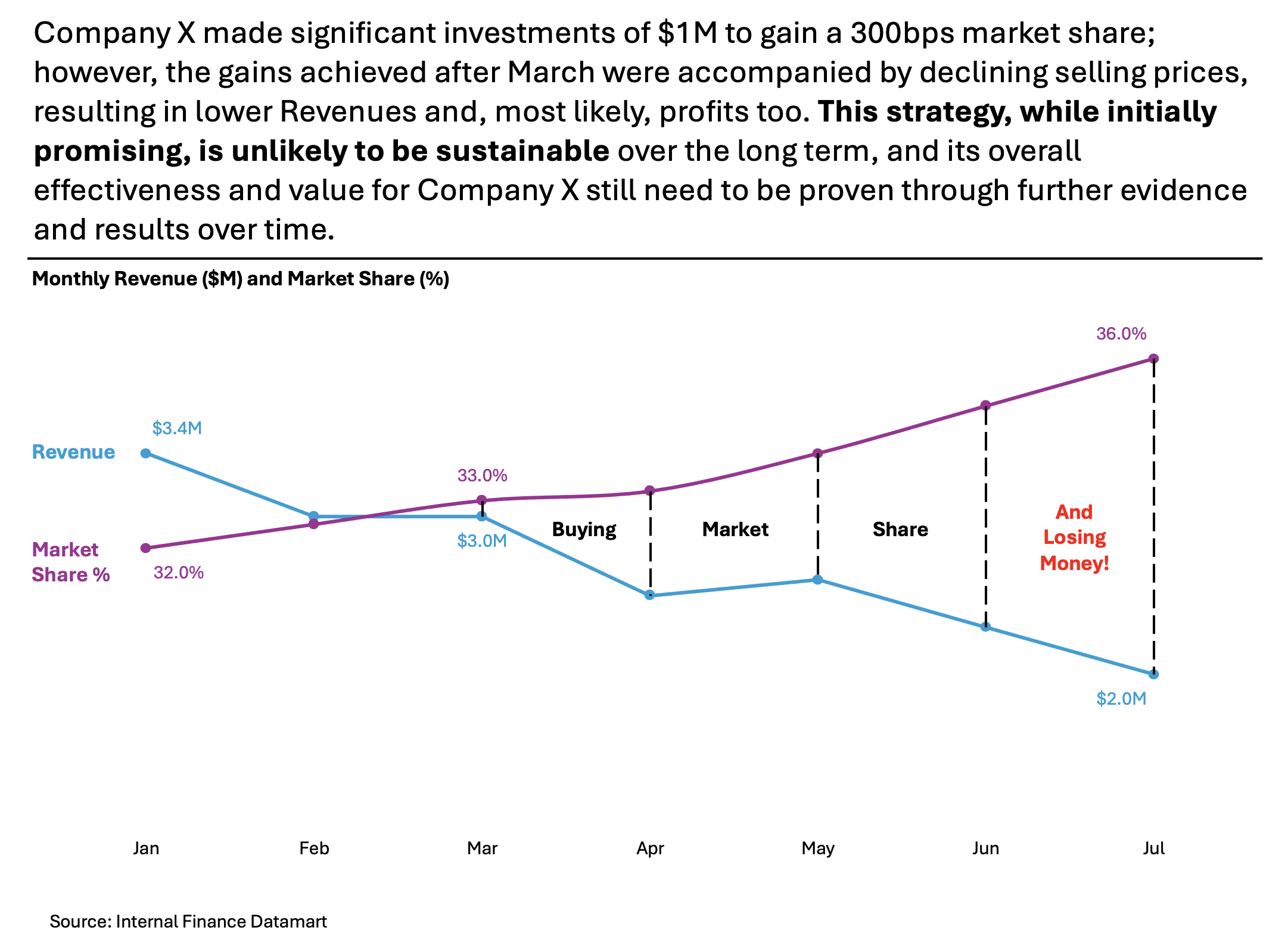
Our example will be a chart that resembles graphics from the Wall Street Journal. I don’t have the direct link to the article, but I have a snippet from another site. A corresponding chart is provided below to accompany the article.
Here, we are not very interested in the topic itself. We focus more on the visual and the story it wants to tell. Note that there is a difference between reading a whole article to understand context. Presenting the idea in front of an audience is a different skill. A full article sometimes explains what you can see on the chart. It is another challenge when you have just you and your slide in front of an audience. The way you show your points will differ. The important thing is: Data Storytelling is everywhere.

The setting
This chart shows the Company’s X Revenue and its Market Share evolution over time. The author’s main point is to probably show that “buying Market Share is very costly”. The author uses a Bar Chart and Line Chart. The chart displays the data. But the chart itself has too many elements and does not align with Tufte’s data-to-ink ratio. Thus, I would suggest the following adjustments to enhance the message and incorporate more visual elements. Practice these Data Visualization skills to become fluent and progress faster in your career.
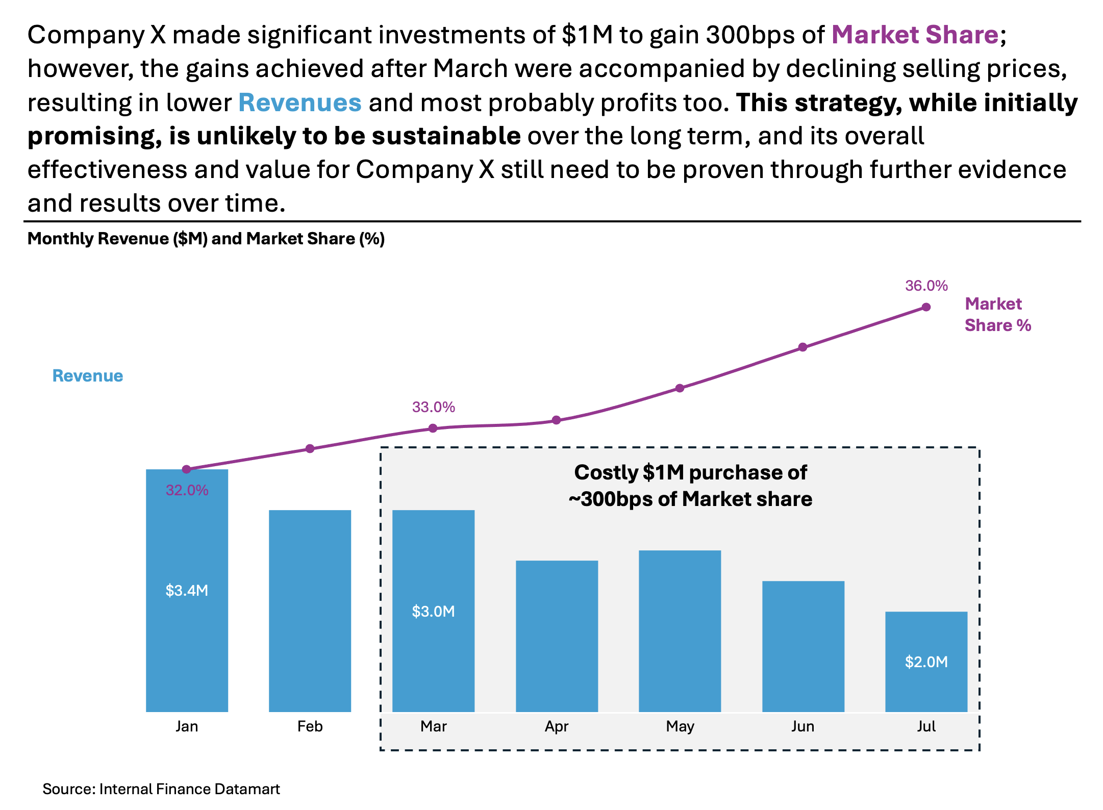
Further enhancements to the chart to improve the Data storytelling should be:
- Isolate the “story” with vivid Colors – I would clearly separate the color for Revenue vs. Market Share % so that you can quickly spot the respective KPIs.
- Declutter the Y axis – You can remove both Y axes because they are not necessary to tell the story. If you put the first and last % or $ on the chart – you are pointing the audience’s attention to the “direction” of the line to indicate if the growth projections got better or worse over time; remove the Gridlines – if you are showing some reference numbers in the chart – you don’t need them and make a space instead for a “Snow-white”
- Add Labels where needed – I suggest moving the Legend to the left side. This placement helps people easily understand what the numbers refer to. For better visualization, use the same colors as the bars. I would also add pointers and a “mini story” that illustrates how, beyond March, the Company is losing money.
- Add a Telling Title – When you read the title, you should immediately grasp the message. This allows you to easily follow along in the article if you are more interested in the details.
- Add Coloring to the Headlines, too, so that you can associate the verbal narrative with the visual.
An alternative result after application of a few concepts of Data Visualization:
Another alternative could be the following one below – I have kept the Revenue as Bar Chart, but making the story clearer:
Summary
Review the simple concepts for clear Data Storytelling. Keep practicing. You can do wonders—not only for the Visualizations but also for your Data Storytelling and professional career. There are multiple views of the same story; you need to select the one that best suits you.
If there is a chart you wish me to review, just let me know. I can give some thoughts on revision. Please contact me via the contact form.
You can use the Chart of the Week tag to see other examples.
You can download the free Chart Decision Tree and Visual Compare Guide.

Leave a comment