What to expect?
Let’s examine a practical application of basic Data Visualization concepts and Data Storytelling. We will look at one existing publicly available chart on the internet, preferably each week. You can take these lessons to your world of Data Storytelling. Apply them at the office or home when persuading your spouse about spending habits :-).
Data Storytelling Example
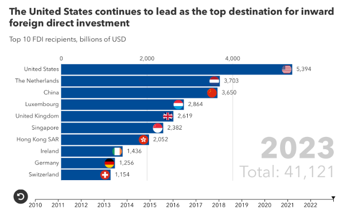
Our example will be a chart from IMF blog. It is an article discussing where the Foreign Direct Investment went over time (it’s done through a racing chart). A corresponding chart is provided below to accompany the article.
Here, we are not very interested in the topic itself. We focus more on the visual and the story it wants to tell. Note that there is a difference between reading a whole article to understand context. Presenting the idea in front of an audience is a different skill. A full article sometimes explains what you can see on the chart. It is another challenge when you have just you and your slide in front of an audience. The way you show your points will differ. The important thing is: Data Storytelling is everywhere.
The setting
Just to explain, this article has an embedded “racing chart”. It is a visual support that shows a story over a long time. The positions of the Countries on the chart are changing as it plays forward. I did a snapshot in the year 2023. The chart itself shows the Countries ranked by the amount of Foreign Direct Investment $B flowing into them. Correctly, this chart is a Bar chart, because it is showing Ranking, which is Item Comparison. The chart displays the data. But if you use the chart in a presentation, you should eliminate a few elements. This is to align with Tufte’s data-to-ink ratio. Thus, I would suggest the following adjustments to enhance the message and incorporate more visual elements. Practice these Data Visualization skills to become fluent and progress faster in your career.
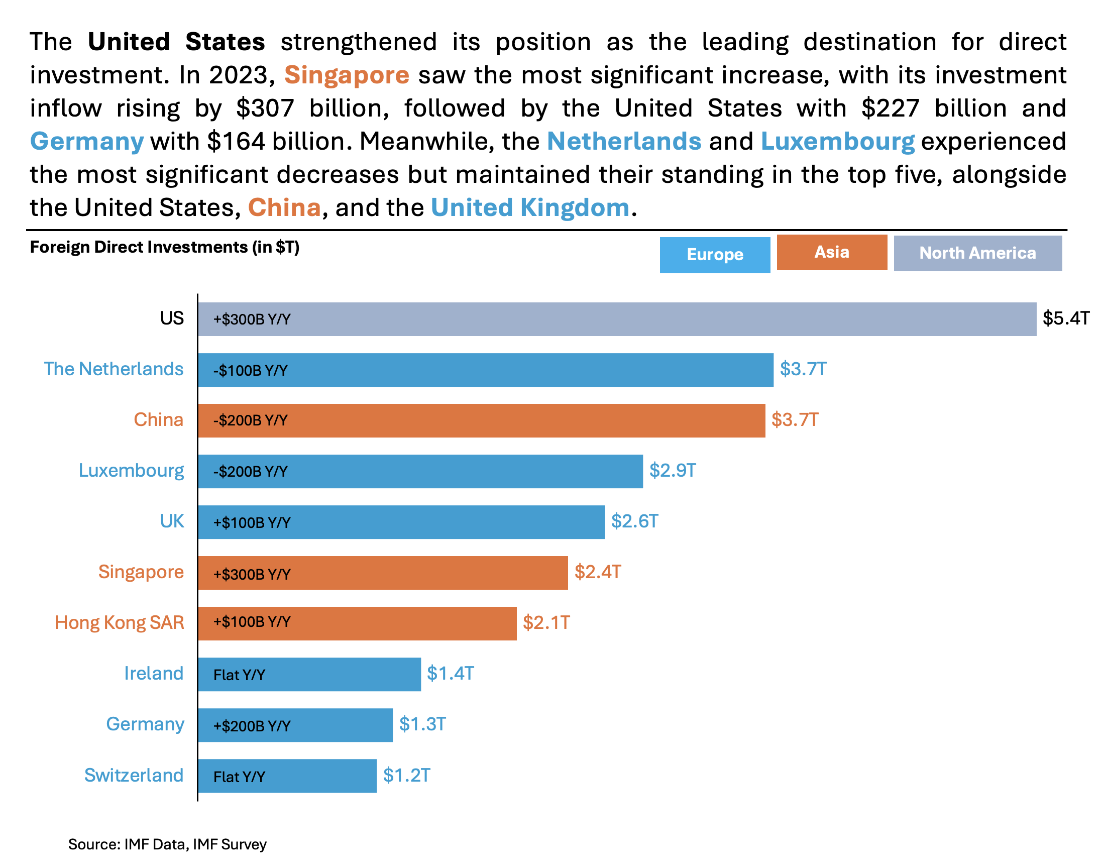
Further enhancements to the chart to improve the Data storytelling should be:
- Isolate the “story” with vivid Colors – I would clearly separate the color. This would distinguish Geographical regions to elevate the story. Adding respective labels in the top right of the chart.
- Declutter the X axis – You can remove both X axes (bottom, top), because they are not necessary to tell the story. Keep the background of the chart “white”.
- Add Labels where needed – I suggest adding a Y/Y label to understand which Country has improved the most in annual growth.
- Add a Telling Title – When you read the title, you should immediately grasp the message. This allows you to easily follow along in the article if you are more interested in the details.
- Add Coloring to the Headlines, too, so that you can associate the verbal narrative with the visual.
An alternative result after application of a few concepts of Data Visualization:
Summary
Review the simple concepts for clear Data Storytelling. Keep practicing. You can do wonders—not only for the Visualizations but also for your Data Storytelling and professional career. There are multiple views of the same story; you need to select the one that best suits you.
If there is a chart you wish me to review, just let me know. I can give some thoughts on revision. Please contact me via the contact form.
You can use the Chart of the Week tag to see other examples.
You can download the free Chart Decision Tree and Visual Compare Guide.

Leave a comment