
The Component Comparison and its different alternatives
As we discussed in the essential article on Component Comparison, it represents a situation. You need to show an item as a mix of two or more elements. The usual words used with it are: % of Total, Share of, Mix of, Component of, Includes X. You can find it in the world around you every day. Last week, we talked about the Sun Burst Chart. Today, we take a look at the Waterfall Chart.
Waterfall Charts: Bridging the unbridgeable – The Data Storytelling jewel


In the fast-paced corporate world, leaders ask for visual tools that unravel the “how” behind changing business metrics. The Waterfall Chart is a base pillar of executive presentations and boardroom dashboards. It fulfills this mission by bringing sequential change to life, step by step.
I’ve lost count of how many times I have used this chart in my presentations. It is an essential chart for telling the story from A to Z. By adding labels, annotations, splits of the bars, and many other interactive elements, it effectively enhances the narrative. And people understand it. It is like that waterfall in the image above, bridges one level to another with clarity and steps.
“We build too many walls and not enough bridges.”
Isaac Newton
The Waterfall Chart owes its rise to the world of strategic consulting. It was most famously popularized in the 1990s by McKinsey & Company. The chart shows how an initial value changes through a series of positive and negative adjustments. It quickly became a favorite among financial analysts and project leaders. Sometimes called a bridge or flying bricks chart, the waterfall chart transforms static tables of numbers into dynamic stories. Anyone can follow these intuitive stories.
Practical Examples from the Corporate World
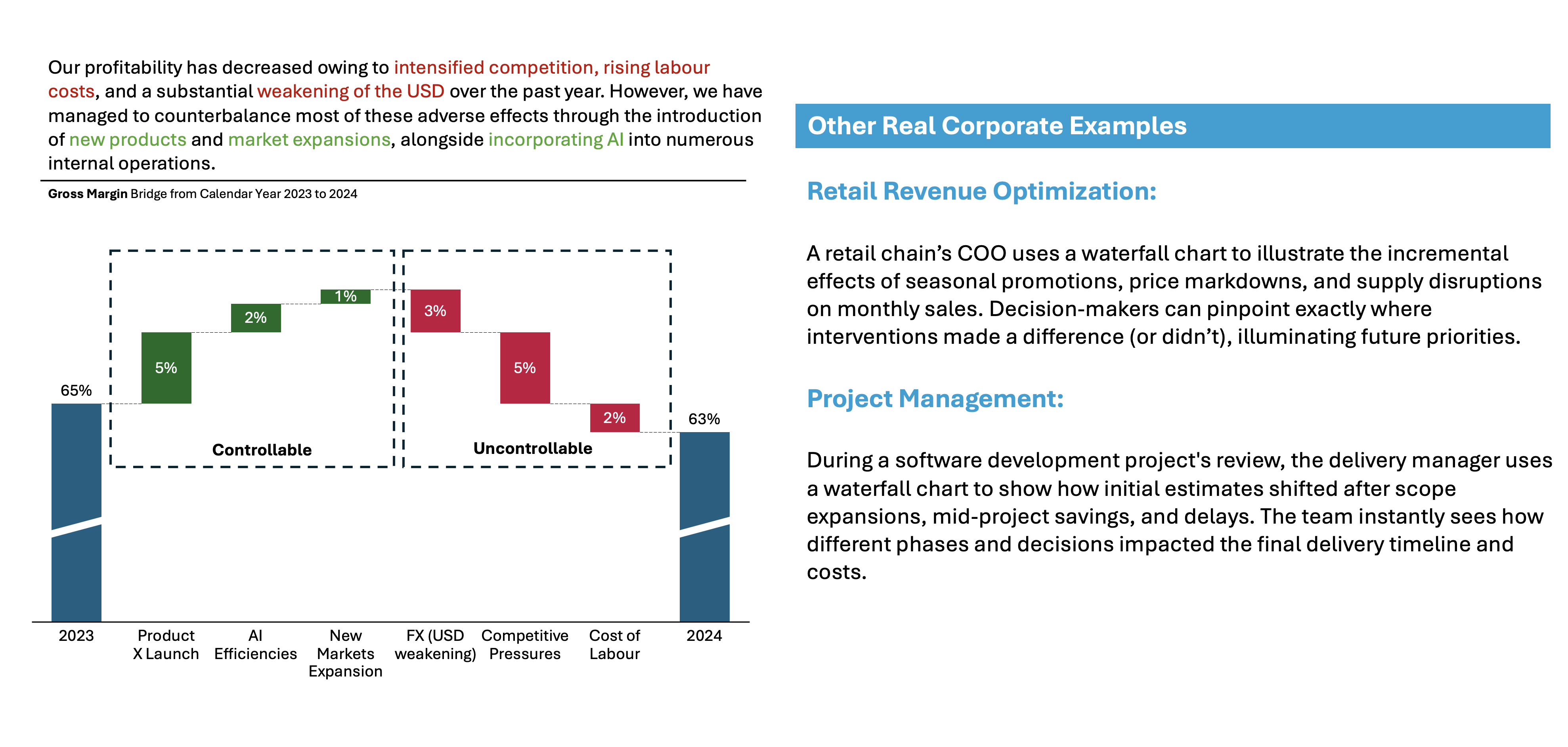
You can use this chart in various situations and roles. You don’t necessarily need to be a finance analyst. It’s for anyone who wants to explain their data for their own portfolio. This includes Marketing, Research, and Investors. It also includes Content Creators, Social Media Experts, and Supply Chain, etc.
Example:
Imagine a software company that is just presenting data on the Earnings call. They are trying to explain to analysts why their Gross Margin declined 200bps on a year-over-year basis. They know that they need to be very careful how they frame it. They must ensure that the audience precisely understands what they, the company, can control and what they can’t.
👉🏻 Advantages
- Clarity of Sequential Change: Shows how an opening value, like revenue or headcount, evolves as each gain or loss accumulates. This evolution makes the journey from start to finish crystal clear.
- Narrative Power: By tracking each stage, the waterfall chart reinforces a logical narrative. Whether it’s a sales campaign, budget period, or HR movement, this narrative flows left-to-right. This structure aligns with how audiences process stories.
- Highlights Drivers: Makes it easy to see which individual steps, departments, or factors had the greatest positive or negative impact. This guides focus for follow-up discussions.
- Quick Comprehension: Both executives and teams immediately grasp the net effect of many contributing factors versus a simple before/after view.
- Versatility: Widely used in finance, project management, HR, supply chain, and sales—anywhere cumulative gains and losses matter.
👉🏻 Disadvantages
- Comparability Issues: With no shared baseline, it can be hard to compare individual steps or gains/losses directly.
- Visual Clutter: Including too many steps or categories can make the chart confusing, undermining its storytelling impact.
- Risk of Oversimplifying: Waterfall charts can mask complex dependencies or parallel processes, reducing nuanced insights.
- Viewer Familiarity: Not everyone recognizes waterfall charts instantly; they may be mistaken for stacked columns without context.
- Limited Predictive Value: They mainly display historical change and are less useful for forecasting or handling multiple simultaneous scenarios.
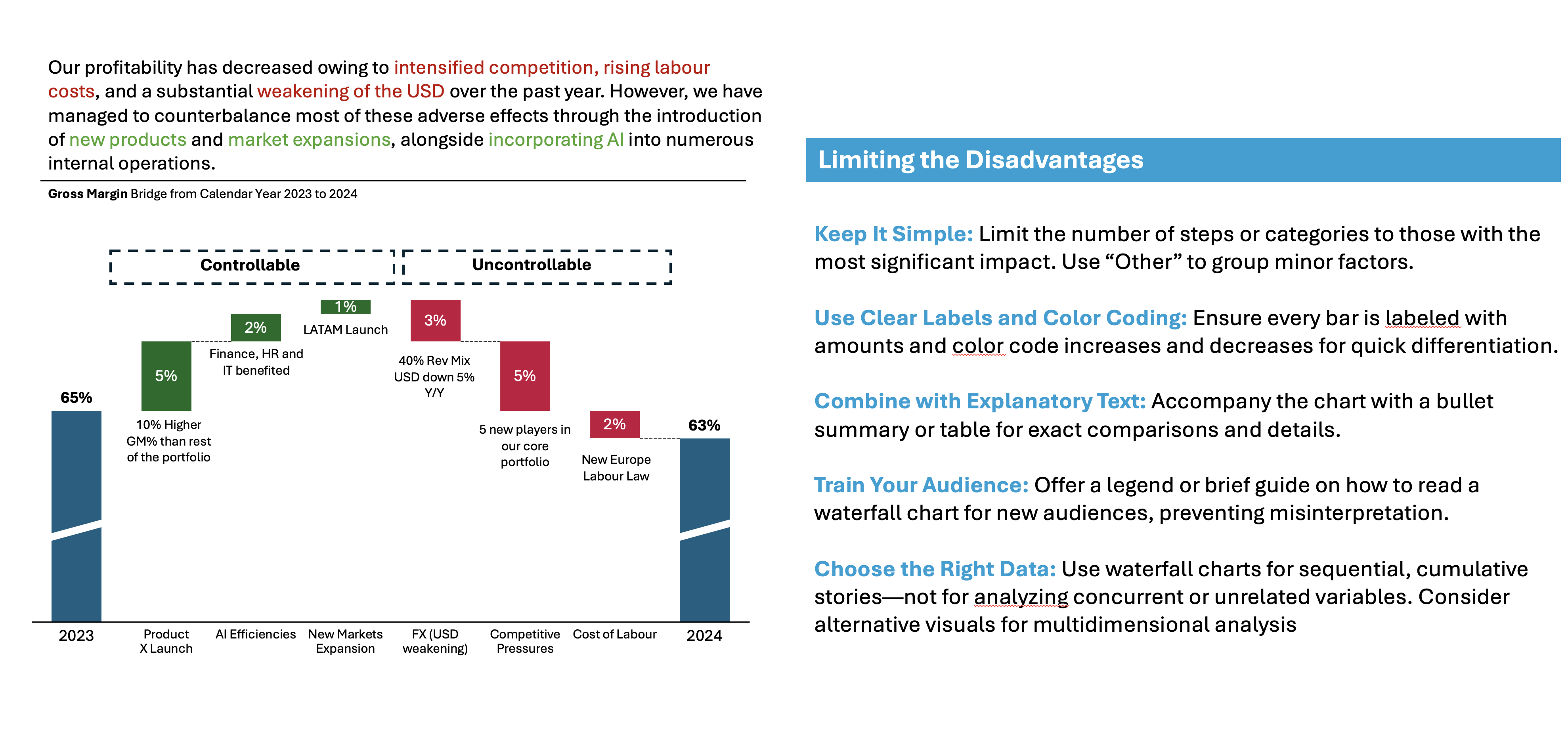
Practical Tips to Reduce the Disadvantages
There are always creative ways to help yourself avoid the pitfalls, depending again on the story you choose to tell. Not every piece of data is essential, and not everything needs to be visible or communicated. I have added some tips I’ve learned during my professional journey on the right side of the image below.
Are there other alternatives?
Of course, in the future post I am going to talk about:
- Various other visually appealing alternatives!
Visualizations and their use cases, we have already talked about:
- 100% Stacked Column Chart
- 100% Bar Chart
- Pie Chart
- Doughnut Chart
- Area Chart
- Mekko Chart
- Treemap Chart
- Sankey Chart
- Area Bump Chart
- Sun Burst Chart
Summary
Waterfall charts turn raw numbers into meaningful narratives. They reveal not just where you started and ended, but exactly how you got there. Their clarity and storytelling strength make them irreplaceable in finance, operations, and beyond. However, mastering their use means knowing when to simplify, annotate, and supplement for the best results.
Ready to drive better business discussions with clear, focused visual stories? Add waterfall charts to your next corporate report or dashboard—and help your audience see the journey, not just the destination.
For a free downloadable essential resources for your Data Storytelling journey, click here: Free Downloads
And of course, if you want to keep transforming your Data Storytelling skills, subscribe to regular updates to your inbox!

Leave a comment