
The Item Comparison and its different alternatives
As we discussed in the essential article on Item Comparison, you need to display many items that need to be shown in a certain ranking or order. The usual words used with it are: Rank, Better than, Less than, Best of, Larger than, More than, Less than...etc. . You can find it in the world around you every day.
Bar Charts: Not all the Bars are equal – depends on the situation where you use them!


The history of the bar chart can be traced back to the late 18th century. William Playfair, a Scottish engineer and political economist, is credited with inventing the modern bar chart in 1786. He used it in his “Commercial and Political Atlas” to visualize imports and exports of Scotland. This innovation revolutionized the way quantitative data could be communicated visually. Earlier, in the 14th century, French philosopher Nicole Oresme used proto-bar charts. He explored physical phenomena with them. Later, in the 1700s, Joseph Priestley published time-scaled bar charts for educational purposes.
I utilize various charts in my daily work. The top three are the Bar Chart, Column Chart, and Line Chart. These charts are highly versatile and essential tools for effectively conveying data stories. The Bar Chart is particularly useful for ranking performance, as it provides clear visibility of the results. However, it is important to exercise caution, as there are potential pitfalls that can lead to trivial mistakes.
“Pictures are infinitely more memorable than text.”
Unknown
Bar charts present data across discrete categories, allowing for easy comparison of values. Each rectangular bar displays its value via height or length. This makes differences highly visible. It is useful whether for sales data, performance scores, or budget breakdowns.
Practical Examples from the Corporate World
In corporate environments, bar charts are often the first choice for comparing items because they are:
- Suitable for presentations, dashboards, and executive summaries
- Instantly readable, even for non-technical audiences
- Excellent for side-by-side comparison of categories (products, regions, teams)
Example:
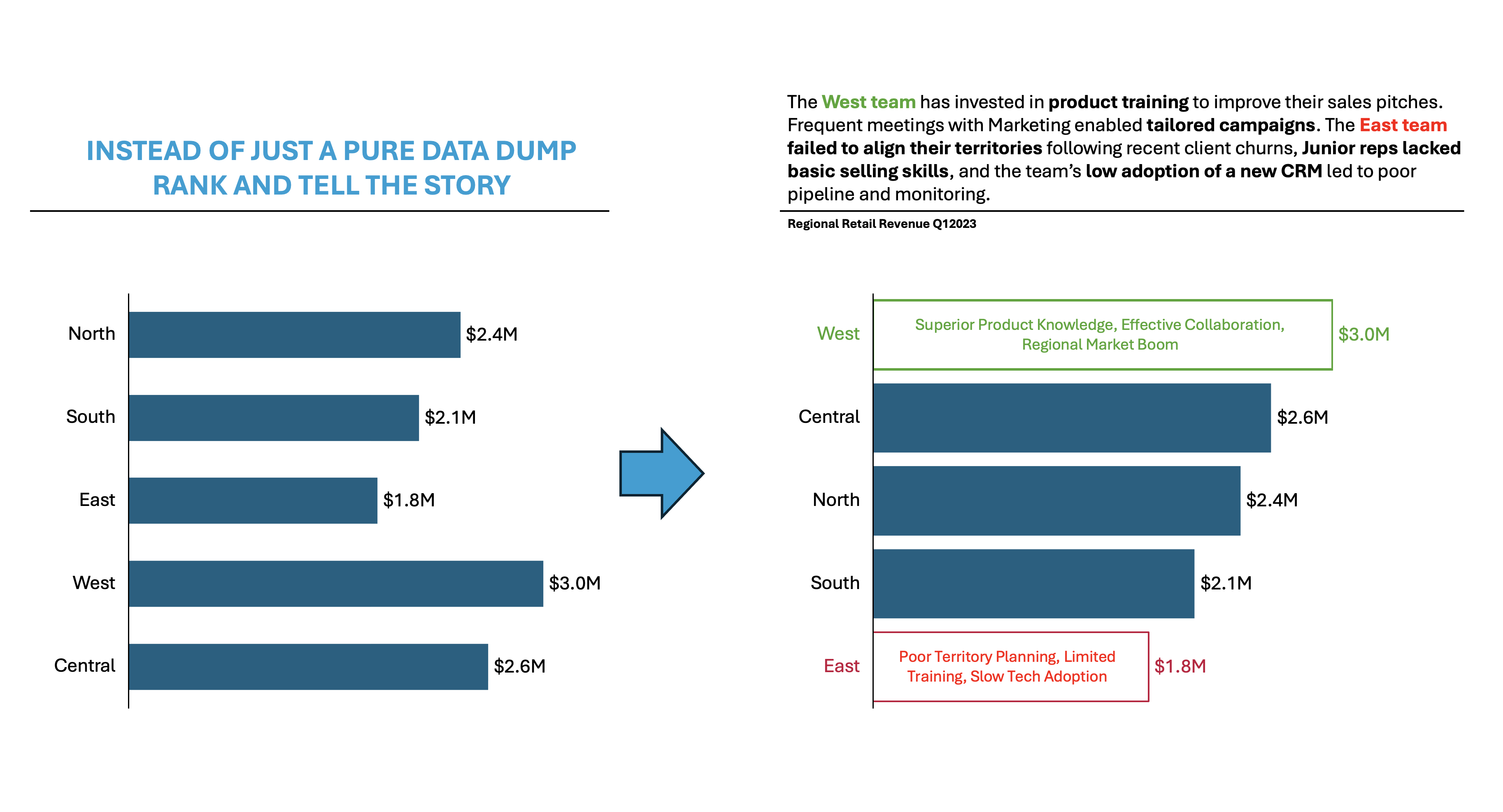
Imagine a retail technology company, “TechRetail Inc.,” with five regional sales teams: North, South, East, West, and Central. Leadership is reviewing Q3 sales to optimize resources, reward high performers, and address underperformance.
During the analysis, he has found out the following:
- West Team ($3.0M, Highest):
- Superior Product Knowledge: The team invested heavily in product training, leading to more persuasive sales pitches and the ability to answer client questions with authority.
- Regional Market Boom: West region experienced a surge in commercial real estate, resulting in higher demand for the company’s technology solutions.
- Effective Collaboration: Frequent meetings with marketing enabled tailored campaigns that resonated well with local businesses.
- East Team ($1.8M, Underperforming):
- Poor Territory Planning: Territories were not realigned after major client acquisitions, leading to uneven workload distribution.
- Limited Training: Junior reps lacked advanced negotiation skills, impacting results in competitive bids.
- Slow Adoption of Technology: East lagged in using new CRM tools, making pipeline management and reporting less effective.
👉🏻 Advantages
- Clarity and accessibility: Bar charts turn complex tables into intuitive visuals anyone can interpret at a glance.
- Versatility: They adapt to any domain: sales, finance, HR, marketing, logistics.
- Quick visual estimate: Viewers can rapidly gauge relative sizes and detect patterns.
- Handling large datasets: Summarize and simplify large volumes of data efficiently.
👉🏻 Disadvantages
- Risk of misrepresentation: Manipulating the y-axis or omitting the zero baseline can distort perception.
- Limited for complex relationships: Not suitable for time series, correlation, or progress tracking.
- Visual clutter: Too many bars or labels can make charts hard to read.
- Lack of nuance: Doesn’t display interrelationships, causes, or assumptions behind the numbers..
Practical Tips to Reduce the Disadvantages
There are always creative ways to help yourself avoid the pitfalls, depending again on the story you choose to tell. Not every piece of data is essential, and not everything needs to be visible or communicated. I have added some tips I’ve learned during my professional journey on the right side of the image below.

Are there other alternatives?
Of course, in the future post I am going to talk about:
- Various other visually appealing alternatives!
Visualizations and their use cases, we have already talked about in Component Compare:
- 100% Stacked Column Chart
- 100% Bar Chart
- Pie Chart
- Doughnut Chart
- Area Chart
- Mekko Chart
- Treemap Chart
- Sankey Chart
- Area Bump Chart
- Sun Burst Chart
Summary
Bar charts remain the preferred chart for comparing items. This preference is due to centuries of evolution. Bar charts offer unmatched simplicity and impact for corporate communication. Their strengths – clarity, versatility, and speed – empower executives and teams to make faster, smarter decisions. But success depends on mindful design: starting axes at zero, de-cluttering visuals, and limiting categories for maximum punch.
Ready to unlock actionable insights from your data? Next time you need to compare items, whether sales, teams, or budgets, choose a bar chart and follow these best practices. Transform your data into decisions: Make your next presentation not just informative, but truly influential.
For a free downloadable essential resources for your Data Storytelling journey, click here: Free Downloads
And of course, if you want to keep transforming your Data Storytelling skills, subscribe to regular updates to your inbox!

Leave a comment