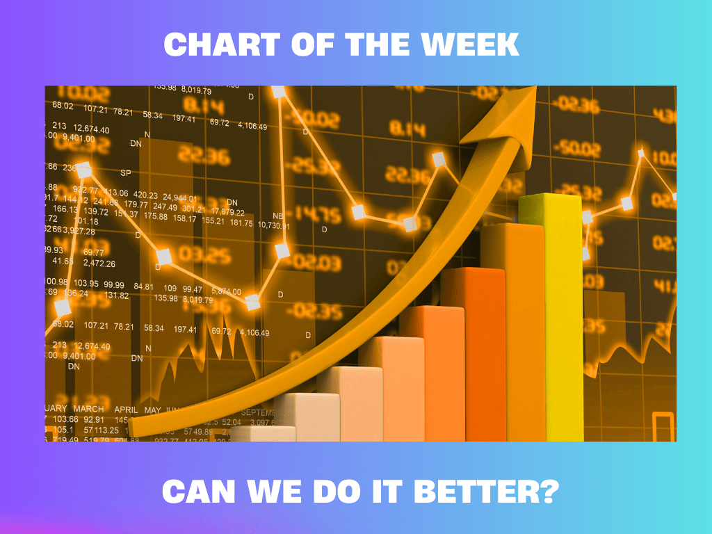
What to expect?
Let’s examine a practical application of basic Data Visualization concepts and Data Storytelling. We will look at one existing publicly available chart on the internet, preferably each week. You can take these lessons to your world of Data Storytelling. Apply them at the office or home when persuading your spouse about spending habits :-).
Data Storytelling Example
Our example will be a chart from BNY blog. It is an article explains if the Big Tech Valuations are too high or is there still room to grown. A corresponding chart is provided below to accompany the article.
Here, we are not very interested in the topic itself. We focus more on the visual and the story it wants to tell. Note that there is a difference between reading a whole article to understand context. Presenting the idea in front of an audience is a different skill. A full article sometimes explains what you can see on the chart. It is another challenge when you have just you and your slide in front of an audience. The way you show your points will differ. The important thing is: Data Storytelling is everywhere.

The setting
The article shows a certain high-level analysis of Big Tech companies vs. the S&P 500. It shows three charts that should reveal the different comparisons of where we stand now versus where we were during the Dot-com bubble. The chart type is properly chosen. However, the Free Cashflow Margins part is confusing. The Headings for the charts are located on the Y axis. If you start to read the charts from left to right, you assume that those 2 charts on the left are continuum of the first one. The chart displays the data, but I would look at it differently and add/eliminate a few elements. This is to align with Tufte’s data-to-ink ratio. Thus, I would suggest the following adjustments to enhance the message and incorporate more visual elements. Practice these Data Visualization skills to become fluent and progress faster in your career.
Further enhancements to the chart to improve the Data storytelling should be:
- Isolate the “story” with the right Colors – I removed the colored background and kept it white. White = Good. I would use the same colors to depict the bars, along with fonts and numbers.
- Declutter the Y axis – Completely remove the Y axis because: 1. It was used as a Title, and 2. You already have numbers in the chart – no need for a separate column of numbers.
- Add Labels where needed – Use labels sparingly. Only keep those that tell a story. Example: I showed the change in the FCF Margins. This indicates that both have improved by significant margins. I reiterated it with a text box to make it clear in the context.
- Add a Telling Title – When you read the title, you should immediately grasp the message. This allows you to easily follow along in the article if you are more interested in the details.
- Add Coloring to the Headlines, too, so that you can associate the verbal narrative with the visual.
- White Space – Use white space whenever possible. Don’t be afraid to add information if it is relevant to the overall story.
An alternative result after application of a few concepts of Data Visualization:

Summary
Review the simple concepts for clear Data Storytelling. Keep practicing. You can do wonders—not only for the Visualizations but also for your Data Storytelling and professional career. There are multiple views of the same story; you need to select the one that best suits you.
If you have a chart you would like me to review, please let me know. I can give some thoughts on revision. Please contact me here.
You can use the Chart of the Week tag to see other examples.
You can download your essential Data Storytelling guides here for free: Free Downloads.

Leave a comment