
The Item Comparison and its different alternatives
As we discussed in the essential article on Item Comparison, you need to display many items. These items need to be displayed in a specific order or ranking. The usual words used with it are: Rank, Better than, Less than, Best of, Larger than, More than, Less than...etc. . You can find it in the world around you every day. Last week, we talked about the Stacked Bar Charts.
Divergent Bar Charts: Opposites bring things more together! Or at least I think so :-)

Diverging bar charts are a modern twist on the stacked bar chart. The stacked bar chart evolved from William Playfair’s innovations in bar chart design of the 18th century. The key innovation was aligning categories from a central baseline. This alignment enables a clear visual distinction between positive and negative values. It also helps differentiate between contrasting groups, such as “agree” versus “disagree,” or “profit” versus “loss.” These originated in statistical graphics as analysts sought ways to illustrate better polarized survey results, performance changes, and comparative ratings
Diverging bar charts are a powerful yet underutilized tool for comparing items. They are especially effective when you need to visualize polarities, contrasts, or deviations. Let’s explore their evolution, best uses, and how to harness them for insightful business reporting.
In my experience, I use them to show ranking of items such as: GM%, Y/Y Growth, ROI, etc.
“It clearly separates good from bad, stars from underachievers, opportunity from risk.”
Corporations are swimming in data where item comparison is essential, whether it’s financial performance, customer satisfaction, or employee engagement. Diverging bar charts allow executives to see not just totals, but also directionality, which segments outperform, which underperform, and by how much.
Practical Examples from the Corporate World
In the corporate world, diverging bar charts are favored for several use cases:
- Survey results with agree/disagree or satisfaction/dissatisfaction splits
- Profit versus loss by division or product
- Staff sentiment (positive/negative)
- Changes from baseline (improvements vs. declines)
Example:
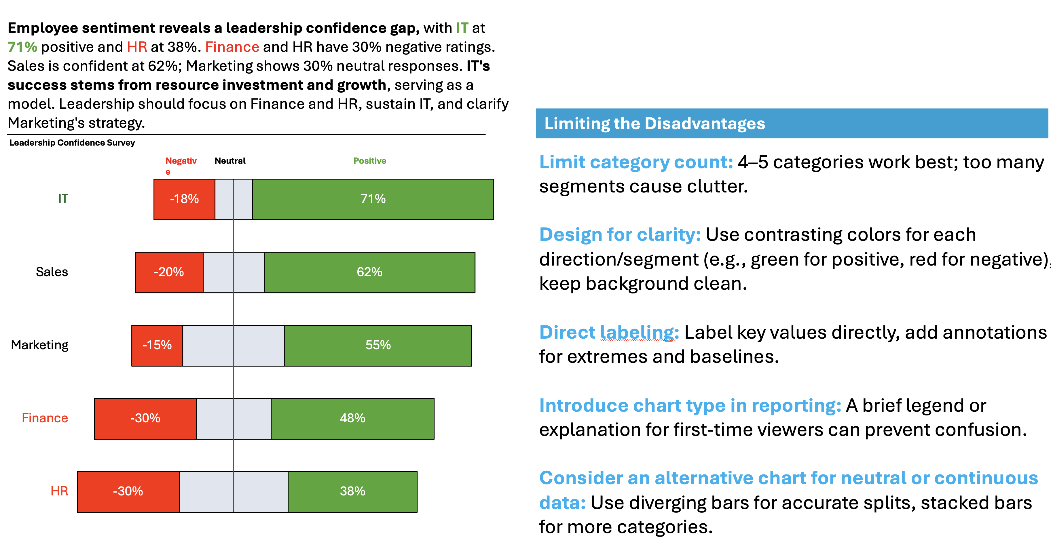
Imagine a large company, surveying leadership confidence in its 5 departments: Sales, Marketing, IT, HR, and Finance. Leadership is reviewing resource allocation from the perspective of both quantity and the mix of staffing.
During the analysis, leadership has found out the following:
- IT Department: (Very high positive, low neutral and negative)
- IT’s robust 71% positive score reflects high satisfaction. This is likely due to investments in tools, training, and remote work flexibility. These investments empower IT teams. Efficient leadership, opportunities for innovation, and reduced customer-facing stress also contribute. Lower negative and neutral scores suggest this department feels well-supported and aligned with company goals.
- Finance Department: (Split – high negative)
- Finance’s 30% negative sentiment (and only 48% positive confidence) is a significant concern. Typical reasons include high workload, increased stress during reporting periods, or changes in budgeting expectations that weren’t well-communicated. Finance teams may feel under-appreciated if their input isn’t solicited for strategic decisions, leading to frustration or skepticism about leadership.
- HR Department: (Low positive – highest neutral and negative)
- HR’s result (38% positive, 30% negative, 32% neutral) is a red flag. HR often deals with company pain points. These include conflict mediation, compliance, and terminations. This can make staff emotionally fatigued. It can also make them skeptical of changes or leadership’s support. Neutrality here may point to lack of clear vision or felt impact for their role. Organizations often view HR as a support function rather than a strategic one, which can lower morale and confidence.

👉🏻 Advantages
- Clarity in polarity: Instantly shows differences above and below a baseline—quickly visualizing trends, sentiment, or financial shifts.
- Part-to-whole and directionality: Combines overall values with a visual cue for direction or group contrast.
- Easy identification of extremes: Outliers and strong performers stand out
👉🏻 Disadvantages
- Space inefficiency: Central baseline may waste chart area, especially with “neutral” or small segments.
- Comparability issues: Only outward ends align to a baseline, making inner groups hard to compare.
- Can confuse novices: Rarely used in general reporting, so may need explanation to new audiences.
- Labeling challenge: Small segments near baseline may be harder to label effectively.
Practical Tips to Reduce the Disadvantages
There are always creative ways to help yourself avoid the pitfalls, depending again on the story you choose to tell. Not every piece of data is essential, and not everything needs to be visible or communicated. I have added some tips I’ve learned during my professional journey on the right side of the image below.
Are there other alternatives?
Of course, in the future posts I am going to talk about various other visually appealing alternatives!
Visualizations and their use cases, we have already talked about in Component Compare:
Summary
Diverging bar charts bring clarity and storytelling power to any dataset. They work well with data split between opposites. They provide managers and teams with instant and actionable insights. While they require thoughtful design and clear explanations, their ability to spotlight contrast, direction, and outliers makes them indispensable for meaningful comparison and big decisions
Ready to upgrade your presentations with charts that truly highlight the story? Try a diverging bar chart in your next analysis, and let your data’s dual nature speak for itself
For a free downloadable essential resources for your Data Storytelling journey, click here: Free Downloads
And of course, if you want to keep transforming your Data Storytelling skills, subscribe to regular updates to your inbox!

Leave a comment