
Let’s continue with the essential three things to have on our minds when thinking about telling a story with charts. Let’s remember what I flashed in the earlier blog.
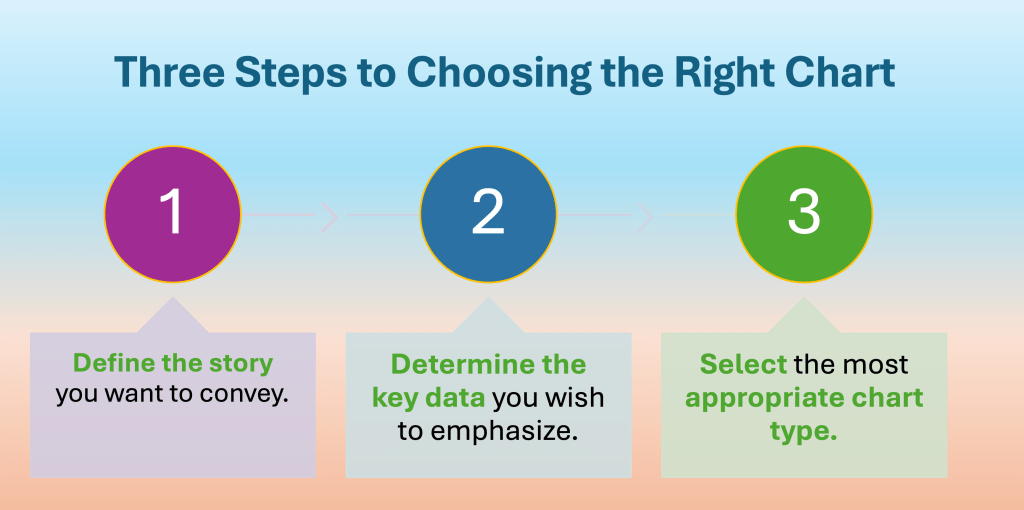
Step 1 – Defining the story you want to convey is crucial before selecting any chart. A well-defined narrative is the foundation for your data visualization, guiding every decision you make. When you articulate what message you aim to communicate, you gain clarity on the types of data to gather. You also understand the context needed and the audience’s perspective.
This careful consideration helps you choose your data’s most effective visual representation. It ensures that the representation resonates with your audience. It also enhances understanding. By prioritizing your story, you avoid the common pitfall of using a chart simply for the sake of it. Instead, you create a compelling visual that underscores the insights you wish to share.
Remember – it is the point you want to make, rather than the data you want to show.
Let’s look at the point I am trying to make with the next simplified example:
Here is a simple table with product revenue mix per Region X and Region Y. Both columns sum up to 100%.
| Region X | Region Y | |
| Product A | 12% | 20% |
| Product B | 15% | 10% |
| Product C | 35% | 25% |
| Product D | 38% | 45% |
What charts can you draw to represent the data set above? Try to sketch it first. No need to use any tools, software or special apps. Just pencil and paper – always start with that so that you can quickly visually see what makes sense.
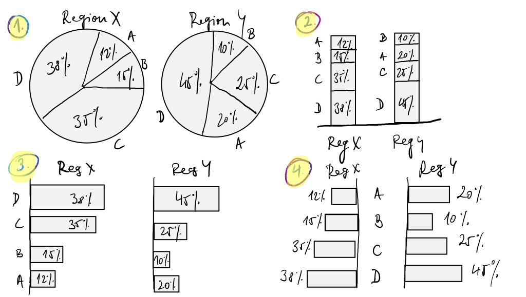
These are just few options, as there are many more. Now, what chart would you pick? Well, IT DEPENDS!
In Charts 1 and 2, you are showing/informing that each Region has a different Product Mix. In Chart 3, you rank the Mixes for Region X. At the same time, you mirror the same for Region Y. This clearly shows that Products C and D have the highest mixes in both. In Chart 4, you compare the product mixes for each region. Region Y has a higher Product Mix of D and A than Region X.
There is a very high probability that you will have to sketch multiple charts during your Data Storytelling journey. This is essential for tailoring it to your message. Use different angles to understand what best suits the story you want to tell. Only your creativity is your limit.
In the next blog, we will continue with Step 1. We will try to find the storyline based on the simple dataset.

Leave a comment