Enhance Your Data Visualizations with Color Harmony

Color theory is crucial in data visualization. It affects how information is perceived. It also influences how it is interpreted by the audience. Understanding color harmony, contrast, and the emotional implications of colors can significantly enhance the effectiveness of your visualizations.

Color Wheel

For instance, selecting an easy color palette on the eyes can help emphasize key data points. Providing enough contrast makes patterns more discernible. Additionally, using color to categorize data can aid in quick comprehension. Avoid overloading with too many hues that confuse the viewer. To quickly spot key messages, you need to pick distinctive colors.

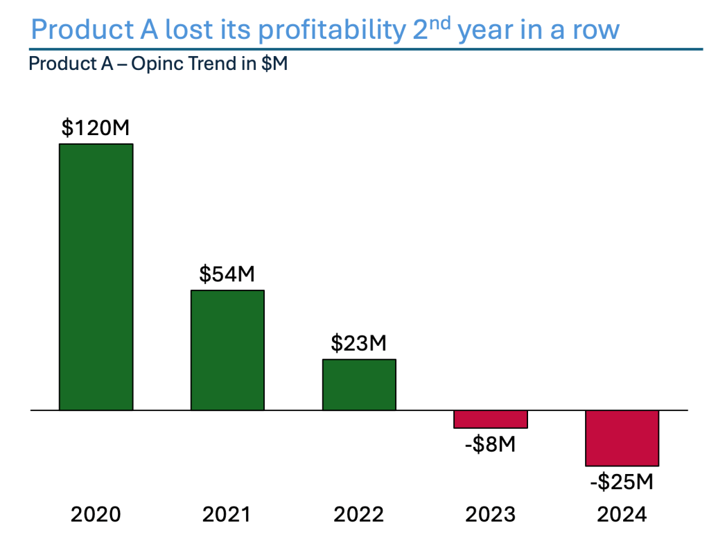
The chart below shows Product A’s profitability and loss. The positive and negative years are delineated. Traditional color coding is used, with GREEN representing gains and RED indicating losses, enhancing the clarity of the narrative. If you consult the color wheel, you’ll find that these two colors are opposite, making them complementary colors. These colors show a striking contrast.

Alternative Chart for Profitability path using complimentary colors from Color Wheel

Using color theory principles effectively can enhance data visualizations. You can use analogous colors as well to create a cohesive feel. Let’s look at how this effect can be translated into your visual. The chart below shows that the colors are almost the same until they are not. Region C is dominating with Dark Blue, while the rest are subtle. The second most important region is Region D. It was a former winner. Yet, Region C overtook it. So, Region C was assigned the Darkest Blue from the chart.

Alternative Chart using analogous colors to build your data visualization.

These techniques allow visualizations to communicate insights more clearly and engage the audience on a deeper level. Proper color choice improves aesthetic appeal. It also enhances functionality. This leads to better decision-making and interpretation of data.

“Colors are like good friends—if you mix them all together, you’ll end up with a shade that can only be described as ‘uh-oh!’”


Discover more from Visual Wizards Academy

Subscribe to get the latest posts sent to your email.

31 responses

  1. […] – Colors, effects, legends, labels, images, annotations, headlines, […]

    Like

  2. […] careful consideration helps you choose your data’s most effective visual representation. It ensures that the representation resonates with your audience. It also enhances […]

    Like

  3. […] coloring to the sub-headlines too – so that you can clearly associate the verbal narrative to the […]

    Like

  4. […] examine a practical application of basic Data Visualization concepts and Data Storytelling. We will look at one existing publicly available chart on the […]

    Like

  5. […] examine a practical application of basic Data Visualization concepts and Data Storytelling. We will look at one existing publicly available chart on the […]

    Like

  6. […] Data visualization is crucial, as shown by extensive research. Recent surveys reveal that data storytelling is gaining importance in various industries. It is also gaining significance in research areas. This practice makes complex information easier to grasp and relate to. And it’s not just in the Corporate world. It’s everywhere in our daily lives. It is making our lives easier. Through it, we understand more. We know things quicker, much quicker. […]

    Like

  7. […] approach not only boosts understanding but also enables an emotional connection. Remember, people FEEL the numbers and the narratives. They are often personally linked […]

    Like

  8. […] the surface. However, it hides deeper problems when you dig in. It’s the classic case of “all green lights, no real […]

    Like

  9. […] examine a practical application of basic Data Visualization concepts and Data Storytelling. We will look at one existing publicly available chart on […]

    Like

  10. […] examine a practical application of basic Data Visualization concepts and Data Storytelling. We will look at one existing publicly available chart on the […]

    Like

  11. […] examine a practical application of basic Data Visualization concepts and Data Storytelling. We will look at one existing publicly available chart on the […]

    Like

  12. […] examine a practical application of basic Data Visualization concepts and Data Storytelling. We will look at one existing publicly available chart on the […]

    Like

  13. […] examine a practical application of basic Data Visualization concepts and Data Storytelling. We will look at one existing publicly available chart on the […]

    Like

  14. […] examine a practical application of basic Data Visualization concepts and Data Storytelling. We will look at one existing publicly available chart on the […]

    Like

  15. […] examine a practical application of basic Data Visualization concepts and Data Storytelling. We will look at one existing publicly available chart on the […]

    Like

  16. […] examine a practical application of basic Data Visualization concepts and Data Storytelling. We will look at one existing publicly available chart on the […]

    Like

  17. […] examine a practical application of basic Data Visualization concepts and Data Storytelling. We will look at one existing publicly available chart on the […]

    Like

  18. […] examine a practical application of basic Data Visualization concepts and Data Storytelling. We will look at one existing publicly available chart on the […]

    Like

  19. […] examine a practical application of basic Data Visualization concepts and Data Storytelling. We will look at one existing publicly available chart on the […]

    Like

  20. […] examine a practical application of basic Data Visualization concepts and Data Storytelling. We will look at one existing publicly available chart on the […]

    Like

  21. […] examine a practical application of basic Data Visualization concepts and Data Storytelling. We will look at one existing publicly available chart on the […]

    Like

  22. […] examine a practical application of basic Data Visualization concepts and Data Storytelling. We will look at one existing publicly available chart on the […]

    Like

  23. […] examine a practical application of basic Data Visualization concepts and Data Storytelling. We will look at one existing publicly available chart on the […]

    Like

  24. […] examine a practical application of basic Data Visualization concepts and Data Storytelling. We will look at one existing publicly available chart on the […]

    Like

  25. […] examine a practical application of basic Data Visualization concepts and Data Storytelling. We will look at one existing publicly available chart on the […]

    Like

  26. […] Design Theory is more than aesthetics. It’s about strategically using color, space, typography, and layout to guide a viewer’s eye. The purpose is to highlight what matters. […]

    Like

  27. […] examine a practical application of basic Data Visualization concepts and Data Storytelling. We will look at one existing publicly available chart on the […]

    Like

  28. […] examine a practical application of basic Data Visualization concepts and Data Storytelling. We will look at one existing publicly available chart on the […]

    Like

  29. […] examine a practical application of basic Data Visualization concepts and Data Storytelling. We will look at one existing publicly available chart on the […]

    Like

  30. […] examine a practical application of basic Data Visualization concepts and Data Storytelling. We will look at one existing publicly available chart on the […]

    Like

Leave a reply to Chart of the Week – Solar vs. Nuclear – Are we turning the point? – Visual Wizards Academy Cancel reply