
Selecting the most appropriate chart
In my prior posts, I described Step 2 in our journey. This step involves deciding on the key data you want to emphasize. We went through 5 different compares. We examined their respective languages or words used. This can quickly help you recognize the right compare.
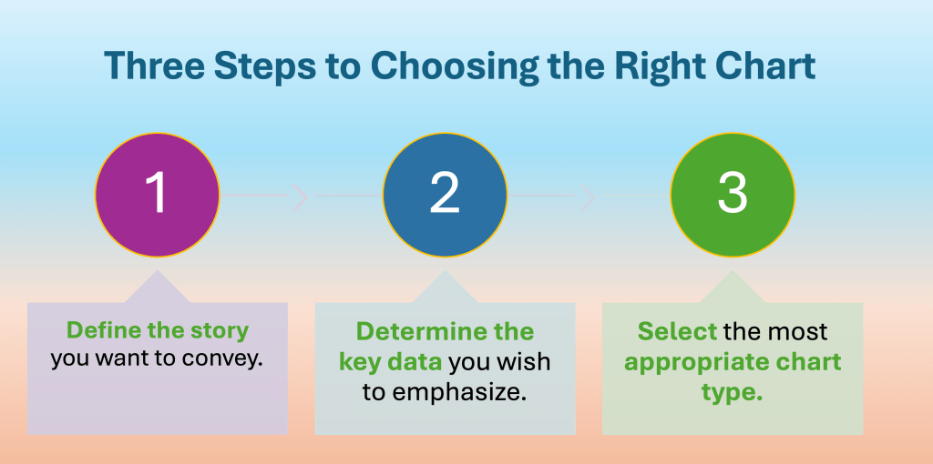
Once you know the correct comparison, you can easily pick from the five basic charts. And that’s what Step 3 is all about.
How to connect the Compares to the 5 Basic Charts?
You have now learned that, regardless of your message, it will always suggest one of five types of comparisons. It shouldn’t be surprising that any comparison usually relates back to the five fundamental charts presented above.
As we move ahead, remember that selecting the appropriate chart isn’t a precise science. We earlier mentioned that this is a continuous process, as each chart (visualization) must enhance your narrative and essential message. If it doesn’t, it isn’t the suitable visualization for your needs.
Let’s go back. We need to connect all of the Compares to the five basic chart forms. These include bars, columns, lines, dots, and pie.
The bar, column, and line charts will take up ~90% of most of your attempts. Dot and Pie are another 5%, and then more exotic ones or combinations of those above, a further 5%.
The simple matrix above should help you with most of your stories.
For further imagination of what different type of charts are there (not exhaustive), you can download this file.
Summary
Selecting appropriate chart is not a rocket science. It just takes practice and application of key concepts along the way.
I hope this helps you become better at creating your amazing Data Stories. You will also become faster at it. Your Business Partners and leaders expect this from you.

Leave a reply to Building Incredible Visuals: A Practical Framework for Data Storytelling Success – Visual Wizards Academy Cancel reply