
The Component Comparison and its different alternatives
As we have discussed in the essential article on Component Comparison, it represents a situation. Your story is to show an item as a mix of something. The usual words used with it are: % of Total, Share of, Mix of, Component of, Includes X. You can find it in the world around you every day. So, what are the different chart alternatives?
100% Stacked Column Chart

You can clearly see that this chart depicts three components of the whole: Services, Industry, and Agriculture. All three are adding up to 100%. This is very important to note, it needs to add up to 100% otherwise this chart does not make sense. There are some Pros and Cons associated with this chart.
👉🏻 Advantages
- Clear Visualization of Proportions: The 100% stacked bar chart is highly effective. It displays the relative percentage each part contributes to the whole within each category. This makes it easy to compare how different segments (like product lines or regions) divide up each total.
- Immediate Understanding of Shares: Each bar totals 100%. Viewers instantly recognize that the chart is about proportions or percentages. It is not about absolute values.
- Compact and Efficient Use of Space: 100% stacked bar charts are visually compact. This makes them suitable for presentations and reports. They are especially effective when space is limited. They are also helpful when there are many categories to display.
- Easy Comparison Across Categories: By standardizing each bar to 100%, it’s straightforward to compare the distribution of components (e.g., sales by product line) across different groups (e.g., regions).
- Direct Labeling: When segments are labeled directly, it further enhances clarity and reduces the need for mental calculation
👉🏻 Disadvantages
- Difficulty Comparing Across Segments: It’s easy to see the proportion within each category when comparing the same segment. However, categorizing it differently is challenging. Each segment starts at a different point and does not share a common baseline.
- Potential for Clutter: If there are too many segments within each bar, the chart can become cluttered. It becomes harder to read if segments are small or similar in color.
- Mental Math Required: Viewers may need to perform mental calculations to determine exact percentages or to compare sums of adjacent segments (e.g., adding two subcategories together), which can be time-consuming and error-prone.
- Loss of Absolute Value Information: All bars are standardized to 100%. Therefore, the chart does not show the actual totals or the differences in overall size between categories.
- Challenges with Negative Values: Negative values are difficult to represent clearly in a 100% stacked bar chart. This often makes it unsuitable for datasets that include them.
Practical Tips to Reduce the Disadvantages
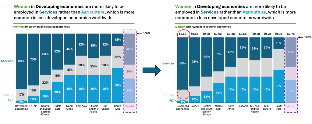
There are always creative ways to help yourself avoid the pitfalls, depending again on the story you choose to tell. Not every piece of data is essential, and not everything needs to be visible or communicated. On the right chart below, I have made two adjustments. I removed the middle section of the chart. The story is clearly about Agriculture and Services, not Industry. I don’t need to show the Industry %. And then I added Total Values of Economy (made up $). This demonstrates that you can add back the values. It helps give at least some understanding of how the different sizes of the X-axis compare.
Are there other alternatives?
Of course, in the future post I am going to talk about:
- Pie Charts and Doughnut Charts
- 100% Stacked area charts
- Tree maps and Mekko Charts
- Sankey Charts and others
Summary
There is always a chart for your story, but you need to understand the basic concepts, principles, and language used to correctly choose what you need to persuade, inform, inspire, or entertain!
For a free downloadable resource, click the Chart Decision Tree and Compare Visual Guide.

Leave a reply to Maximize Data Storytelling Insights with Area Bump Charts – Visual Wizards Academy Cancel reply