
What to expect?
Let’s examine a practical application of basic Data Visualization concepts and Data Storytelling. We will look at one existing publicly available chart on the internet, preferably each week. You can take these lessons to your world of Data Storytelling. Apply them at the office or home when persuading your spouse about spending habits :-).
Data Storytelling Example
Our example will be a chart from a World Bank blog (again) featuring various topics, accompanied by corresponding charts.
Here, we are not very interested in the topic itself. We focus more on the visual and the story it wants to tell. Note that there is a difference between reading a whole article to understand context. Presenting the idea in front of an audience is a different skill. A full article sometimes explains what you can see on the chart. It is another challenge when you have just you and your slide in front of an audience. The way you show your points will differ. The important thing is: Data Storytelling is everywhere.
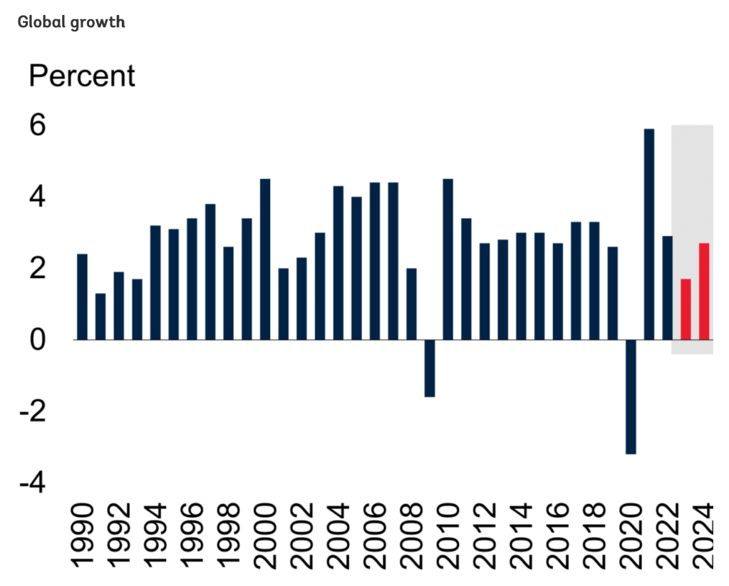
The setting
This section shows five charts that define the Global Economic Outlook (from Jan 2023). I took the first chart, which describes the Global GDP Growth and its outlook for 2023 and 2024. The chart displays the data. But the chart itself is too bare and does not align with Tufte’s data-to-ink ratio. Thus, I would suggest the following adjustments to enhance the message and incorporate more visual elements. Practice these Data Visualization skills to become fluent and progress faster in your career.
Further enhancements to the chart to improve the Data storytelling should be:
- Rethink Fonts – One of the fundamental concepts of Data Visualization is that people notice first what stands out. Based on the font size in the original picture, people will first see the X and Y axes. Both of them serve only as subtle points, not the main story. Never use the Largest fonts on unimportant labels.
- Highlight the important. Yes, they have highlighted the forecasted periods. However, why do they use RED color? It does not show a decline but a decent growth. I would use a different color for the Forecast values. RED should be used for the “crises” years of 2008 and 2020.
- Simplify both axes – You don’t need to clutter your axes with unnecessary items. Remove the Y axis, not necessary if you introduce subtle 3 lines depicting the 2,4,6% Growth lines. Remove most of the year labels from the X axis. The trend clearly shows all of the years in between. Don’t clutter you axis.
- Add a Telling Title – When you read the title, you should get the message straight away. This lets you easily follow it in the article if you are more interested in the details.
- Add Coloring to the Headlines, too, so that you can associate the verbal narrative with the visual.
An alternative result after application of a few concepts of Data Visualization:

Summary
Review the simple concepts for clear Data Storytelling. Keep practicing. You can do wonders—not only for the Visualizations but also for your Data Storytelling and professional career. There are multiple views of the same story; you need to select the one that best suits you.
If there is a chart you wish me to review, just let me know. I can give some thoughts on revision. Please contact me via the contact form.
You can use the Chart of the Week tag to see other examples.
You can download the free Chart Decision Tree and Visual Compare Guide.

Leave a comment