
What to expect?
Let’s examine a practical application of basic Data Visualization concepts and Data Storytelling. We will look at one existing publicly available chart on the internet, preferably each week. You can take these lessons to your world of Data Storytelling. Apply them at the office or home when persuading your spouse about spending habits :-).
Data Storytelling Example
Our example will be a chart from a World Bank blog featuring various topics, accompanied by corresponding charts.
Here, we are not very interested in the topic itself. We focus more on the visual and the story it wants to tell. Note that there is a difference between reading a whole article to understand context. Presenting the idea in front of an audience is a different skill. A full article sometimes explains what you can see on the chart. It is another challenge when you have just you and your slide in front of an audience. The way you show your points will differ. The important thing is: Data Storytelling is everywhere.

The setting
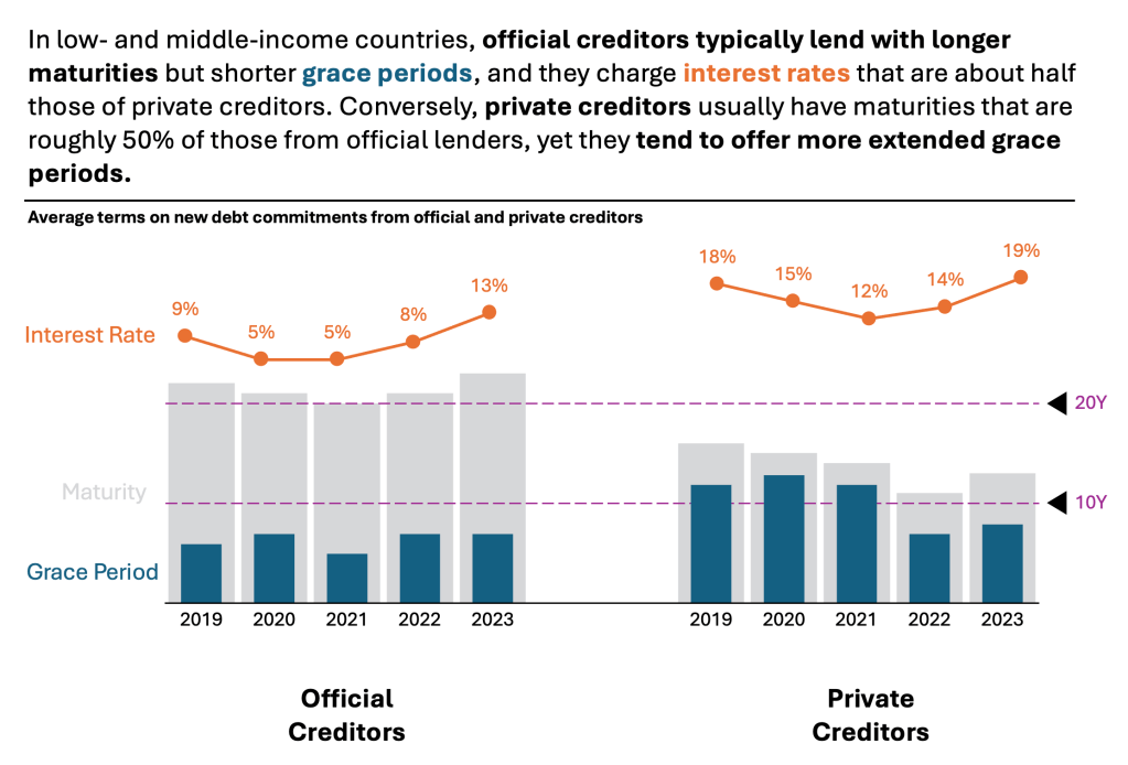
This section presents average terms on a new debt commitments from official and private creditors. The author uses a combination of Bar Chart and Line charts. The chart displays the data. But the chart itself is too bare and does not align with Tufte’s data-to-ink ratio. Thus, I would suggest the following adjustments to enhance the message and incorporate more visual elements. Practice these Data Visualization skills to become fluent and progress faster in your career.
Further enhancements to the chart to improve the Data storytelling should be:
- Move Legend – If possible, reposition your legend directly to the chart elements. This action will help reduce cognitive load. It eliminates the need to switch between the legend at the bottom and the charts at the top. You can afford it if there are not many elements in the visual.
- Use distinctive colors – You can nest two column charts into each other. Make one with a less distinctive color and one with a more distinct color. Another color for the Interest Rates.
- Remove the Y axis – It’s not necessary at all. If you introduce the “watermarks” at 20Y and 10Y, it provides a good direction for understanding the numbers. Remove gridlines to create more white space.
- Add a Telling Title – When you read the title, you should immediately grasp the message. This allows you to easily follow along in the article if you are more interested in the details.
- Add Coloring to the Headlines, too, so that you can associate the verbal narrative with the visual.
An alternative result after application of a few concepts of Data Visualization:
Summary
Review the simple concepts for clear Data Storytelling. Keep practicing. You can do wonders—not only for the Visualizations but also for your Data Storytelling and professional career. There are multiple views of the same story; you need to select the one that best suits you.
If there is a chart you wish me to review, just let me know. I can give some thoughts on revision. Please contact me via the contact form.
You can use the Chart of the Week tag to see other examples.
You can download the free Chart Decision Tree and Visual Compare Guide.

Leave a comment