
The Component Comparison and its different alternatives
As we discussed in the essential article on Component Comparison, it represents a situation. You need to show an item as a mix of two or more elements. The usual words used with it are: % of Total, Share of, Mix of, Component of, Includes X. You can find it in the world around you every day. Last week, we talked about the 100% Stacked Bar Chart. Today, we take a look at 100% Area Chart.
100% Area Chart – Hmm, Not so effective tool for Data Storytelling
The area chart traces its roots back to Scottish engineer and political economist William Playfair. He is credited with inventing the area chart, along with the bar, line, and pie charts, in 1786. In his influential book, The Commercial and Political Atlas, Playfair used area charts to represent complex economic time-series data.
He illustrated changes in England’s national debt. He also compared imports and exports over time. His approach pioneered using filled areas below lines to visualize cumulative values. This made relationships and changes clear. It also made dense numerical data accessible and engaging to a wider audience.
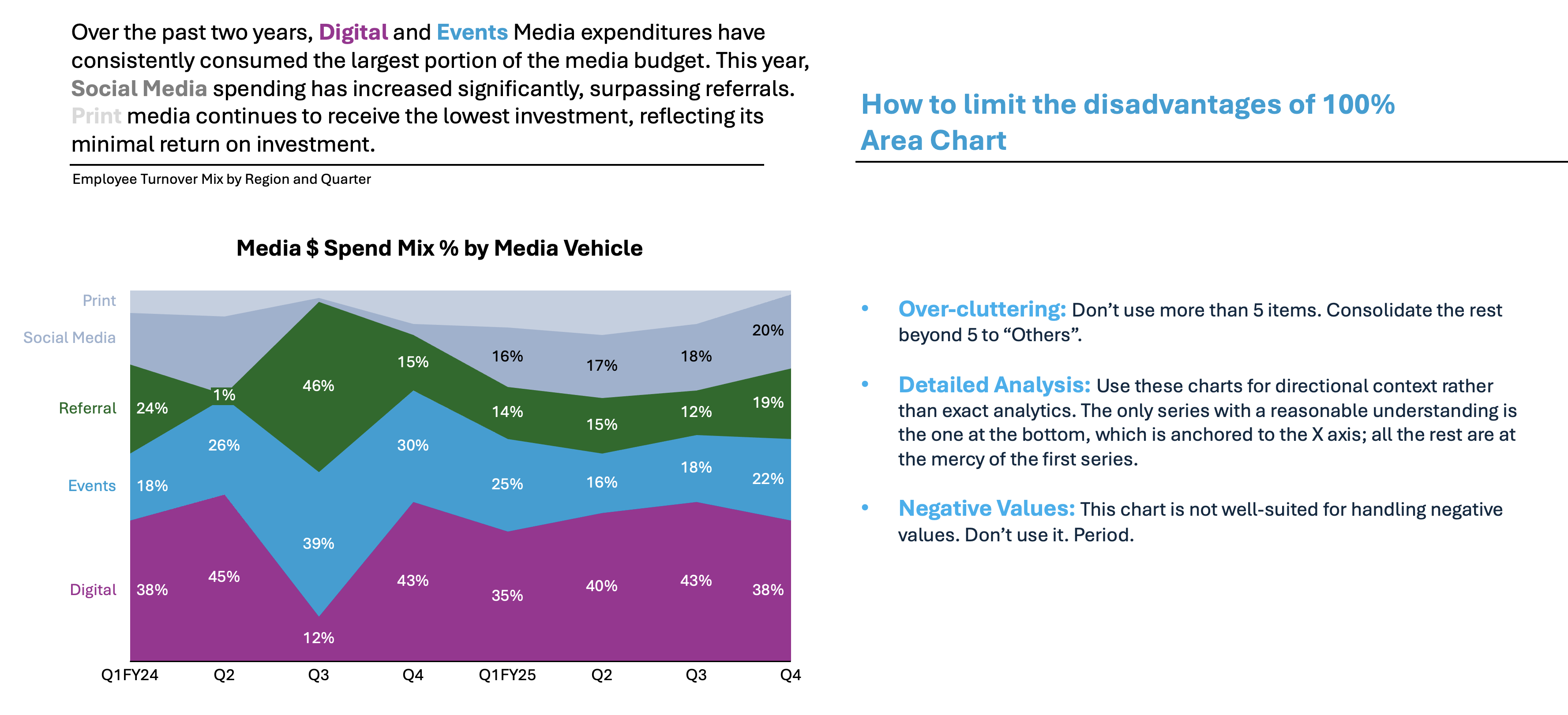
Practical Examples from the Corporate World
Mostly used when comparing components over time, showcasing their respective mixes. I rarely use Area Charts. They may not display all the necessary items to tell the story.

👉🏻 Advantages
- Highlights Trends Over Time: This is excellent for showing how values change over time. It also demonstrates how their components progress. It provides both magnitude and trend in a single glance.
- Visualizes Part-to-Whole Relationships: Stacked area charts make it easy to see the contribution of each category. They help to understand how these proportions shift over time.
- Easily Compares Multiple Data Series: Multiple series can be displayed together, making it easy to follow progression and overlap.
- Intuitive for Audience: The use of filled areas helps viewers distinguish one component from another. This makes comparisons more intuitive than with lines alone.
- Communicates Volume: The colored or shaded area not only shows change but also visually represents the size of values
👉🏻 Disadvantages
- Can Become Cluttered: With many data series or closely overlapping categories, area charts can quickly become difficult to interpret. They can become visually cluttered.
- Not Suited for Detailed Analysis: Identifying precise values for overlapped series can be difficult. It’s especially challenging for small categories. This is particularly true without data labels.
- Overlapping Confusion: When data series overlap, discerning changes or the starting and ending points of components becomes challenging.
- Less Effective with Many Categories: Works best for a handful of categories. Too many series can obscure the underlying trends and relationships.
- Difficult with Negative Values: Representing negative numbers can be confusing compared to alternatives like line charts
Practical Tips to Reduce the Disadvantages
There are always creative ways to help yourself avoid the pitfalls, depending again on the story you choose to tell. Not every piece of data is essential, and not everything needs to be visible or communicated. I have added some tips I’ve learned during my professional journey on the right side of the image below.
Are there other alternatives?
Of course, in the future post I am going to talk about:
- Tree maps and Mekko Charts
- Sankey Charts and others
Summary
Area charts were invented to visualize how several quantities or components change together over time. They provide both an overall total and the composition of its parts. Their main advantages lie in highlighting aggregate trends. They also excel at visualizing part-to-whole relationships. This is especially true when the audience cares about the mix as well as the sum.
Area charts can become messy with too many series. This issue makes them less suitable for granular analysis or heavily segmented data. For clear, time-based visual storytelling with a limited number of components, area charts remain a compelling and widely used tool.
There is always a chart for your story. You need to understand the basic concepts, principles, and language used. This helps you choose what you need to persuade, inform, inspire, or entertain correctly.
For a free downloadable resource, click the Chart Decision Tree and Compare Visual Guide.

Leave a comment