
Introduction
I still remember the first time I opened a messy spreadsheet. It looked more like a jumble of numbers than anything meaningful. At that moment, I wondered, How in the world could anyone make sense of this? That was my earliest encounter with Exploratory Data Analysis (EDA). Since then, I’ve come to realize that EDA is not just about statistics. It’s about data storytelling.
To me, EDA feels like walking into a library. All the books (which I love and enjoy reading) are scattered on the floor. At first glance, it’s chaos. But as I start organizing and flipping through pages, patterns begin to emerge. Similarly, EDA enables us to transform raw, messy data into clear, concise stories that inform, inspire, and guide decisions.

“Sometimes the most broken pieces can create the most beautiful art.”
I believe I have mentioned this before. Often, when someone asks me, “So what do you want to show in the final Executive Presentation?” I reply, “I don’t know yet.” It depends!
First, I need to examine the data to see what it tells me. Is there any pattern emerging? Is there some consecutive trend or sudden change in direction? Discovering a secret path through old ruins is like uncovering hidden insights in complex data sets.
As you delve deeper, the trail becomes clearer amid noisy, disconnected data points. Stay attentive and determined to uncover the meaningful story beyond. The patience pays off!
Why EDA is the First Step in Data Storytelling

“Data! Data! Data!” he cried impatiently.
“I can’t make bricks without clay.“
(Sherlock Holmes)
When you think of storytelling, you imagine characters, plots, and emotions. Data is no different. The numbers are characters, patterns become plots, and anomalies are the surprising twists that keep things interesting. Before jumping into formal models or dashboards, I always take time to explore the data.
For example, I once worked on a dataset about customer purchases. Initially, I thought it would simply tell me which products were selling best. I examined histograms and scatter plots. I noticed something unusual. Customers who purchased eco-friendly products also tended to make more frequent purchases overall. That single insight reshaped the business narrative – it wasn’t just about selling products; it was about cultivating values-driven loyalty.
How I Approach EDA
“Don’t wait for someone to ask: What does it mean?”
When I explain EDA to friends who aren’t data analysts, I say this: EDA is like meeting someone for the first time. You start with small talk, ask questions, and gradually uncover their story.
Here’s how I usually “converse” with:
- Look at the shape of the data. Analyze the first data set. See if it can explain our basic questions.
- Are there any obvious relations? Do we notice any correlations or relationships between the data and the results?
- Visualize it – Is the pattern visible? Do we need to include another data set or maybe use a different visual? Try sketching first before you embark on the journey.
- Look into the context – Is this something we expected? Is it a continuum of where we were before?
- Search for outliers – These are the odd stories, the unexpected twists you didn’t see coming.
The Power of Visuals in Data Storytelling
During EDA, the visuals are just as important as the numbers. They make the story vivid and memorable. When I share insights, I don’t just present rows of data. I tell a story through visuals. People can instantly see this story.
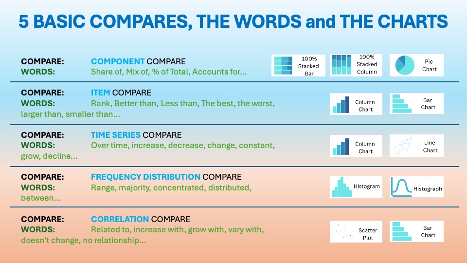
Here are the 5 basic charts (visuals) that often help me bring the data to life:
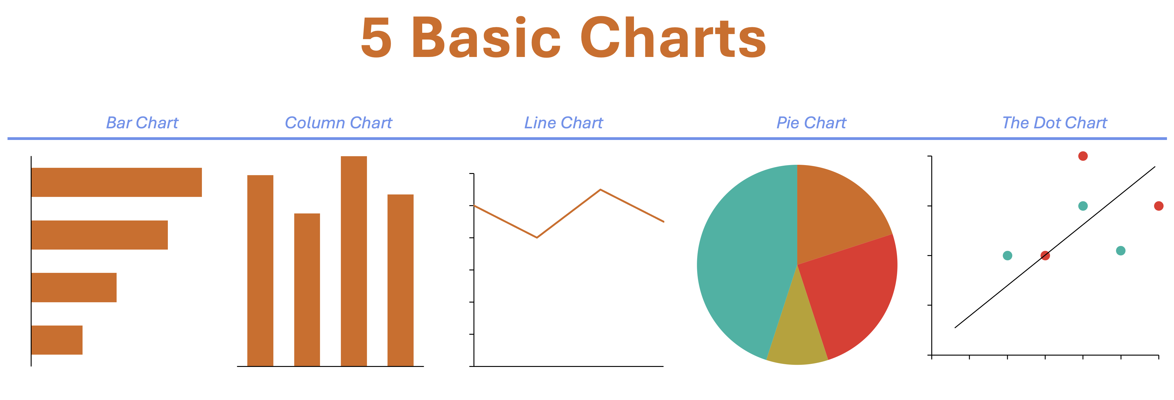
For that customer purchase dataset I mentioned earlier, a scatter plot revealed the eco-friendly purchasing pattern. A box plot highlighted a small but very loyal group of customers. Their behavior was completely different from the rest. These weren’t just charts—they were story illustrations.
Bringing It All Together
EDA is not just about numbers for the sake of numbers. It’s about finding the story hidden in them. When I treat EDA as a storytelling exercise, everything changes. I avoid overwhelming my audience with statistics. Instead, I guide them through a narrative: Here’s what we expected. Here’s what we found. And here’s why it matters. Clearly described in my 3-Watt strategy.
And the magic? People lean in. They don’t just see the data—they feel the insight behind it.
So, the next time you dive into a messy dataset, don’t think of it as a chore. Think of it as opening up a mystery novel where you get to be both the detective and the storyteller. Trust me—it makes the journey not only insightful but also a lot more fun.
For a free downloadable resource, click the Chart Decision Tree and Compare Visual Guide.

Leave a reply to Building Incredible Visuals: A Practical Framework for Data Storytelling Success – Visual Wizards Academy Cancel reply