
The Component Comparison and its different alternatives
As we discussed in the essential article on Component Comparison, it represents a situation. You need to show an item as a mix of two or more elements. The usual words used with it are: % of Total, Share of, Mix of, Component of, Includes X. You can find it in the world around you every day. Last week, we talked about the Sankey Chart. Today, we take a look at Area Bump Chart.
Area Bump Chart – A great chameleon among the visuals
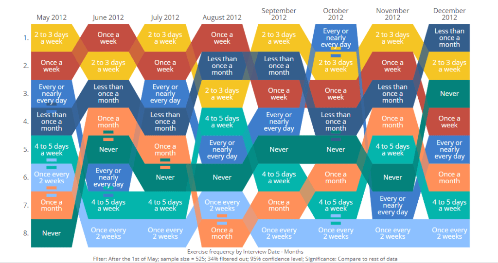
The Area Bump Chart is a modern evolution of the traditional bump chart. It visualizes changes in rank or position over time for multiple categories. The classic bump chart has been used for several decades. It is especially popular in sports, finance, and popularity rankings. This chart gained notable attention in data visualization communities through works like Matt Chambers’ “Car Color Evolution.”
The area bump chart was introduced to address a major limitation of bump charts. Standard bump charts cannot show actual values or magnitudes, only rank. The area bump chart enhances data visualization by adding another dimension. It varies the thickness or area of each “bump” line along the time axis. It displays both rank changes and the relative quantities of each category as they evolve over time.
Practical Examples from the Corporate World
An area bump chart is particularly powerful in the corporate world. It visualizes the shifting landscape of competitors, product lines, or market segments. This is especially true when both rank and actual size are critical to business decisions.
Example:
Imagine a large technology firm with multiple product lines such as smartphones, tablets, laptops, and smartwatches, across several regions. Senior leadership is planning for the next fiscal year and they want to understand not just which product lines have held the top spot over time, but they also want to know how their share of overall company revenue has changed.
In a quarterly strategy meeting, the market analytics manager presents an area bump chart. This chart shows each product line’s rank for every quarter in the past five years. It also depicts the share of revenue. The chart’s “bumps” visually reveal periods. During these periods, tablets surpassed laptops in both market share and revenue.
There is a notable increase in smartwatch sales following a major launch. The chart also shows a steady decline in smartphone dominance due to market saturation. Each product’s line shifts upward or downward. This shows changes in rank. It also thickens or thins, which reveals growth or shrinkage in actual revenue.

👉🏻 Advantages
- Displays Rank and Magnitude Simultaneously: Shows how categories move up or down in ranking. It also illustrates how their actual values change. This brings together two layers of information.
- Intuitive Visual Comparison: It’s easy to see which categories are dominant or growing. You can also identify large gaps between competitors or segments.
- Captures Dynamic Changes: Effectively highlights significant shifts, competition, or market churn across time periods.
- Engaging Visuals: The flowing, “stream-like” appearance is visually attractive and can make presentations or dashboards more compelling.
- Supports Multiple Categories: Allows tracking more than a handful of entities at once, provided they are distinct enough.
👉🏻 Disadvantages
- Clutter with Many Series: If there are too many categories, the chart can quickly become messy. It can be hard to interpret. Small areas may get lost or overlapped.
- Rank Visibility May Suffer: The focus on area can obscure precise rank changes. This happens if two lines are close in value or cross frequently.
- Comparing Exact Values is Challenging: It’s hard to extract precise numeric changes. These are used mainly for patterns and trends. They are not for granular analysis.
- Requires Thoughtful Design: Colors, area scaling, and line separation must be carefully chosen to avoid confusion or misleading impressions.
- Complexity for Viewers: Audiences unfamiliar with bump charts may need guidance to understand both area and rank information
Practical Tips to Reduce the Disadvantages
There are always creative ways to help yourself avoid the pitfalls, depending again on the story you choose to tell. Not every piece of data is essential, and not everything needs to be visible or communicated. I have added some tips I’ve learned during my professional journey on the right side of the image below.

Are there other alternatives?
Of course, in the future post I am going to talk about:
- Various other visually appealing alternatives!
Visualizations and their use cases, we have already talked about:
- 100% Stacked Column Chart
- 100% Bar Chart
- Pie Chart
- Doughnut Chart
- Area Chart
- Mekko Chart
- Treemap Chart
- Sankey Chart
Summary
Area bump charts are a new, compelling addition to the visualization toolkit. They bridge the gap between pure rank or position changes and quantitative magnitude. Their main strengths lie in revealing both the competitive landscape and real-world impact of category movement across time.
Yet, they should be used with care. Too many entities can clutter the visualization. Extracting exact values may be difficult. For audiences interested in dynamic stories of rank and size, area bump charts are an engaging option. Examples include market share battles, sports standings with points, or evolving demographic segments. They provide an insightful way to analyze the action.
There is always a chart for your story. You need to understand the basic concepts, principles, and language used. This helps you choose what you need to persuade, inform, inspire, or entertain correctly.
For a free downloadable resource, click the Chart Decision Tree and Compare Visual Guide.
And of course, if you want to keep transforming your Data Storytelling skills, subscribe to regular updates to your inbox!

Leave a reply to Stacked Bar Charts: Because Comparing Apples, Oranges, and Bananas Shouldn’t Be Boring – Visual Wizards Academy Cancel reply