
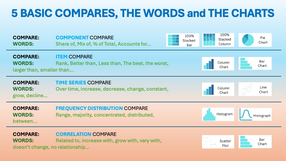
The Time Series Comparison and its different alternatives
As we discussed in the essential article on Time Series Comparison, you want to display items over a certain period. The visuals should show change over time. The usual words used with it are:
Over time, increase, decrease, change, constant, grow, decline…etc. . You can find it in the world around you every day. This is the first blog from the Time series.
Lines That Tell Time (Series Stories)


Line charts are arguably the most intuitive and widely used visualization for tracking change over time. Scottish engineer William Playfair first introduced them in 1786. This was detailed in The Commercial and Political Atlas. He plotted economic data, such as exports and imports, to reveal trends that tables couldn’t. Earlier roots can be traced to 11th-century planetary motion charts. However, it was Playfair’s innovation of connecting data points with lines. This emphasized continuity and trend, making line charts a cornerstone of statistical graphics.
Their enduring purpose: reveal patterns, trends, cycles, and anomalies in time-based data. This involves looking at data from daily sales to yearly revenue. These patterns make them essential for forecasting and storytelling.
“Their enduring purpose: reveal patterns, trends, cycles, and anomalies in time-based data.”
Corporations love slope charts because they deliver instant insight into directional change across many categories without overwhelming the eye. In boardrooms and dashboards, they answer “What changed and how much?” for metrics like revenue, satisfaction, or market share between two periods.
Data Storytelling: Practical Examples from the Corporate World
In business dashboards, reports, and strategy sessions, line charts reign supreme because they instantly communicate change direction, speed, and momentum. Executives use them to:
- Track sales, revenue, or KPIs over months, quarters, or years
- Compare multiple series like products or regions on one chart
- Spot seasonality, outliers, or inflection points for quick decisions
- Forecast future performance based on historical trends
Line charts cut through data noise, letting teams focus on “Is it going up, down, or sideways?”, the core question of most corporate analytics.
Example:
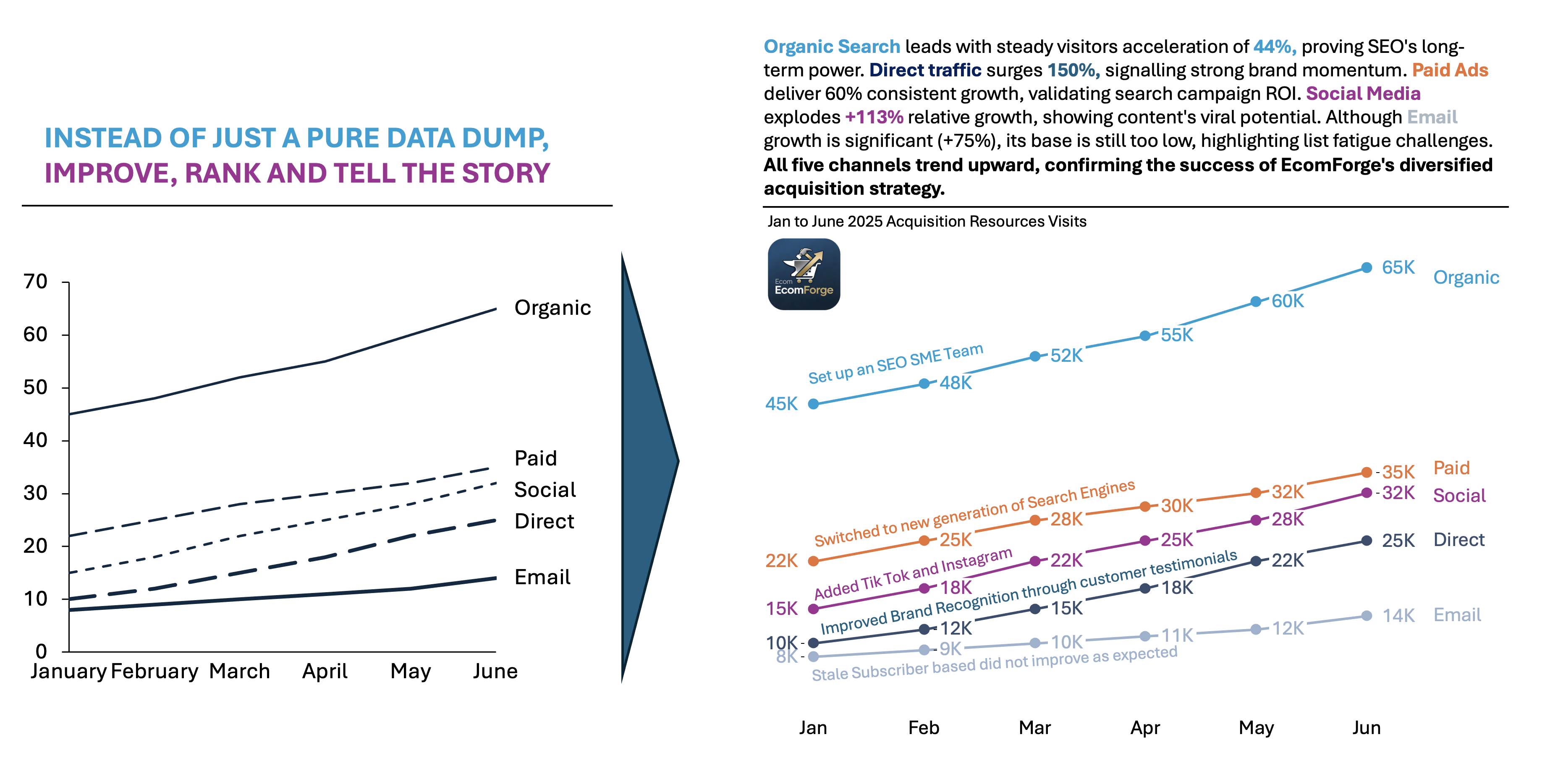
EcomForge is a SaaS e-commerce platform designed for mid-market online retailers with an annual revenue of $1M–$50M. These retailers need more customization and analytics than Shopify provides. They also want less complexity than BigCommerce or Magento. Their customers include fashion boutiques, health supplement brands, and home decor stores. They look for scalable solutions with built-in SEO, inventory management, and marketing automation.
The Nature of the Acquisition Sources:
- Organic Search (45K→65K):
- SEO-driven traffic from Google/Bing. EcomForge invests heavily in content marketing (guides, case studies) targeting “best ecommerce platforms 2026.
- Paid Ads (22K→35K):
- Google Ads and Meta campaigns targeting “ecommerce software for small business.
- Social Media (15K→32K):
- LinkedIn posts, Twitter threads, and Instagram Reels showcasing customer success stories.
- Email (8K→14K):
- Newsletters to 50K+ subscribers with platform updates, webinars, and case studies.
- Direct (10K→25K):
- Brand recognition is driving typed URLs/bookmarks from repeat visitors and word-of-mouth.
👉🏻 Advantages
- Trend clarity: Smooth connections highlight direction and acceleration effortlessly.
- Multiple series comparison: Overlay 3–5 lines to compare performance seamlessly.
- Scalable for time: Handles daily to decadal data with ease.
- Predictive power: Straightforward for forecasting and anomaly detection
👉🏻 Disadvantages
- Spaghetti charts: Too many lines create visual clutter and confusion.
- Misleading scales: Exaggerated Y-axes or irregular time intervals distort perception.
- Discrete data misfit: Poor for categorical or non-continuous time data.
- Small changes invisible: Subtle variations get lost in noise
Practical Tips to Reduce the Disadvantages
There are always creative ways to help yourself avoid the pitfalls, depending again on the story you choose to tell. Not every piece of data is essential, and not everything needs to be visible or communicated. I have added some tips I’ve learned during my professional journey on the right side of the image below.

Are there other alternatives for your Data Storytelling?
Of course, in the future posts I am going to talk about various other visually appealing alternatives!
Visualizations and their use cases, we have already talked about in Component Compare:
Summary
Line charts are the gold standard for time series. They make trends undeniable. They show momentum, cycles, and turning points with elegant simplicity. They excel at comparing series, forecasting, and anomaly hunting, though clutter and scale tricks demand careful design. Used right, they turn time-based data into compelling business narratives.
Don’t let your time series data hide in tables. Grab a line chart for your next dashboard or report. Follow the best practices above. Watch your trends come alive. Start plotting today—your insights deserve to shine.
For a free downloadable essential resources for your Data Storytelling journey, click here: Free Downloads
And of course, if you want to keep transforming your Data Storytelling skills, subscribe to regular updates to your inbox!

Leave a comment