
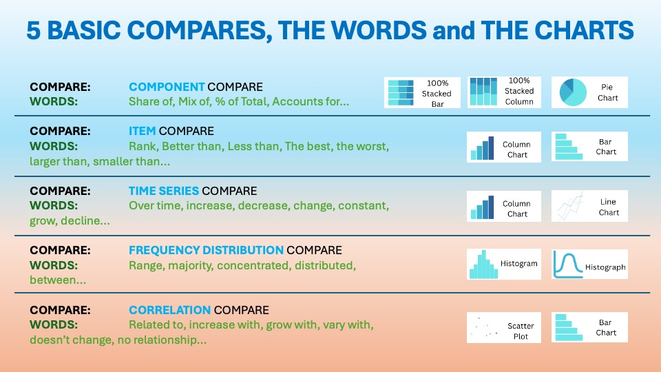
The Time Series Comparison and its different alternatives
As we discussed in the essential article on Time Series Comparison, you want to display items over a certain period. The visuals should show change over time. The usual words used with it are:
Over time, increase, decrease, change, constant, grow, decline…etc. You can find it in the world around you every day. Last time we talked about the basic Line Chart.
Line Charts with Projections: Forecasting the Future of Time Series


Line charts were invented by William Playfair in 1786. They revolutionized how we track change over time. By connecting data points, they reveal trends, cycles, and momentum. Playfair used them to plot economic data like exports and imports, making invisible patterns visible to policymakers and merchants. Adding projections, dashed or shaded forecast lines, extends this power into prediction. This is a natural evolution. Businesses began blending historical trends with statistical forecasting in the 20th century.
They’re used because they make time-based stories intuitive. You can see what happened and how it evolved. You also see what comes next—all in one glance.
“They’re used because they make time-based stories intuitive.”
Corporations rely on line charts with projections for strategic planning, budgeting, and risk assessment. They are essential for “future” or predictive Data Storytelling.
Data Storytelling: Practical Examples from the Corporate World
They’re ubiquitous in your Data Storytelling because they:
- Show historical performance alongside forecasts for scenario planning
- Compare actuals vs. targets with future guidance
- Highlight gaps and opportunities between trends and goals
- Support investor reports and executive briefings with credible outlooks
From sales forecasts to cash flow projections, they bridge data with decisions.
Example:

Subscribi is a subscription analytics SaaS platform. It helps DTC (Direct to Customers) brands improve recurring revenue by predicting churn. Pricing analysis also plays a major role. Another important aspect is customer lifetime value modeling. Customers include health supplement companies, meal kit companies, beauty box companies, and SaaS startups managing $1M–$100M in ARR. The platform thrives amid the exploding subscription economy, projected to grow from $317B in 2024 to $1.2T by 2032 (19% CAGR), driven by consumer preference for convenience and businesses seeking predictable revenue.
Market Context:
Subscription analytics demand surges as churn rates average 5–7% monthly, but top performers achieve <3% with data-driven optimization. Subscribi’s growth mirrors this. Industry Y/Y growth averages 18–20%. This growth is fueled by AI churn models, personalized pricing, and LTV (Long Term Value) forecasting. These factors are significant amid economic recovery and digital transformation.

👉🏻 Advantages
- Holistic view: Past + present + future in one chart for complete context.
- Visual forecasting: Dashed lines clearly distinguish actuals from predictions.
- Easy comparisons: Overlay multiple scenarios (optimistic, baseline, pessimistic).
- Trend continuation: Leverages historical momentum for realistic outlooks
👉🏻 Disadvantages
Practical Tips to Reduce the Disadvantages
There are always creative ways to help yourself avoid the pitfalls, depending again on the story you choose to tell. Not every piece of data is essential, and not everything needs to be visible or communicated. I have added some tips I’ve learned during my professional journey on the right side of the image below.

Are there other alternatives for your Data Storytelling?
Of course, in the future posts I am going to talk about various other visually appealing alternatives!
Visualizations and their use cases, we have already talked about in Component Compare:
Visualizations and their use cases, we have already talked about in Time Series Compare:
- Line Chart
Summary
Line charts with projections blend history with foresight. They give corporations a complete time-series picture, past performance, current trends, and a future path. They’re indispensable for planning but demand clear distinction, validated models, and conservative horizons to avoid false confidence.
Don’t guess the future, plot it. Take your latest KPI data, add a forecast line, and watch your strategy gain clarity. Start forecasting today and lead with confidence.
For a free downloadable essential resources for your Data Storytelling journey, click here: Free Downloads
And of course, if you want to keep transforming your Data Storytelling skills, subscribe to regular updates to your inbox!
Leave a Reply