

Stop Painting, Start Pointing: Use Color to Direct Attention in Your Charts
Color is one of the fastest ways to convey meaning in a chart, but in many corporate decks, it’s treated like confetti rather than a storytelling tool.
When every bar, line, and KPI splashes a different hue, nothing stands out, the key message disappears, and your audience has to work harder to find the point.
Used deliberately, though, color can guide attention, signal risk vs. opportunity, and make your visuals consistently clear wherever you are, across finance, operations, and sales.
This is from the series of TOP 30 Tips in Data Storytelling.
“Start in grayscale, then let a single strong color say: this is where your eyes should land first.”
Why Color Should Be Strategic when you tell your Data Story
Color works on three levels in corporate visuals: it directs focus, builds associations, and reinforces brand. A single strong accent color on the key number tells the audience, “Look here first,” while muted neutrals fade background data into context.
Consistent use of the same color for the same concept, green for growth, red for risk, your brand blue for “our company”, helps people understand charts faster and remember the story.

Example: Company Blog
Rough Situation: When do we see the highest Traffic
How not to do it:
The communication team presents a weekly view of the Corporate Blog. They try to convey that the weekend is when traffic is at its highest. Unfortunately, because of the timing of their slot, they had only 3 min to tell the story. Despite their effort, they could not quickly grab the leaders’ attention.
How to do it:
The chart selection is good, but it needs few tweaks:
- Separate colors for weekday (light grey) and weekend (blue)
- Clearly indicate the average traffic for weekdays and weekend
- Adjust the heading to the colors in the chart so that the text/message is aligned with the coloring in the chart

Trouble starts when color has no job. Rainbow palettes, random color assignments, or mixing brand and non‑brand colors without a clear rationale all increase cognitive load and reduce clarity.
Research and industry practice suggest using a limited palette (often no more than 5 colors per chart, usually fewer), reserving bold tones for emphasis and letting neutrals carry most of the load. The goal isn’t to make charts look “pretty”, it’s to make them readable and emotionally coherent.
Some helpful articles from my past are around Color Harmony and Visual Design Theory. But I am including a short overview below.
Color Theory for your Data Storytelling
Color theory is simply about how colors work together and how they affect what people see and feel. Every color has three basic parts:
- the type of color (red, blue, green),
- how strong it looks, and
- how light or dark it is
When you change these three, you can make a color calm and soft or loud and intense. A color wheel is just a circle that shows which colors sit next to each other and which ones are opposites.

Colors that sit side by side on the wheel (like blue and teal) feel natural together and are good for gentle differences.
Colors that sit opposite each other (like blue and orange) stand out strongly and are good for contrast. In charts, we usually talk about three kinds of palettes: one for categories, one for numbers going from low to high, and one for values going up and down from a middle point.
Category palettes use clearly different colors so you can tell groups apart, but they don’t imply that one is “bigger” than the other. Low‑to‑high palettes use a single color that goes from light to dark, making larger numbers appear stronger on the screen.
Up‑and‑down palettes use two colors (often one for negative and one for positive) with a neutral tone in the middle. Problems start when you throw in a “rainbow” of many bright colors for no clear reason.
Too many colors make patterns harder to see and force people to keep checking the legend. Good color theory also thinks about people with color‑blindness, so you don’t rely only on red‑green differences or very low contrast.
In a business setting, it helps to stick to a small set of brand‑friendly colors and reuse them consistently everywhere. If you can answer “What does this color mean?” for every color on your chart, you’re already using color theory well.
Visual Design Theory
Visual design theory is about how you place things on a page so people can understand them quickly and without effort. It gives you simple rules for what should be big, what should be small, and what should sit next to what.
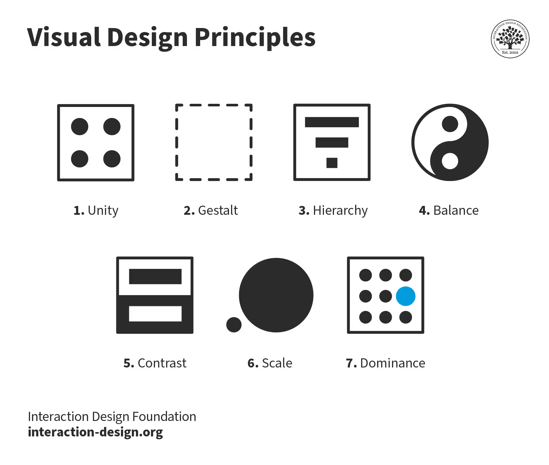
One key idea is hierarchy, which means making the most important information look most important using size, boldness, and position.
Another is contrast, which means using differences (in size, color, or weight) so key elements stand out from everything else.
Alignment is about lining things up so charts, titles, and numbers form neat columns and rows instead of floating randomly.
Balance is ensuring one side of a page doesn’t feel “heavier” or busier than the other.
Proximity means putting related items close together so the eye understands they belong to the same group.
Repetition means reusing the same fonts, sizes, and colors so each page feels like part of the same system.
White space (empty space) is not wasted space; it gives room around important elements so the page does not feel cramped or noisy.
Many good dashboards follow the way our eyes read, often left to right, top to bottom, by putting the main point near the top left.
When you apply these ideas, viewers do not have to “fight” with your slide or screen; their eyes flow naturally from the title to the main number to the detail. In practice, visual design theory is less about making things pretty and more about making them clear, consistent, and easy to use.
Summary – From insights to action
In corporate storytelling, color is either your greatest ally or your quiet saboteur. Too many colors, used inconsistently, turn dashboards into noise and make even strong stories forgettable.
But when you treat color as a deliberate language, one main hue for your brand, one accent for focus, one signal for risk, you guide eyes to the right place, reinforce identity, and make your data feel calm, credible, and emotionally resonant.
For your next slide or dashboard, don’t start by picking a “fun” theme. Start by asking: “What should this color mean?” Then strip back the rainbow, choose one main color, one highlight, and one alert tone, and apply them consistently.
If your audience can now grasp what matters in a few seconds, and your charts finally look like they belong to the same company, you’ve turned color from decoration into strategy.
For free resources to help you on your Data Storytelling Journey, click here.
Don’t forget to try the free 10 Step Training for Curious Beginner here.
To keep Transforming Your Data Storytelling Journey, sign up for regular Insights.
Leave a Reply