The Power of Data Ink Ratio: Simplifying Visual Communication

Once upon a time, there was a famous statistician called Edward Tufte (1942 and still enjoying life!). He was among the first pioneers of Data Visualization. This was back in the days when you started with just paper and pencil. And while working on his projects, he came up with something called “Data Ink Ratio.” That simple wisdom is valid till now and should be used in your daily thinking.

But what it is?

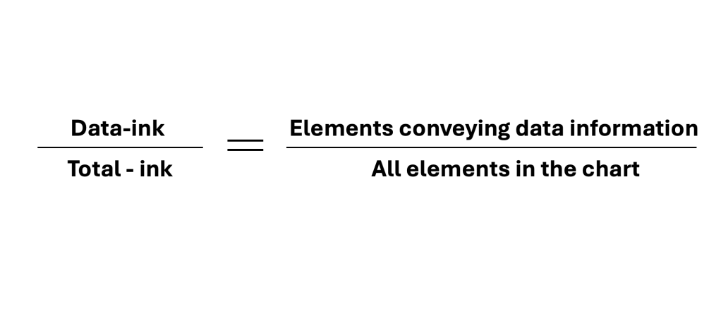
It asks chart creators to scrutinize whether all elements in the chart are relevant to the chart’s message. We should always strive for clarity, simplicity, and cleanness of the message. Our goal is not to throw EVERYTHING there is at the audience. We aim to deliver the story to the audience with visuals that enhance the story. These visuals should support rather than confuse the audience.

ElementsColors, effects, legends, labels, images, annotations, headlines, etc.

Two actions available to you:

  • Erase non-data ink, as much as needed – accessory elements that don’t add information should be considered for removal (Gridlines, Axis, colors w/o meaning, labels, distracting effects)
  • Erase redundant data-ink, as much as needed – check for extra data elements that can be removed (legends, excessive information, symbols, highlighters, etc.)

Few benefits of this approach:

  • Concise message – Including only essential elements ensures that your message remains clear and easy for the audience to digest.
  • Saving time – not only will the readers get the message quicker but you will also avoid confusing people/audience
  • Saving space – space is a resource that you can use on other KPI or metrics vs. unnecessary elements

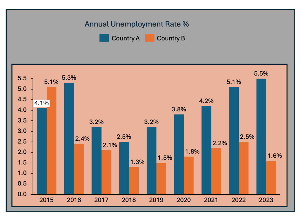
A simple example is below, where you can see BEFORE and AFTER applying Tufte’s Data-Ink Ratio.

BEFORE

AFTER

Constantly thinking about what is important and what is not helps visualizations communicate insights more clearly. It engages the audience on a deeper level and enhances functionality, leading to better decision-making and interpretation of data.

The ability to simplify means to eliminate the unnecessary so that the necessary may speak.” (Hans Hofmann)


Discover more from Visual Wizards Academy

Subscribe to get the latest posts sent to your email.

38 responses

  1. […] phase. The chart has the data, but it does not tell the story. So, I would make the following adjustments to elevate the message part and increase the visual elements. Practice these Data Visualization […]

    Like

  2. […] Simplify your visuals: Only include data that directly supports your main point. Remove unnecessary details and focus on what matters most (remember Tufte Data Ink Ratio) […]

    Like

  3. […] time. The chart displays the data. But the chart itself is too cluttered and does not align with Tufte’s data-to-ink ratio. Thus, I would suggest the following adjustments to enhance the message and […]

    Like

  4. […] sake, do not put everything you know in the Power BI snapshot. You still need to apply the basics of […]

    Like

  5. […] avoid the pitfalls, depending again on the story you choose to tell. Not every piece of data is essential, and not everything needs to be visible or communicated. On the right chart below, I have made two […]

    Like

  6. […] and 2024. The chart displays the data. But the chart itself is too bare and does not align with Tufte’s data-to-ink ratio. Thus, I would suggest the following adjustments to enhance the message and […]

    Like

  7. […] avoid the pitfalls, depending again on the story you choose to tell. Not every piece of data is essential, and not everything needs to be visible or communicated. I have added some tips I’ve learned […]

    Like

  8. […] Line charts. The chart displays the data. But the chart itself is too bare and does not align with Tufte’s data-to-ink ratio. Thus, I would suggest the following adjustments to enhance the message and […]

    Like

  9. […] avoid the pitfalls, depending again on the story you choose to tell. Not every piece of data is essential, and not everything needs to be visible or communicated. I have added some tips I’ve learned […]

    Like

  10. […] story. There is a sub-headline to add context. The slide requires prominent space for a chart to visualize the data effectively. A telling chart headline guides the viewer. Clear data sources are necessary […]

    Like

  11. […] avoid the pitfalls, depending again on the story you choose to tell. Not every piece of data is essential, and not everything needs to be visible or communicated. I have added some tips I’ve learned […]

    Like

  12. […] a Line Chart. The chart displays the data. But the chart itself is too bare and does not align with Tufte’s data-to-ink ratio. Thus, I would suggest the following adjustments to enhance the message and […]

    Like

  13. […] avoid the pitfalls, depending again on the story you choose to tell. Not every piece of data is essential, and not everything needs to be visible or communicated. I have added some tips I’ve learned […]

    Like

  14. […] comparison. The chart displays the data. But the chart itself is too bare and does not align with Tufte’s data-to-ink ratio. Thus, I would suggest the following adjustments to enhance the message and […]

    Like

  15. […] avoid the pitfalls, depending again on the story you choose to tell. Not every piece of data is essential, and not everything needs to be visible or communicated. I have added some tips I’ve learned […]

    Like

  16. […] The chart displays the data. But the chart itself has too many elements and does not align with Tufte’s data-to-ink ratio. Thus, I would suggest the following adjustments to enhance the message and […]

    Like

  17. […] avoid the pitfalls, depending again on the story you choose to tell. Not every piece of data is essential, and not everything needs to be visible or communicated. I have added some tips I’ve learned […]

    Like

  18. […] avoid the pitfalls, depending again on the story you choose to tell. Not every piece of data is essential, and not everything needs to be visible or communicated. I have added some tips I’ve learned […]

    Like

  19. […] avoid the pitfalls, depending again on the story you choose to tell. Not every piece of data is essential, and not everything needs to be visible or communicated. I have added some tips I’ve learned […]

    Like

  20. […] The chart displays the data. But the chart itself has too many elements and does not align with Tufte’s data-to-ink ratio. Thus, I would suggest the following adjustments to enhance the message and […]

    Like

  21. […] The chart displays the data. But the chart itself has too many elements and does not align with Tufte’s data-to-ink ratio. Thus, I would suggest the following adjustments to enhance the message and […]

    Like

  22. […] The chart displays the data. But the chart itself has too many elements and does not align with Tufte’s data-to-ink ratio. Thus, I would suggest the following adjustments to enhance the message and […]

    Like

  23. […] Line charts. The chart displays the data. But the chart itself is too bare and does not align with Tufte’s data-to-ink ratio. Thus, I would suggest the following adjustments to enhance the message and […]

    Like

  24. […] time. The chart displays the data. But the chart itself is too cluttered and does not align with Tufte’s data-to-ink ratio. Thus, I would suggest the following adjustments to enhance the message and […]

    Like

  25. […] avoid the pitfalls, depending again on the story you choose to tell. Not every piece of data is essential, and not everything needs to be visible or communicated. I have added some tips I’ve learned […]

    Like

  26. […] if you use the chart in a presentation, you should eliminate a few elements. This is to align with Tufte’s data-to-ink ratio. Thus, I would suggest the following adjustments to enhance the message and […]

    Like

  27. […] avoid the pitfalls, depending again on the story you choose to tell. Not every piece of data is essential, and not everything needs to be visible or communicated. I have added some tips I’ve learned […]

    Like

  28. […] if you use the chart in a presentation, you should eliminate a few elements. This is to align with Tufte’s data-to-ink ratio. Thus, I would suggest the following adjustments to enhance the message and […]

    Like

  29. […] avoid the pitfalls, depending again on the story you choose to tell. Not every piece of data is essential, and not everything needs to be visible or communicated. I have added some tips I’ve learned […]

    Like

  30. […] data, but I would look at it differently and add/eliminate a few elements. This is to align with Tufte’s data-to-ink ratio. Thus, I would suggest the following adjustments to enhance the message and […]

    Like

  31. […] avoid the pitfalls, depending again on the story you choose to tell. Not every piece of data is essential, and not everything needs to be visible or communicated. I have added some tips I’ve learned […]

    Like

  32. […] data, but I would look at it differently and add/eliminate a few elements. This is to align with Tufte’s data-to-ink ratio. Thus, I would suggest the following adjustments to enhance the message and […]

    Like

  33. […] avoid the pitfalls, depending again on the story you choose to tell. Not every piece of data is essential, and not everything needs to be visible or communicated. I have added some tips I’ve learned […]

    Like

  34. […] the data, but I would look at it differently and add/eliminate a few elements. This aligns with Tufte’s data-to-ink ratio. Thus, I would suggest the following adjustments to enhance the message and […]

    Like

  35. […] avoid the pitfalls, depending again on the story you choose to tell. Not every piece of data is essential, and not everything needs to be visible or communicated. I have added some tips I’ve learned […]

    Like

  36. […] avoid the pitfalls, depending again on the story you choose to tell. Not every piece of data is essential, and not everything needs to be visible or communicated. I have added some tips I’ve learned […]

    Like

  37. […] avoid the pitfalls, depending again on the story you choose to tell. Not every piece of data is essential, and not everything needs to be visible or communicated. I have added some tips I’ve learned […]

    Like

  38. […] avoid the pitfalls, depending again on the story you choose to tell. Not every piece of data is essential, and not everything needs to be visible or communicated. I have added some tips I’ve learned […]

    Like

Leave a reply to Understanding Treemap Charts: A Comprehensive Guide for your Data Storytelling – Visual Wizards Academy Cancel reply