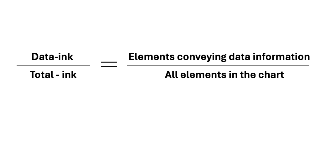
Once upon a time, there was a famous statistician called Edward Tufte (1942 and still enjoying life!). He was among the first pioneers of Data Visualization. This was back in the days when you started with just paper and pencil. And while working on his projects, he came up with something called “Data Ink Ratio.” That simple wisdom is valid till now and should be used in your daily thinking.
But what it is?
Edward Tufte and Data Ink Magic


It asks chart creators to scrutinize whether all elements in the chart are relevant to the chart’s message. We should always strive for clarity, simplicity, and cleanness of the message. Our goal is not to throw EVERYTHING there is at the audience. We aim to deliver the story to the audience with visuals that enhance the story. These visuals should support rather than confuse the audience.
Elements – Colors, effects, legends, labels, images, annotations, headlines, etc.
Two actions available to you:
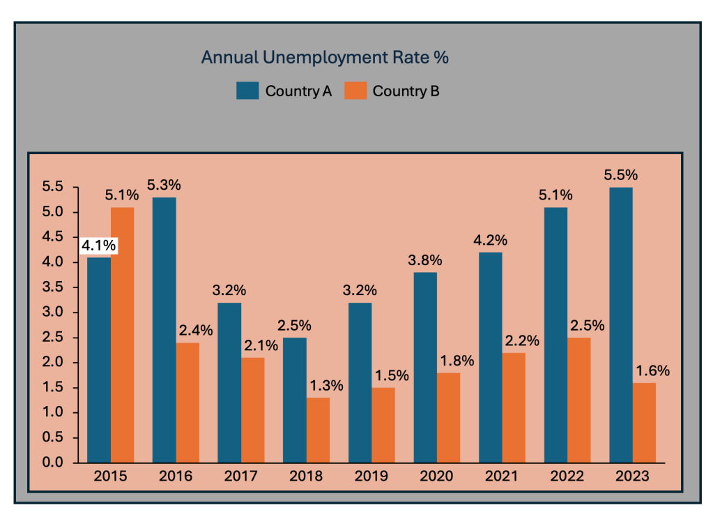
- Erase non-data ink, as much as needed – accessory elements that don’t add information should be considered for removal (Gridlines, Axis, colors w/o meaning, labels, distracting effects)
- Erase redundant data-ink, as much as needed – check for extra data elements that can be removed (legends, excessive information, symbols, highlighters, etc.)
Few benefits of this approach:
- Concise message – Including only essential elements ensures that your message remains clear and easy for the audience to digest.
- Saving time – not only will the readers get the message quicker but you will also avoid confusing people/audience
- Saving space – space is a resource that you can use on other KPI or metrics vs. unnecessary elements
A simple example is below, where you can see BEFORE and AFTER applying Tufte’s Data-Ink Ratio.
BEFORE

AFTER

Constantly thinking about what is important and what is not helps visualizations communicate insights more clearly. It engages the audience on a deeper level and enhances functionality, leading to better decision-making and interpretation of data.
“The ability to simplify means to eliminate the unnecessary so that the necessary may speak.” (Hans Hofmann)


Leave a reply to Chart of the Week – Visual Wizards Academy Cancel reply