

The Time Series Comparison and its different alternatives
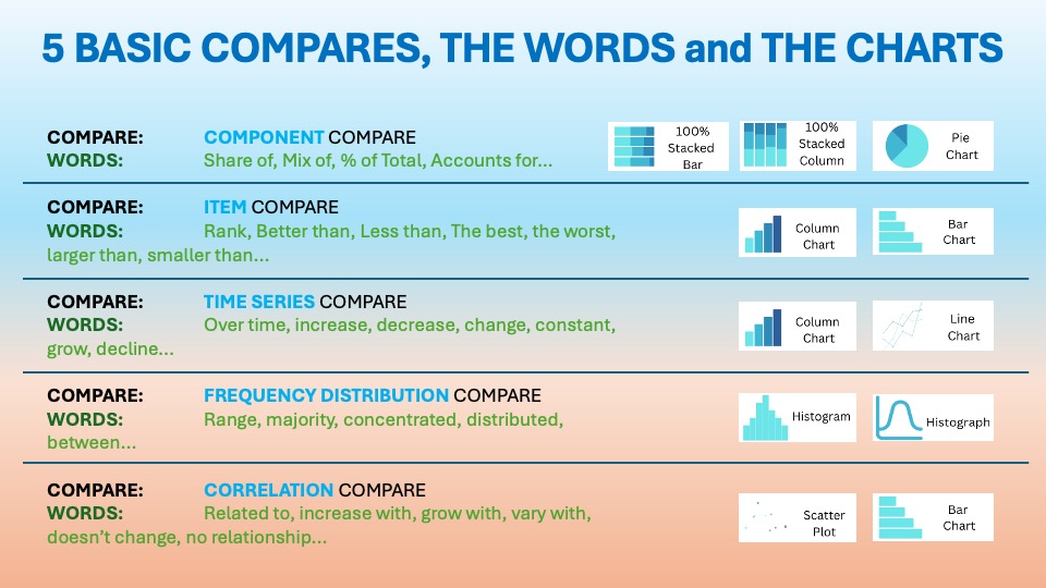
As we discussed in the essential article on Time Series Comparison, you want to display items over a certain period. The visuals should show change over time. The usual words used with it are:
Over time, increase, decrease, change, constant, grow, decline…etc. You can find it in the world around you every day. Last time we talked about the Line Charts with Projections.
From Straight Lines to Smart Fans: Visualizing Uncertainty in Time Series


Line charts were invented by William Playfair in 1786. They revolutionized how we track change over time. By connecting data points, they reveal trends, cycles, and momentum. Playfair used them to plot economic data like exports and imports, making invisible patterns visible to policymakers and merchants.
Fan line charts are designed for moments when you need to say, “Here’s where we’ve been.” They also help show the range of places we might realistically go. They extend a standard line chart (from the past) with shaded forecast bands (to the future). This creates a “fan” shape that visualizes both a central projection and its uncertainty.
Central banks like the Bank of England first formalized and popularized fan charts. They use these charts to communicate inflation forecasts. Fan charts help audiences understand forecasts. These forecasts are probabilistic rather than certain. Some outcomes are more likely than others.
“They’re saying: Here is where we have been and here is where we may go.”
In corporate life, leaders rarely want just a single number for next quarter’s revenue or cost. They want to know the likely range.
Data Storytelling: Practical Examples from the Corporate World
Fan line charts are frequently used for time series comparison because they:
- Combine actual history, baseline forecast, and uncertainty ranges in one view.
- Support scenario discussions: conservative, base, and aggressive paths.
- Help finance, strategy, and operations teams plan for best, expected, and worst cases.
They’re ideal for KPIs that are uncertain but critical: revenue, profit, cash, demand, headcount, or capacity.
Example:

LuminaRetail is a mid-sized, data-savvy fashion and lifestyle retailer. It operates across 8 countries in Europe and Asia. The company has a mix of physical stores, e‑commerce, and marketplace presence. Its core customers are urban professionals aged 25–45. They value affordable, trend-forward apparel. They expect seamless omnichannel experiences when browsing online. They also offer in-app and in-store pickup.
Company Context:
The company has grown quickly over the past five years. It invested heavily in digital. This includes personalized email campaigns and social media collaborations with influencers. Additionally, a robust loyalty program now accounts for over 60% of sales. Macroeconomic conditions are mixed. Consumer confidence is recovering after inflation spikes.
However, shoppers are more promotion-sensitive. This change makes revenue planning and inventory risk more complex. At the same time, LuminaRetail is expanding into two new markets. It is also rolling out a refreshed private-label line. This adds upside potential but also introduces uncertainty to forecasts.

👉🏻 Advantages
- Communicates uncertainty clearly: Shaded bands show that the future is a range, not a point.
- Keeps context of history: Past line plus future “fan” makes it easy to compare projected paths with actual trends.
- Supports risk-aware decisions: Leaders can plan for downside and upside scenarios instead of over-trusting one forecast.
- Visually intuitive: Darker center bands show more likely outcomes; lighter outer bands show tail risks.
👉🏻 Disadvantages
- Can be hard to read for some audiences: Multiple bands can feel complex or “too statistical.”
- Requires good forecasting models: Poor inputs = misleading fans.
- Overconfidence risk if bands are too narrow: May understate true uncertainty.
- Space and clutter: Many bands or multiple series can overwhelm a slide or dashboard
Practical Tips to Reduce the Disadvantages
There are always creative ways to help yourself avoid the pitfalls, depending again on the story you choose to tell. Not every piece of data is essential, and not everything needs to be visible or communicated. I have added some tips I’ve learned during my professional journey on the right side of the image below.

Are there other alternatives for your Data Storytelling?
Of course, in the future posts I am going to talk about various other visually appealing alternatives!
Visualizations and their use cases, we have already talked about in Component Compare:
Visualizations and their use cases, we have already talked about in Time Series Compare:
Summary
Fan line charts upgrade basic time series charts into risk-aware forecasting tools. They tell you where you might end up. They also show how wide the lane is and how likely different outcomes are. Used well, they prevent overconfidence in single-point forecasts and encourage smarter planning across best, base, and worst cases.
If you’re still presenting future numbers as one thin line, it’s time to change the story. Start by adding a fan chart for your most important KPI. Explain the bands in simple language. Invite your stakeholders to plan within the range, not around a guess. Turn your forecasts from “maybe” into informed, visual conversations about risk and opportunity.
For a free downloadable set of essential resources for your Data Storytelling journey, click here: Free Downloads or sign up below.
And of course, if you want to keep transforming your Data Storytelling skills, subscribe to regular updates to your inbox!
Leave a Reply