
The Relationship Comparison and its different alternatives
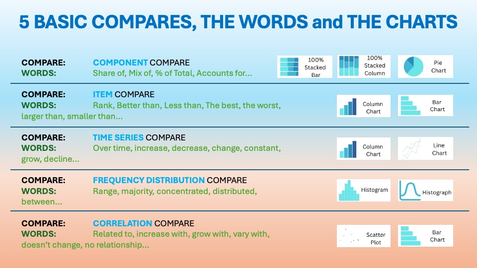
In the essential article on Relationship / Correlation Comparison, we discussed the importance of showing how data is related. It’s also crucial to show if the data is independent. The visuals should show the proximity or distance between data points. The usual words used with it are:
relationship, increases with, contrary to, follows, opposite…etc. You can find it in the world around you every day.
Last time, we were still in Time Series Comparison, where we talked about the Arrow Plot Charts.
One Chart, Two Metrics, Big Insight: Why Scatter Plots Belong in Every Data Storytelling Toolkit

Scatter plots are simple yet powerful. They help you quickly see relationships between two variables. This is why they’ve become a staple for correlation analysis in modern dashboards. When used well, they move you beyond gut feel and help you visually test, “Do these things actually move together?”
Scatter plots sit on the Cartesian coordinate system. René Descartes first introduced this system in the 17th century. Each point is defined by an x and y value. In the 19th century, Francis Galton and other early statisticians popularized scatter plots. They used them to explore relationships, such as parents’ height vs. children’s height. This exploration helped formalize the idea of correlation.
“Correlation is not causation, but it sure is a clue.” Edward Tufte
Scatter plots were special because they showed every data point. They did not just show averages. This allowed patterns, clusters, and odd outliers to become visible. Today, that same capability makes them indispensable. They are crucial whenever you want to understand how two business metrics might be related.
Data Storytelling: Practical Examples from the Corporate World
Professionals widely use scatter plots to explore questions like “Does more marketing spend really drive higher sales?” or “Do higher training hours actually improve performance?”. They provide a visual check before you commit to a narrative or a major investment.
Other common use cases:
- Revenue vs marketing spend by campaign or region.
- Customer satisfaction vs response time by team or channel.
- Defect rate vs machine run time in manufacturing.
- Deal size vs sales cycle length in B2B sales
Every point is a real observation. Scatter plots help users/audience see whether a relationship is clear, weak, or non-existent. They show that it is driven by a few unusual cases.
Example:

BrewVista Café is a specialty coffee shop in a busy central business district. It serves office workers and students who care about both price and quality. The competition is tight. Global chains are vying for the morning and lunchtime crowd. Indie cafés and convenience-store coffee are also in the fight.
Company, market and competition
BrewVista positions itself as “quality you can taste, prices you can justify.” It offers espresso‑based drinks, filter coffee, and seasonal specials, alongside pastries and light lunches.
The local market is crowded, with:
- Chains winning on consistency, loyalty apps, and aggressive promotions.
- Small independents competing on ambiance, origin stories, and barista skill.
BrewVista’s leadership suspects there’s a sweet spot between price and daily sales volume. However, they don’t know if they’re too cheap, too expensive, or just right on key drinks. A scatter plot is the perfect way to visualize that relationship.
Simple Dataset:


Recommendations for BrewVista:
- Double down on high‑volume, mid‑priced heroes
- Protect the Latte and Cappuccino price points; avoid unnecessary discounting that could erode margin on drinks customers will buy anyway.
- Feature them in morning bundles (coffee + pastry) to further lock in their role as everyday choices.
- Reposition premium drinks to earn their price
- Instead of lowering prices on Caramel and Seasonal lattes, emphasize their “treat” status. Focus on better visual presentation. Highlight limited‑time flavors and tell strong stories about the ingredients.
- Use targeted promotions (e.g., “Treat Friday” offers) to slightly raise their daily volume without training customers to expect constant discounts.
- Elevate the perception of cheaper drinks
- Market Filter Coffee as a quality, craft choice. Highlight the origin, roast profile, and brew method. This approach attracts value-seekers who still care about taste.
- Offer espresso‑based quick deals for regulars (e.g., loyalty punch cards) to stabilize volume without cutting prices.
- Run follow‑up tests
- Try small price experiments (±$0.20–$0.30) on one or two drinks and update the scatter plot after a month to see how points move.
- Track whether modest price changes meaningfully shift volume, or whether demand is fairly steady (inelastic).
👉🏻 Advantages
- Shows real relationships: Scatter plots reveal the direction (positive, negative, none) and rough strength of a relationship between two variables.
- Keeps all the data: They display every observation. This includes extremes and outliers. These can be crucial for understanding risk or exceptions.
- Easy to grasp visually: Patterns, clusters, and non‑linear shapes (curves, plateaus) are straightforward to see, even for non‑technical audiences.
- Great for hypothesis testing: You can quickly check whether an assumed link (e.g., higher discounts → higher volume) appears to hold in your data
👉🏻 Disadvantages
- Correlation ≠ causation: A visible pattern doesn’t prove that one variable is causing the other. Both could be driven by a third factor.
- Overplotting: With many points, especially in dense ranges, dots can overlap and obscure important structure.
- Only two variables: Standard scatter plots show two variables; relationships involving more factors require color, size, or entirely different charts.
- Subjective interpretation: Without numeric measures (like correlation coefficients), people can over‑ or under‑estimate the strength of a pattern.
Practical Tips to Reduce the Disadvantages
There are always creative ways to help yourself avoid the pitfalls, depending again on the story you choose to tell. Not every piece of data is essential, and not everything needs to be visible or communicated. I have added some tips I’ve learned during my professional journey on the right side of the image below.

Are there other alternatives for your Data Storytelling?
Of course, in the future posts I am going to talk about various other visually appealing alternatives!
Visualizations and their use cases, we have already talked about in Component Compare:
Summary
Scatter plots are a foundational tool for relationship and correlation analysis. They let you see real data points, patterns, and outliers. This is better than just looking at aggregated assumptions. Used with a bit of discipline, supporting statistics enhance their effectiveness. Careful design and clear language about correlation versus causation are also crucial. They can quickly surface insights that shape smarter marketing, operations, HR, and product decisions.
Burying relationships in dense tables or vague statements can obscure insights. Begin by choosing one business question, like “Does more spending really lead to better results?” Rebuild that view as a scatter plot with a trend line and clear labeling. Share it with your stakeholders. Ask them a simple question: “What do you see now that you couldn’t see before?”
Get your free downloadable set of essential resources for your Data Storytelling journey now. You can click here for Free Downloads. Alternatively, sign up below.
And of course, if you want to keep transforming your Data Storytelling skills, subscribe to regular updates to your inbox!
Leave a Reply