

The Time Series Comparison and its different alternatives
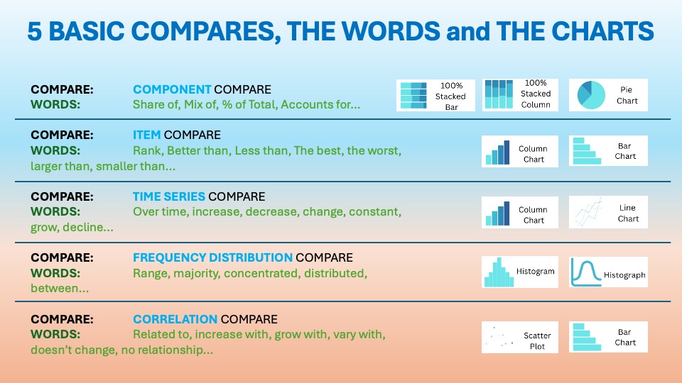
As we discussed in the essential article on Time Series Comparison, you want to display items over a certain period. The visuals should show change over time. The usual words used with it are:
Over time, increase, decrease, change, constant, grow, decline…etc. You can find it in the world around you every day. Last time we talked about the Spark Line Charts.
Waterfall Charts Explained: The Best Way to Tell a Clear “Before and After” Business Story

Waterfall charts are one of the most powerful ways to explain change over time, not just show it. They bridge the gap between “start” and “end” values. Every step in between is revealed. This is perfect for time series comparison in corporate reporting.
Strategy consulting firms like McKinsey & Company popularized waterfall charts in the 1980s. They needed a clear way to show executives how a number moved from point A to point B. They did more than just display opening and closing values. They introduced “bridge” visuals. These visuals broke down each positive and negative driver along the way.
“Waterfall charts bridge the gap between ‘start’ and ‘end’ values, explaining how we moved from point A to point B.”
The chart’s signature “floating bricks” show how a running total evolves as gains and losses accumulate. That makes waterfall charts ideal when the story is not just “what did we end on?” but “what exactly got us there?”
Data Storytelling: Practical Examples from the Corporate World
In office environments, waterfall charts are standard in finance, FP&A, sales, and operations. They’re frequently used to compare performance between time periods. These comparisons include prior year vs current year, budget vs actual, or Q1 vs. Q4. Such charts also explain the drivers of that time-based change.
Teams rely on waterfall charts because they:
- Show how a metric evolves across a period (e.g., year) through discrete monthly or quarterly contributions.
- Visualize time-based variance (e.g., month-on-month adds/drops) alongside a clear starting and ending value.
- Translate complex tables of line items into a single “bridge” that executives can read left to right in seconds
Waterfall charts excel at time-series comparisons. They are ideal when you want to explain how you moved from last year’s result to this year’s. They are more effective than plotting every data point on a traditional line chart.
Example:

PetraDelta Energy is a mid‑sized upstream oil & gas company operating offshore fields in Southeast Asia. Its portfolio includes a mix of mature fields with declining production. It also features a newer deepwater asset that recently moved from development into early production. This change raises both output and operational complexity.
Situation: In 2024, PetraDelta’s leadership approved a strategic push to stabilize production from aging platforms. They aimed to comply with tightening environmental regulations. They also prepared infrastructure for future tie‑backs. All of that implied higher maintenance, more inspections, and new ESG‑driven initiatives that would inevitably show up in operating costs.
As 2025 closed, the CFO faced a challenge. They needed to explain to the board why Opex had risen so much in absolute dollar terms. This happened despite strong cost‑discipline messaging throughout the year.
Operational Expenses Increase Context:
Increased maintenance and integrity work
PetraDelta accelerated maintenance on its aging offshore platforms. There were more shutdowns, inspection campaigns, and brownfield upgrades. These measures aim to prevent unplanned downtime and safety incidents. This alone contributed almost half of the total Opex increase.
On the waterfall, this appears as a large positive bar early in the bridge. It is clear that “doing the right thing” for asset integrity has a serious cost impact. The complication: the board accepts that safety and reliability are non‑negotiable. However, it worries that the pace and scope of work may not be optimized.
Higher energy and logistics costs
The cost of fuel for offshore vessels increased. Helicopter services and power for processing facilities became more expensive. These rises were due to volatile energy prices and tighter logistics capacity in the region. The company also faced longer supply routes due to changing regulations and port constraints.
In the waterfall, this driver shows as another sizable step. It underscores that macro factors inflated Opex beyond internal control. Supply chain realities also played a role. The complication: while some of this is unavoidable, the scale suggests procurement, routing, and scheduling may not be fully optimized.
Compliance, ESG, and environmental initiatives
Stricter emissions rules, reductions in flaring, and environmental monitoring requirements forced PetraDelta to invest in new sensors. They also invested in reporting systems and remediation programs. At the same time, the company launched several ESG initiatives. These included shore-power pilots and upgrades to leak-detection systems. The company also made commitments to community engagement.
This driver is clearly visible in the waterfall. It reinforces the story that part of the Opex increase is a strategic choice. The goal is to improve sustainability and stay ahead of regulation. The complication: some board members question whether the phasing of these initiatives could be smoother. They want to avoid a “cliff” in one year’s P&L.
Workforce and contractor cost inflation
Tight labor markets in engineering, offshore operations, and specialized services pushed up wages and day‑rates. Retaining key technical talent also required market‑aligned compensation.
In the waterfall, this is a smaller but still meaningful step. The complication: while inflationary, it highlights broader challenges in workforce planning, skill mix, and contractor dependence.

👉🏻 Advantages
- Storytelling clarity: They reveal the “anatomy of change” by breaking a total change into understandable components—ideal for executive decks.
- Perfect for bridging time periods: These are great for “2024 revenue → 2025 revenue” bridges. They are also useful for “Q1 → Q4” bridges that decompose growth or decline over the year.
- Highlights key drivers: Positive and negative contributors are immediately visible, along with their relative magnitude.
- Works well with other visuals: It is often paired with summary KPIs, line charts, or tables. These form part of a broader time series comparison dashboard.
👉🏻 Disadvantages
- Limited granularity: Waterfalls are not ideal for high-frequency time series (e.g., daily data); they summarize the main buckets of change, not every point.
- Can get cluttered: Too many steps (e.g., dozens of tiny monthly bars) make the chart hard to read and defeat its storytelling purpose.
- Misinterpretation risk: Poor ordering, inconsistent colors, or unclear totals can confuse readers about what is a “change” vs a “total.”
- Small changes may vanish: If the starting value dwarfs incremental changes, important but small drivers can appear visually insignificant.
Practical Tips to Reduce the Disadvantages
There are always creative ways to help yourself avoid the pitfalls, depending again on the story you choose to tell. Not every piece of data is essential, and not everything needs to be visible or communicated. I have added some tips I’ve learned during my professional journey on the right side of the image below.

Are there other alternatives for your Data Storytelling?
Of course, in the future posts I am going to talk about various other visually appealing alternatives!
Visualizations and their use cases, we have already talked about in Component Compare:
Summary
Waterfall charts transform raw time series comparisons into clear, persuasive stories. They show not only where you ended up, but also exactly how you got there. When paired with line charts and KPIs, they become highly effective tools. These tools are essential to your Storytelling toolkit for explaining change over time.
If your reports still jump straight from “last year” to “this year,” it’s time to rethink your visuals. They lack that bridge in between. Start by identifying one critical metric, such as revenue, margin, headcount, or cash flow. Build a simple waterfall to explain its year-on-year story. Then, implement this approach across your key time series. Your stakeholders will finally see not just what changed. They will see why.
Get your free downloadable set of essential resources for your Data Storytelling journey now. You can click here for Free Downloads. Alternatively, sign up below.
And of course, if you want to keep transforming your Data Storytelling skills, subscribe to regular updates to your inbox!
Leave a Reply