

The Time Series Comparison and its different alternatives
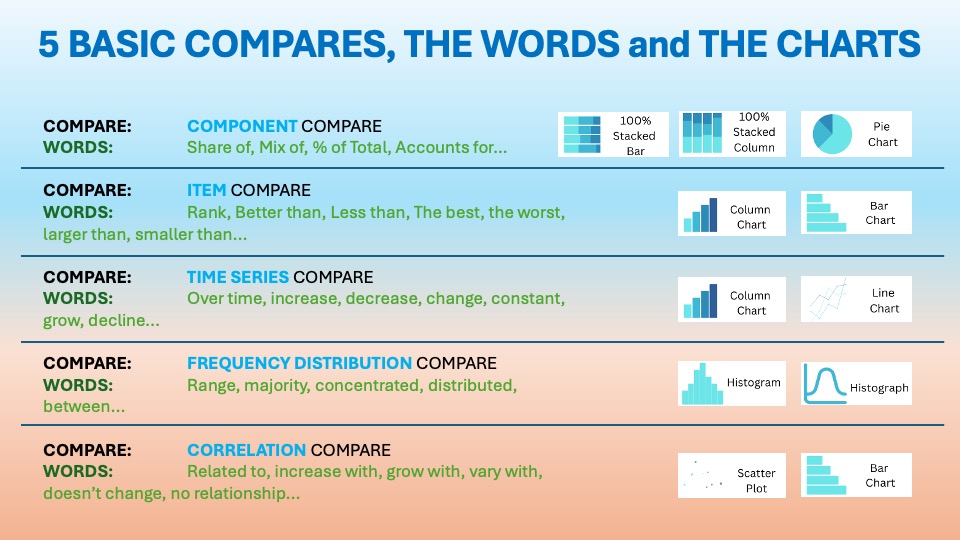
As we discussed in the essential article on Time Series Comparison, you want to display items over a certain period. The visuals should show change over time. The usual words used with it are:
Over time, increase, decrease, change, constant, grow, decline…etc. You can find it in the world around you every day. Last time we talked about the Fan Line Charts with Projections.
Combo Charts: When Lines and Columns Team Up for Better Time Series Stories


When you need to compare time-based performance from two angles at once, like “how big?” and “how efficient?”, a combo of line chart + column chart is one of the most effective visuals you can use. This classic combination lets columns show volume or magnitude over time. A line overlays trend, rate, or target. This gives your audience both context and nuance in a single glance.
The roots are simple: analysts used line charts for trends and column charts for comparing magnitudes. Over time, tools such as Excel, Power BI, and modern BI platforms have introduced combo charts. This allowed both charts to coexist in a single visual. They share the same time axis. The reason was practical.
“Executives wanted to understand not just “how much” (sales, traffic, production). They also wanted to know “how well” (conversion, margin, defect rate) without having to flip between slides.”
There are many examples of companies using these charts. Notably, Finance functions across industries such as banking, professional services, and corporate FP&A use them to compare billable hours vs. revenue, actuals vs. budget, or cash vs. growth rates.
Data Storytelling: Practical Examples from the Corporate World
This combo chart is frequently used for time series comparison because they:
- Lets you compare two related metrics (e.g., sales vs. margin, volume vs. rate) over the same period.
- Works brilliantly when the two metrics are in different units or scales (e.g., dollars vs. percent) via a dual axis.
- Reduces dashboard clutter by combining what would otherwise be two separate charts into one..
Think of it as a single slide that answers both: “What happened?” and “How good was it?”.
Example:

BrightWave Electronics is a mid-sized consumer electronics brand focused on smart home devices, wearables, and accessories. It sells through its own e‑commerce site, marketplaces, and selected retail partners across three key regions in Asia-Pacific.
The company competes on design and reliability at mid-tier prices. It balances promotional activity with a strong focus on brand perception. It also maintains attention on margin.
Company Context:
Over the last year, BrightWave has launched two new product lines: premium smartwatches and smart home bundles. However, they have also faced higher component costs. Intense seasonal discounting pressure from competitors has also been a challenge.
BrightWave competes in one of the most dynamic corners of the Asia-Pacific consumer electronics market. Smart home devices and wearables are growing fast in this market. However, margins are constantly under pressure. The region is crowded with powerful global brands such as Samsung, Apple, Xiaomi, and Huawei.
Aggressive local players also compete on price. They drive rapid innovation cycles and have deep e-commerce reach. Consumers are highly price-sensitive and increasingly time purchases around big sale events (Prime Day, 11.11, Black Friday, local “deal days”), which intensifies seasonal discounting and pushes mid-tier brands like BrightWave into frequent promotions just to stay visible.
Additionally, AI-powered dynamic pricing poses challenges. It becomes harder to sustain premium price points without a very clear value story. Comparison shopping exacerbates the situation.
In the supply chain, BrightWave is being squeezed from several sides. Electronic component lead times for semiconductors, memory, and passives remain volatile. AI, cloud, and IoT demand consume capacity. This leads to pockets of shortage and opportunistic price hikes from suppliers.

👉🏻 Advantages
- Richer story in one view: Columns show magnitude; the line shows trend or target. Together, they explain why a metric moves.
- Great for KPI vs. driver: Perfect when one metric drives or explains the other (e.g., spend vs. conversions).
- Dual axis capability: You can plot values on different scales without losing readability (e.g., revenue vs. margin%).
- Space-efficient: Fewer charts on the page, more room for narrative and insights..
👉🏻 Disadvantages
- Risk of overload: Too many series (multiple lines and columns) quickly get confusing.
- Dual-axis confusion: Viewers may misread the relationship if they miss that the axes have different scales.
- Design sensitivity: Poor color choices or labeling make it hard to see which series matters.
- Not ideal for beginners: Some audiences need a moment (or explanation) to interpret combo charts correctly.
Practical Tips to Reduce the Disadvantages
There are always creative ways to help yourself avoid the pitfalls, depending again on the story you choose to tell. Not every piece of data is essential, and not everything needs to be visible or communicated. I have added some tips I’ve learned during my professional journey on the right side of the image below.

Are there other alternatives for your Data Storytelling?
Of course, in the future posts I am going to talk about various other visually appealing alternatives!
Visualizations and their use cases, we have already talked about in Component Compare:
Summary
A combo of line and column charts is very powerful. It is one of the most underutilized tools for time-series comparison in business. It merges volume and quality, actuals and targets, drivers and outcomes into one clear, compact story.
When used well, it has a restrained series count. With thoughtful color, it clearly labels and helps your audience see not just what changed over time. It also illuminates why.
Next time you prepare a report or dashboard, select one key KPI. Choose its most important driver or target. Build a line-and-column combo chart. Use it as your “anchor visual” for the discussion. Notice how much faster stakeholders align on what’s really happening. They will also quickly determine next steps.
Get your free downloadable set of essential resources for your Data Storytelling journey now. You can click here for Free Downloads. Alternatively, sign up below.
And of course, if you want to keep transforming your Data Storytelling skills, subscribe to regular updates to your inbox!
Leave a Reply